Guided*
/


USPS
A poster about typography through the style of the United States Postal Service.
Project Type
Poster Design
Role
Visual Designer
↳ PDF poster
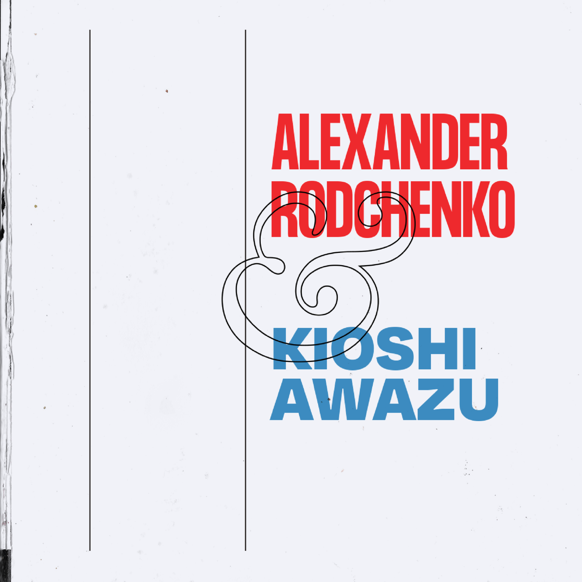
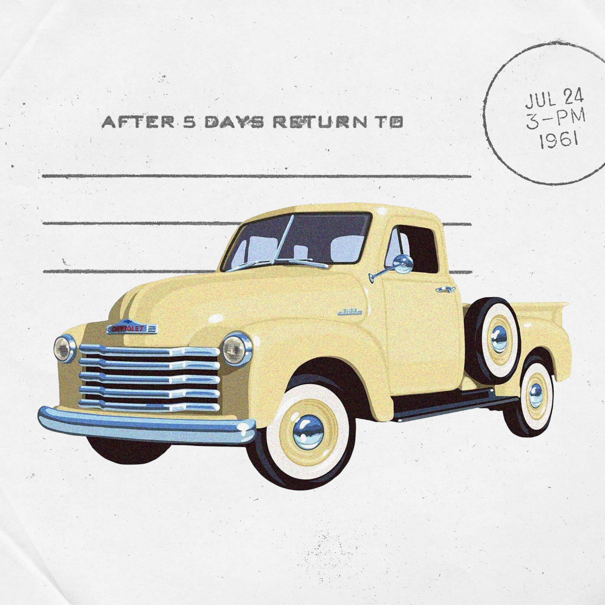
As a semester-long project under the direction of Mark Laughlin, students were tasked with creating a 24x36-inch poster that effectively uses the frame to display interaction between graphic visuals and terms specific to typography. Overall, the poster is an exercise to present type as both image and information while incorporating concept.
Inspired by the current events of the USPS losing federal funding during the 2020 presidential elections, I decided to base the visual concept of my poster on the postal service. Inspired by the tangible collage of textures, stamps, and typography, I worked through 13 weekly iterations of the poster to hone in on maximizing the composition and imagery.
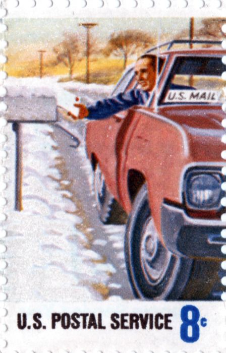
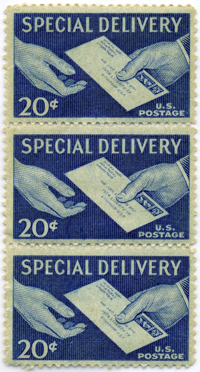
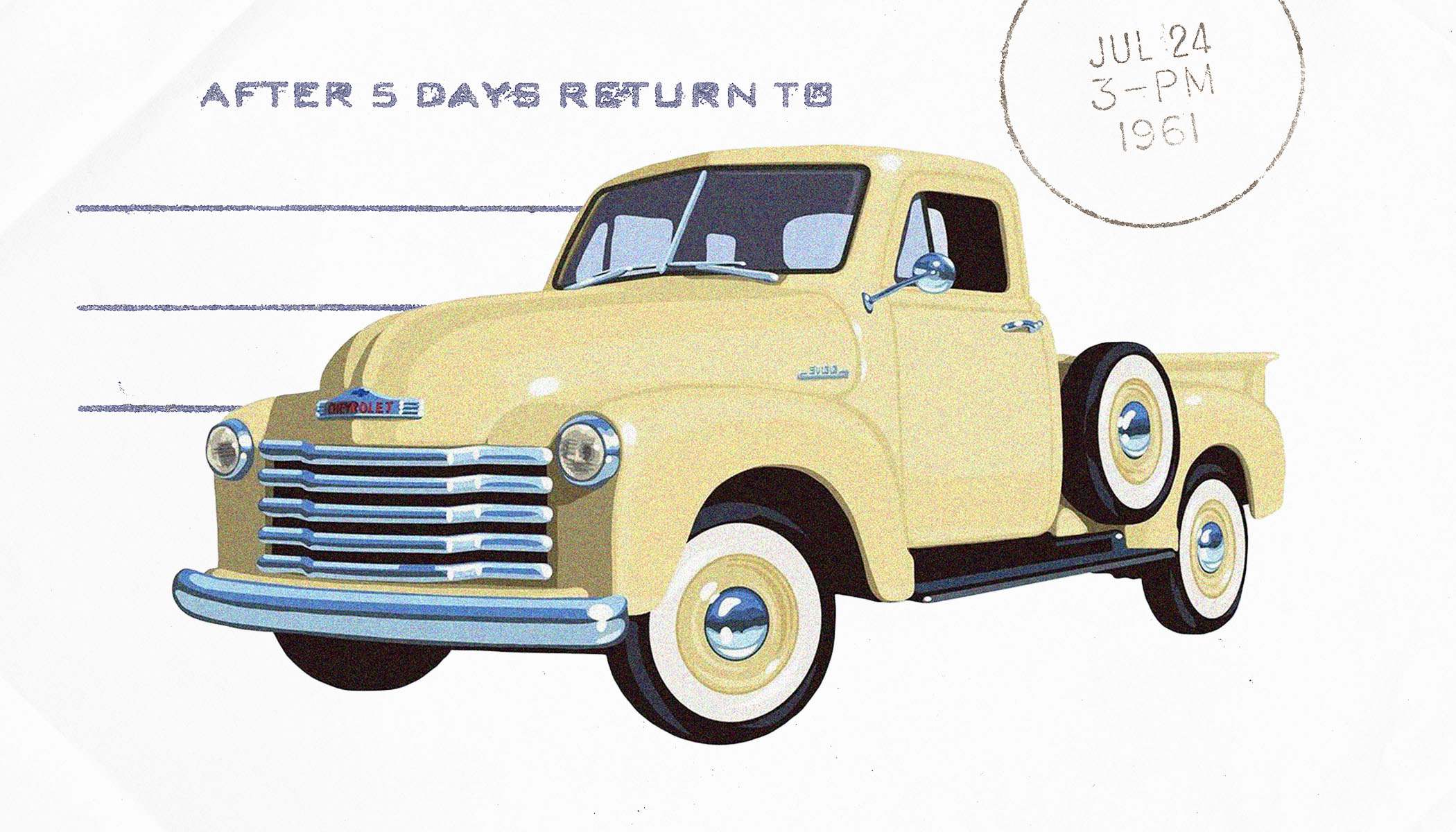
I began my process by collecting assets that could be used in my poster. This process of gathering assets common to the USPS brought me to find stamps, textures, and graphics which greatly inspired my early versions of the poster. The inspiration I collected allowed me to shape my visual approach into this poster as one inspired by all things that appear on an envelope: paper texture, stamps, and a little grit. Additionally, the red and blue that are common in airmail packaging inspired my use of color.
The final version of the poster features both image and information, utilizing the theme of the USPS through paper textures and vintage graphics. It is set in Helvetica Neue, inspired by the bold and uniform sans serif typeface common to American design. Additional typefaces, Garamond and Manrope provide different styles of typography, as required by the project guidelines.