The Avenue
Collateral design for the magazine's biannual issue launch.
Project Type
Brand Strategy
Collateral Design
Editorial Design
Role
Marketing Lead Designer
Team
Calem Robertson
Liv Iriarte
Simran Gvalani
Kaela Anderson
↳ Awakening
↳ the Avenue
The Avenue is Northeastern’s leading fashion and culture magazine. Run entirely by an agile team of students, the organization conceptualizes and launches a new magazine at the end of every semester.
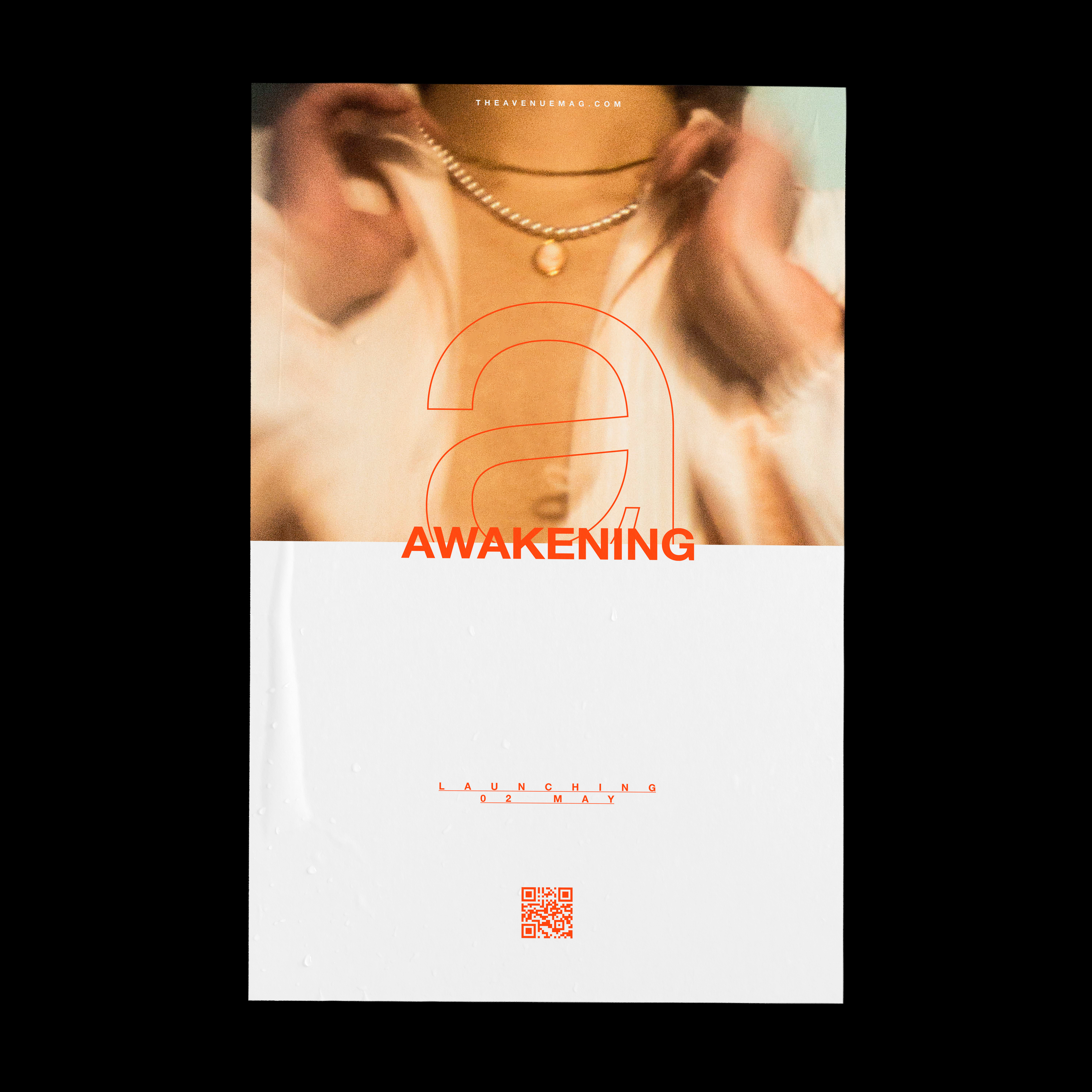
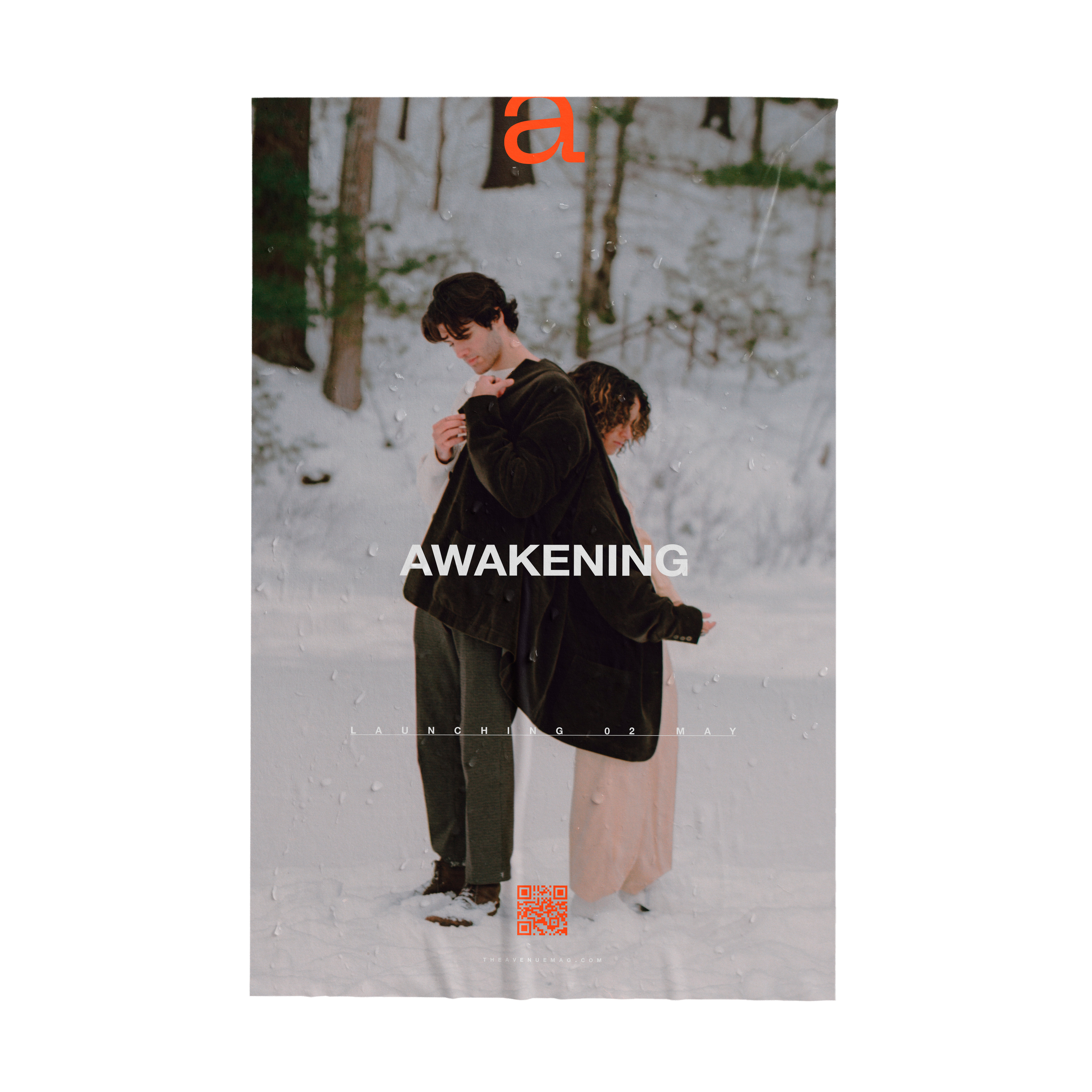
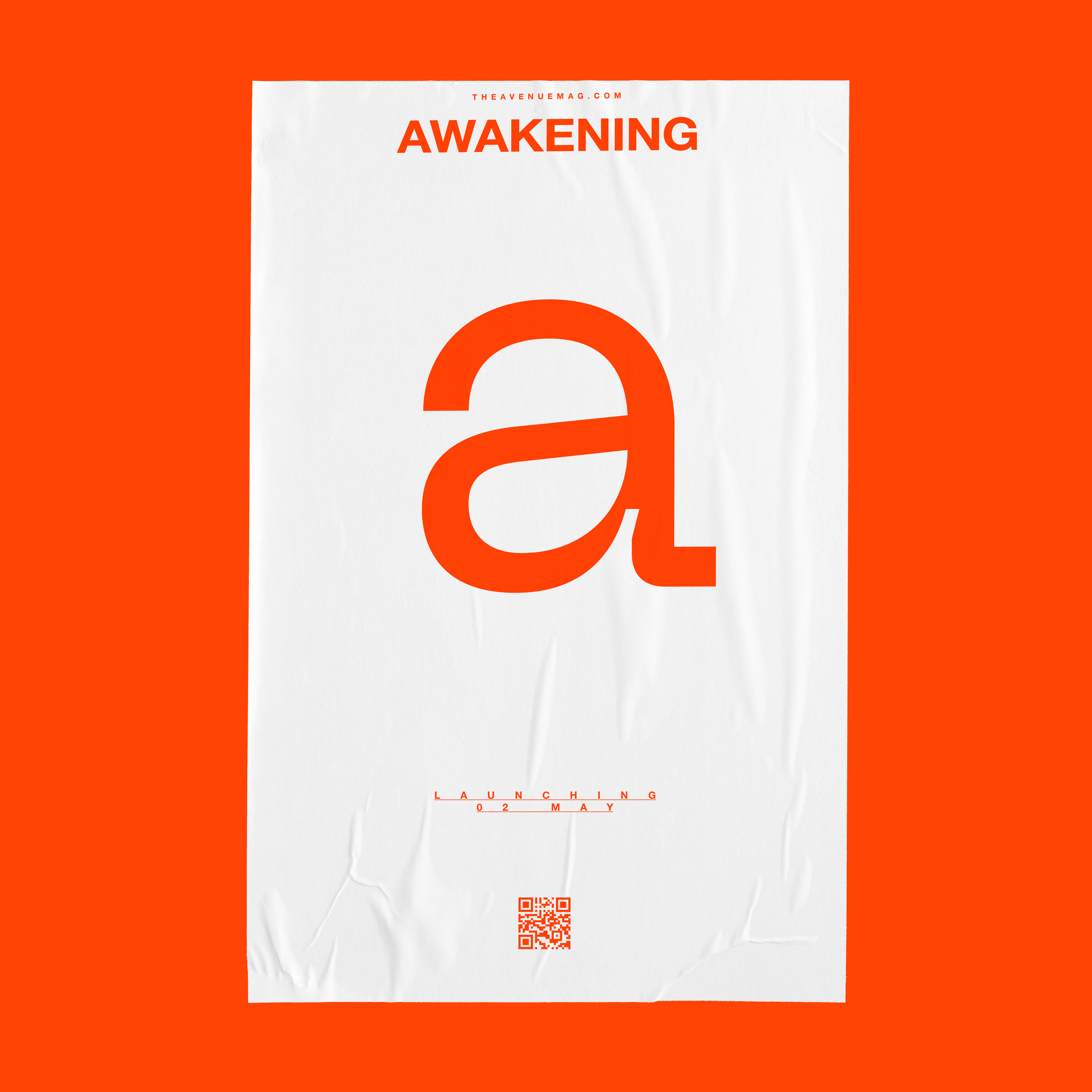
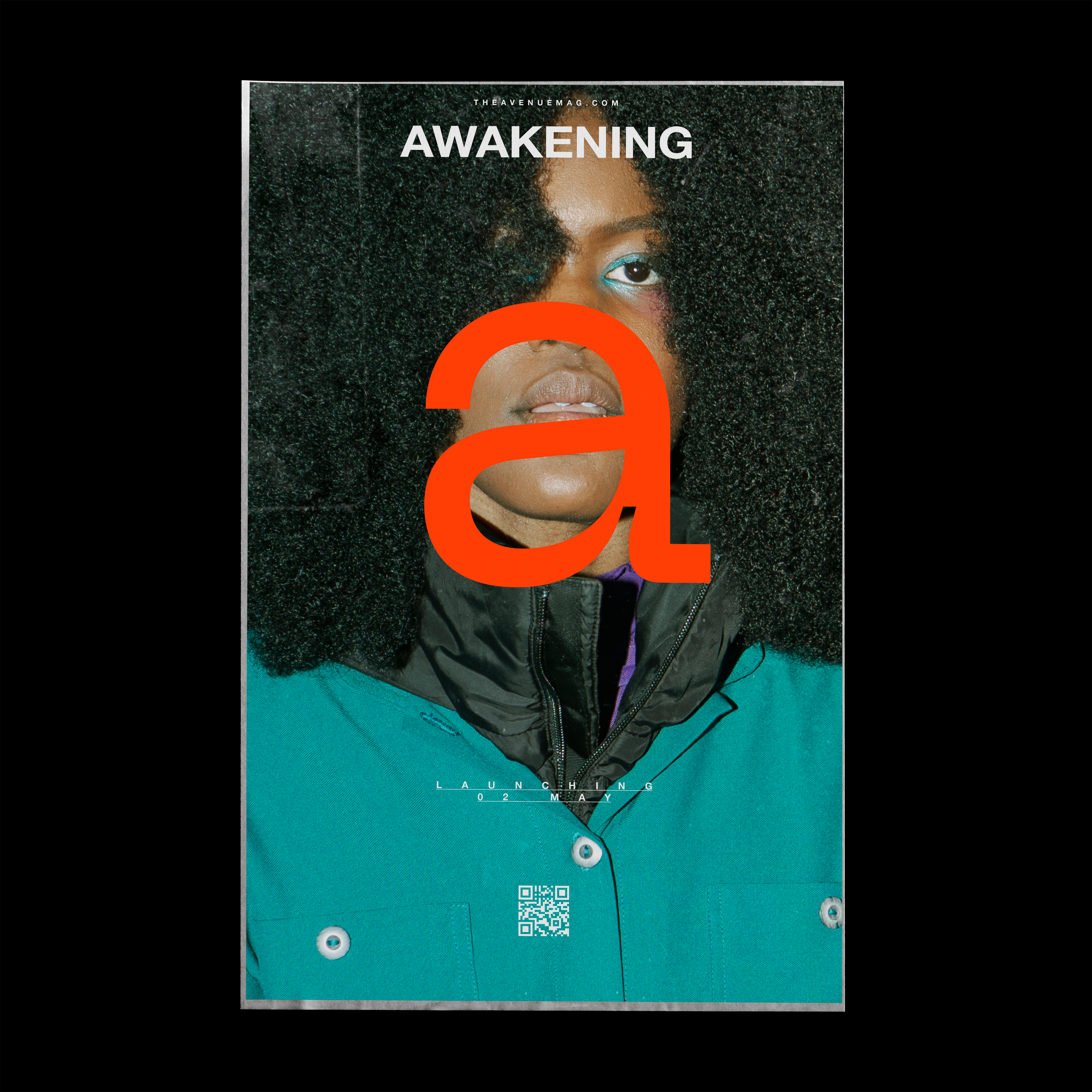
To advertise the launch of the magazine’s latest issue, Awakening, I was able to lead the design strategy to raise awareness for the launch of their publication. Deliverables of this project included poster design as well as social media collateral. Additionally, I have participated in layout design for articles in the issues Awakening and Environment.
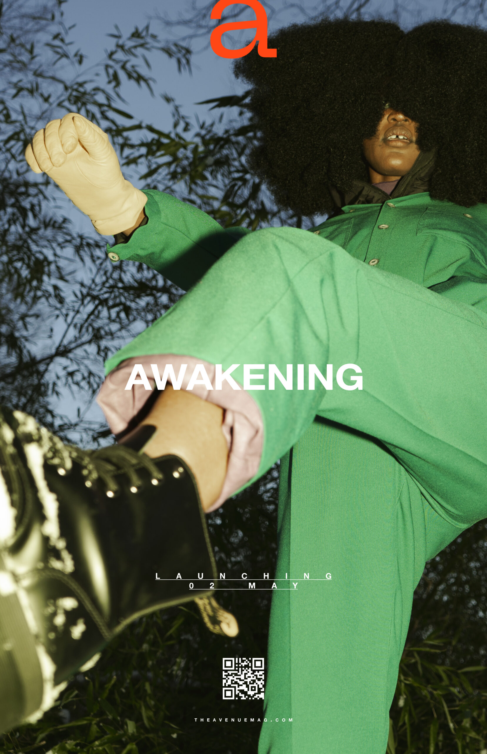
Awakening the Magazine's Forgotten Style Guide.
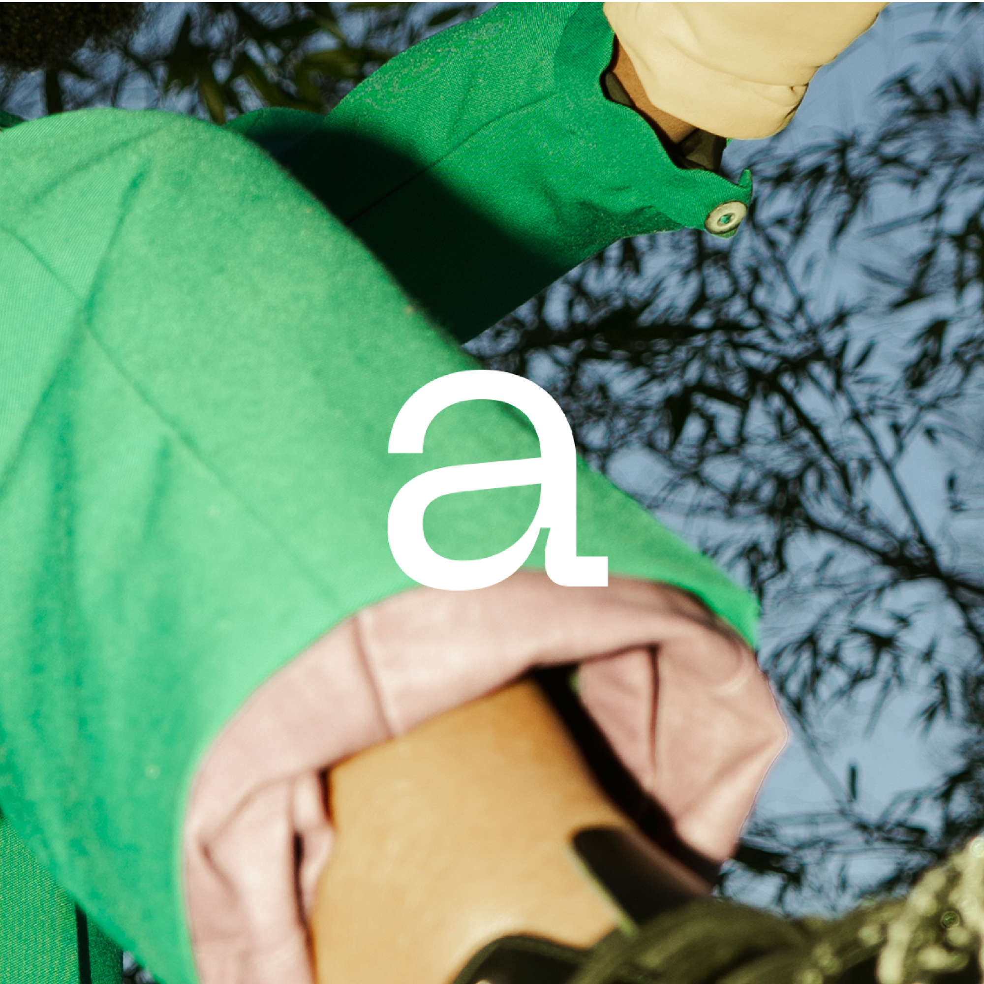
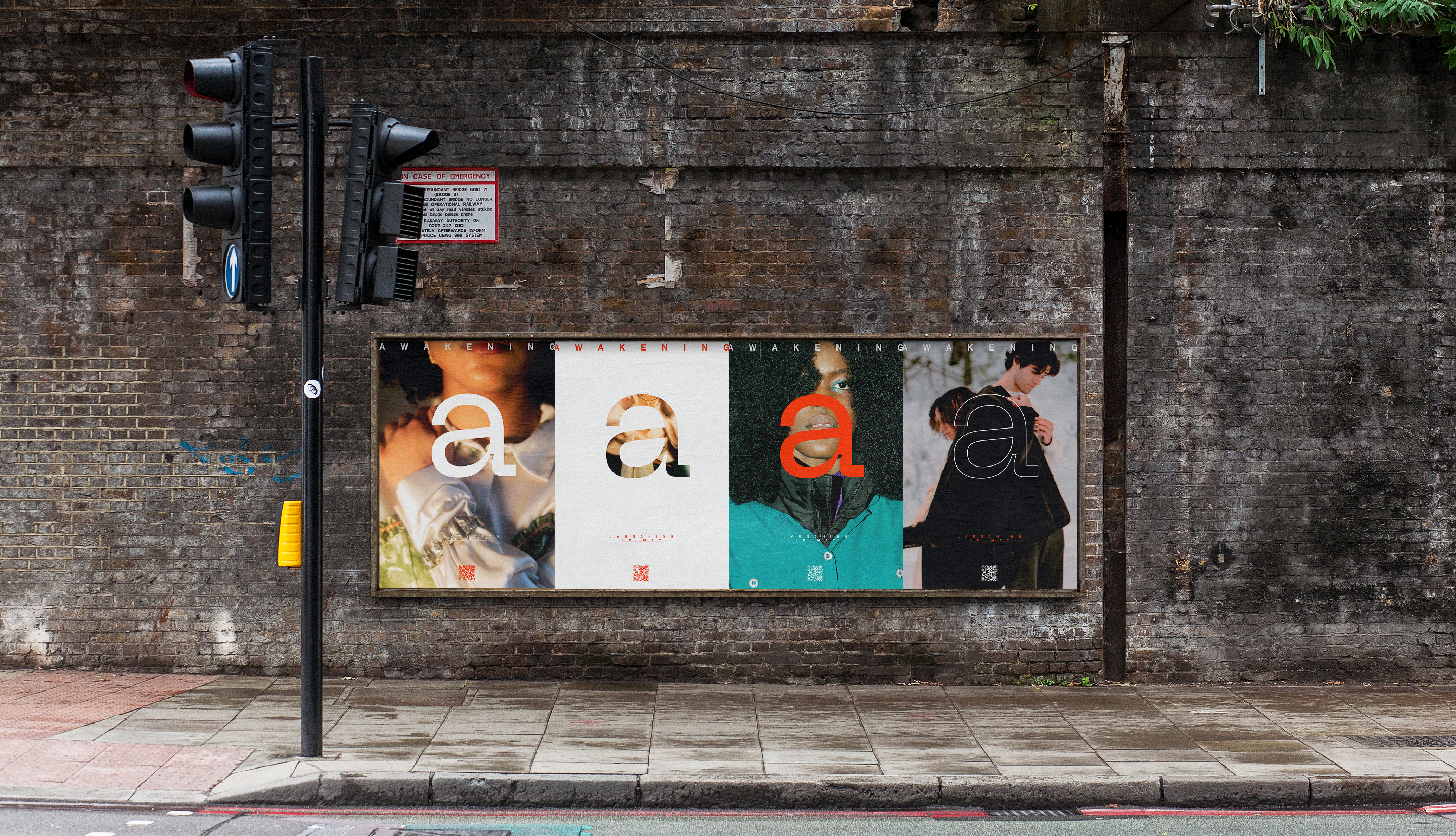
Working with the preexisting style guide and the issue-specific emphasis on the colors red and black, I refined my posters to include the magazine’s main identifier, the letter a, set in Neue Machina by type foundry Pangram Pangram. Keeping in mind the fact that these posters are to be used as advertisements, I limited how graphic these posters appear in order to create a sense of interest and anticipation. Keeping the design of these assets as simple as possible maximizes the effectiveness of the image and information displayed.
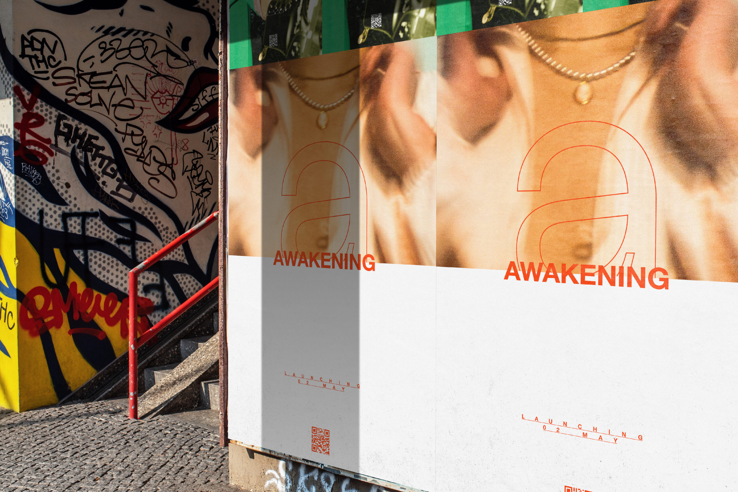
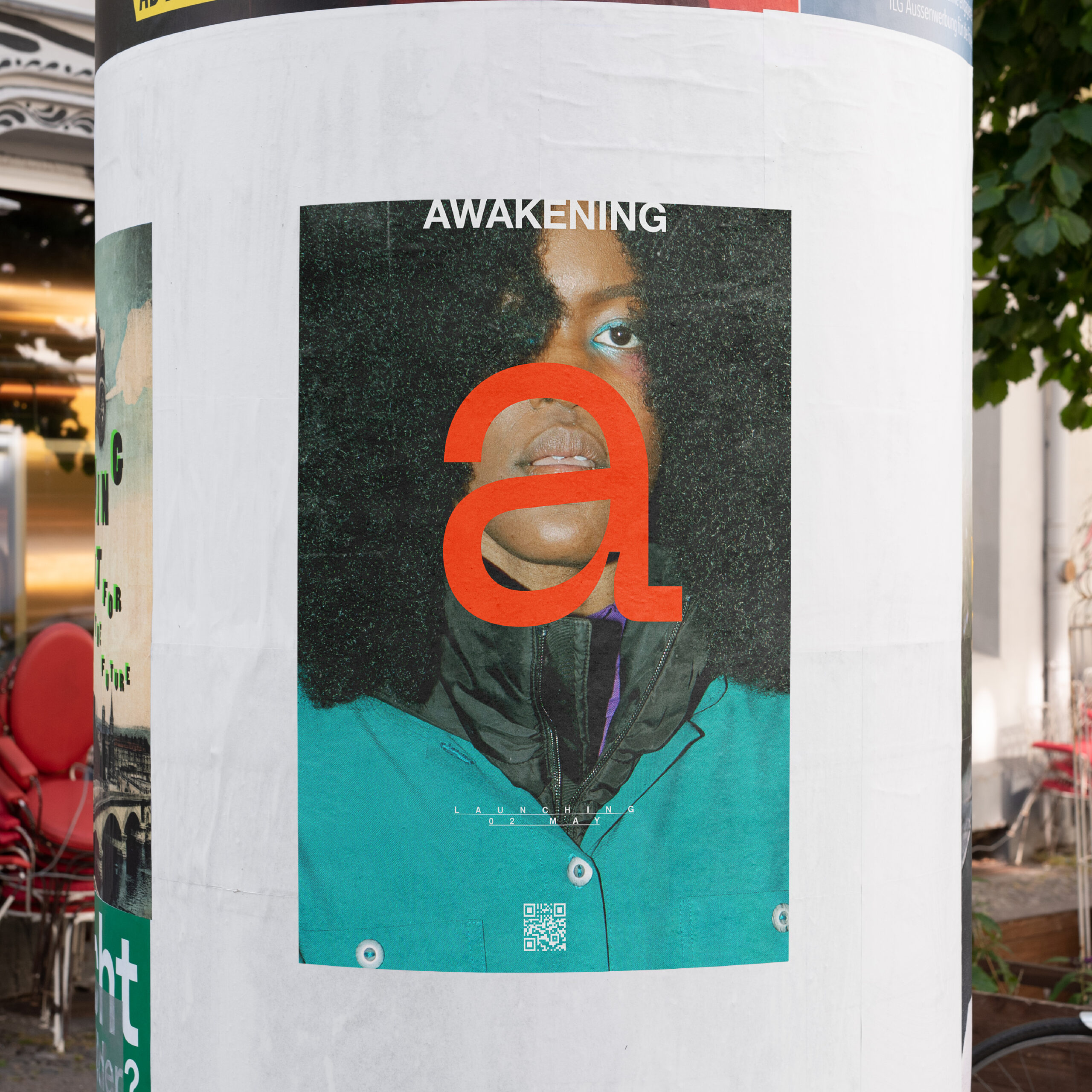
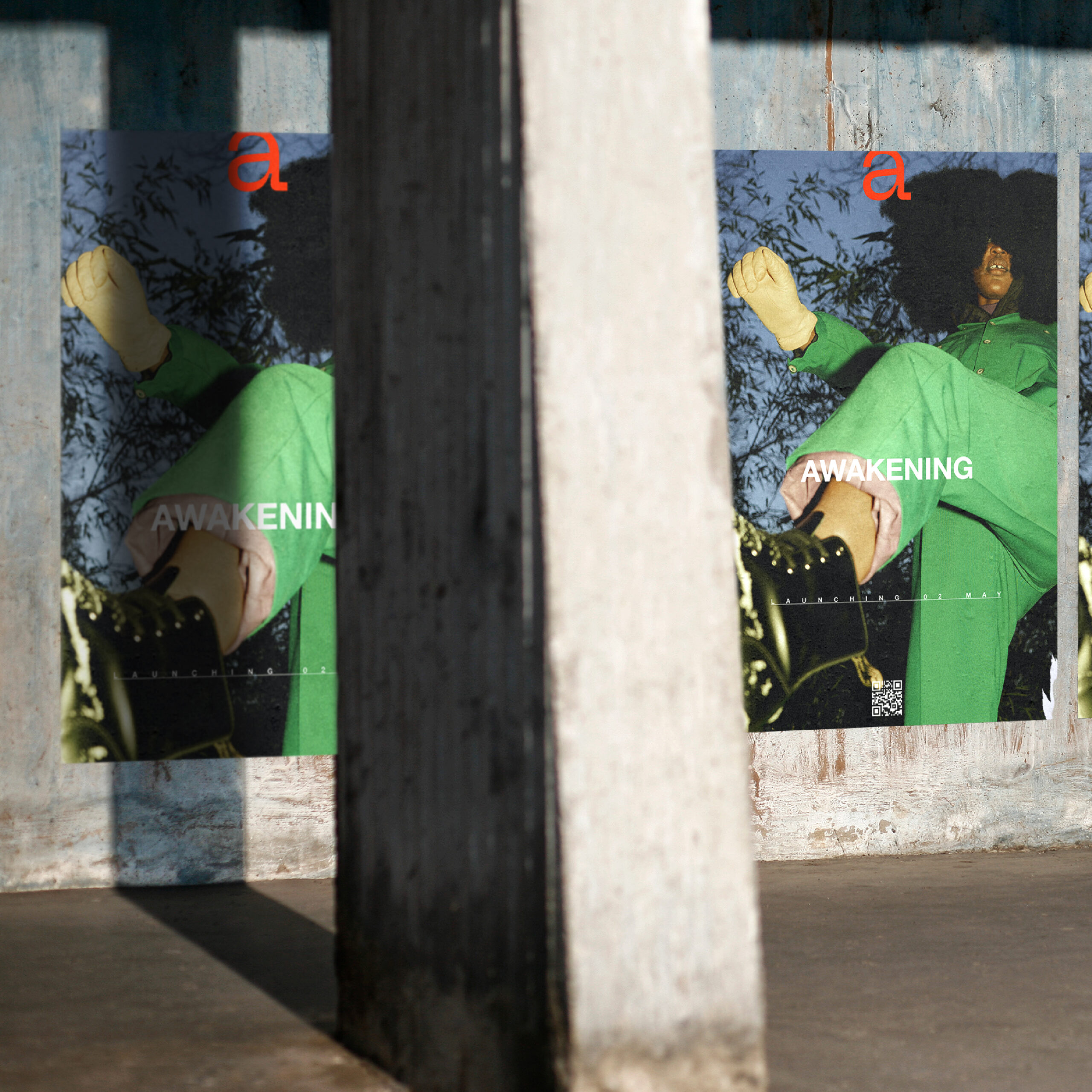
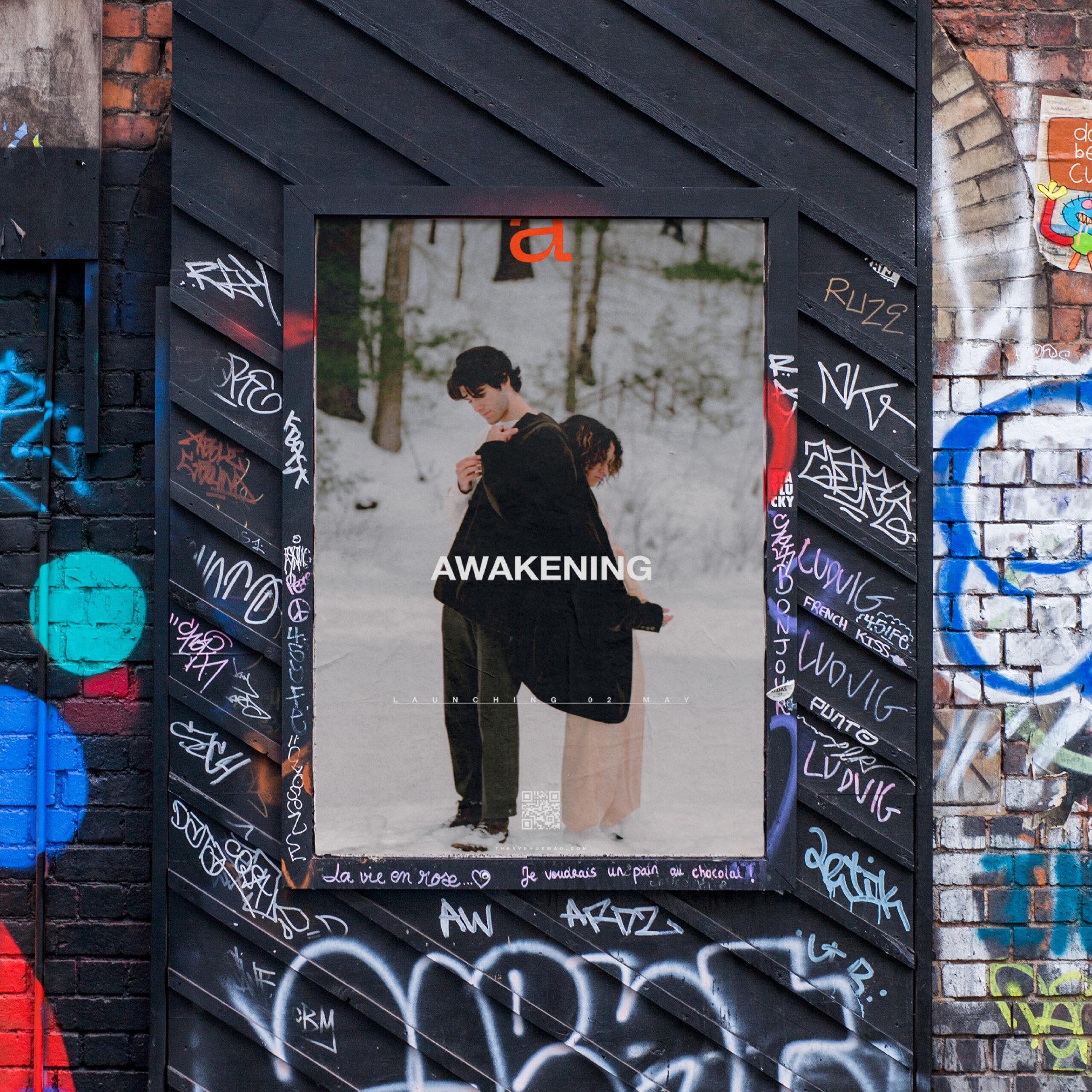
Minimal posters causing maximum curiosity.
To create excitement and wonder about the magazine's launch, these posters included minimal information causing great visual intrigue and the excitement of unknowing. A simple QR code links viewers to the magazine's website for more details about the issue and its launch.
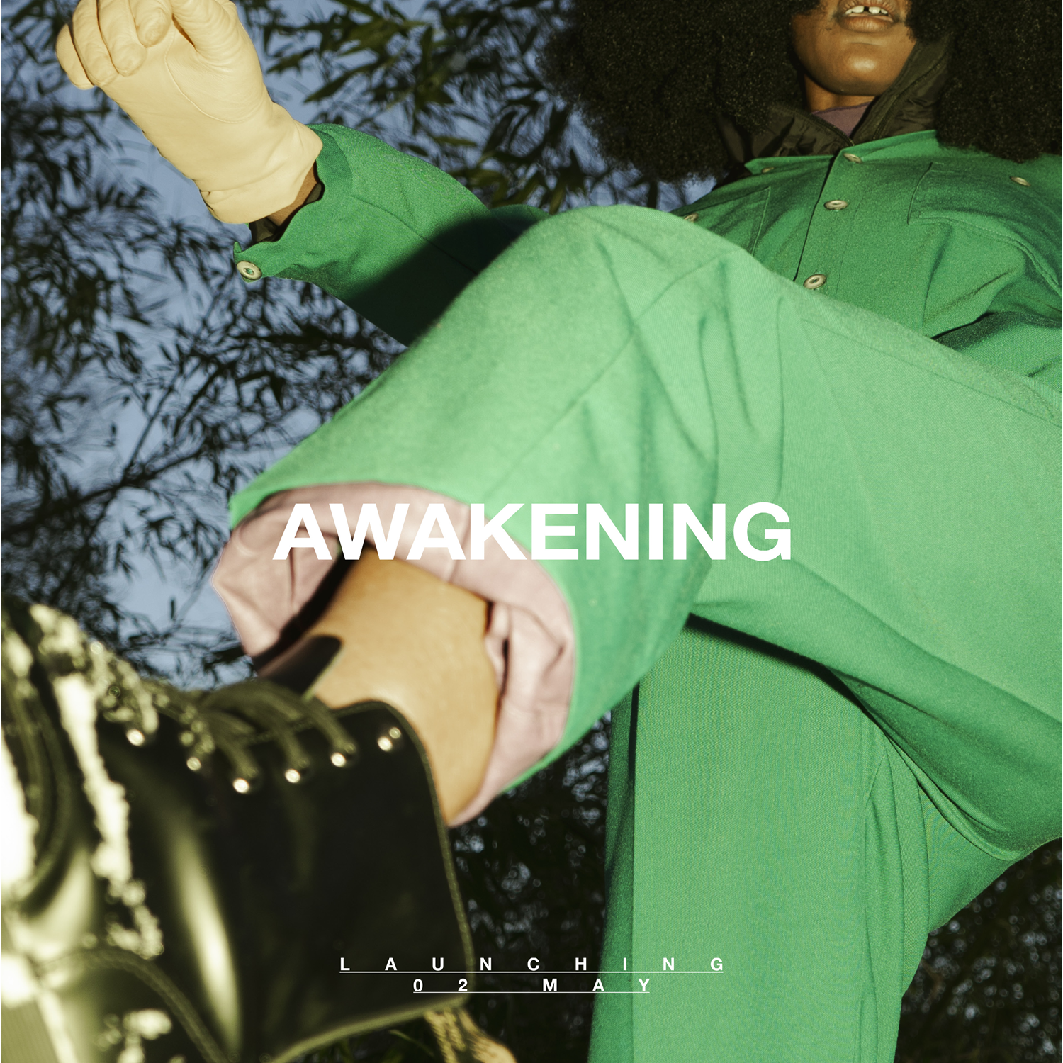
I worked with the social media manager to create a series of nine Instagram posts to promote the launch of the issue. These posts function to raise attention and cause interest in Awakening.
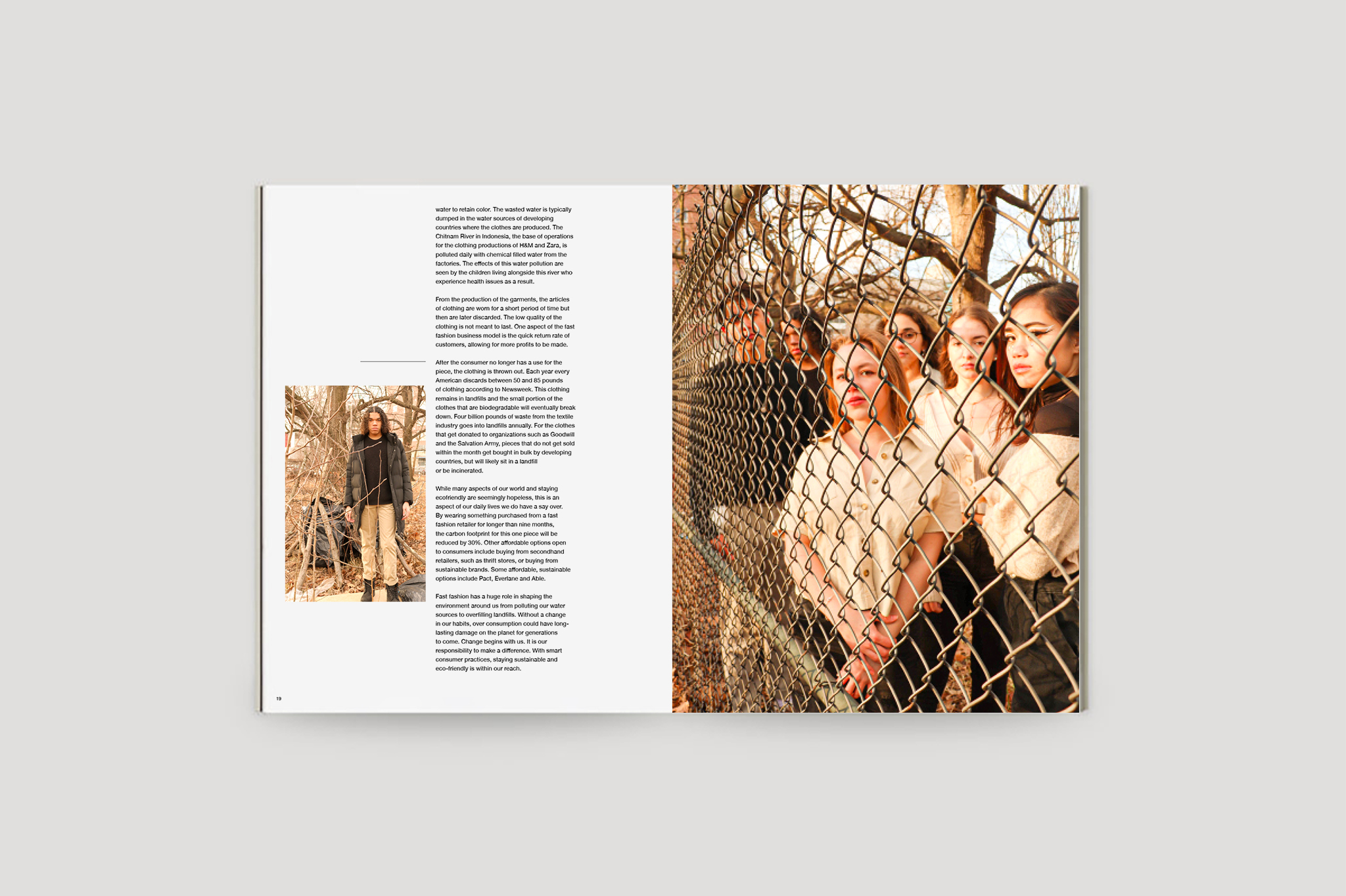
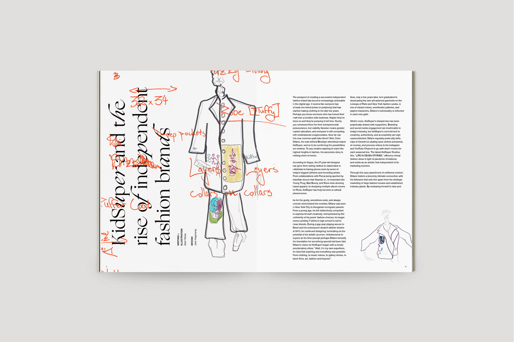
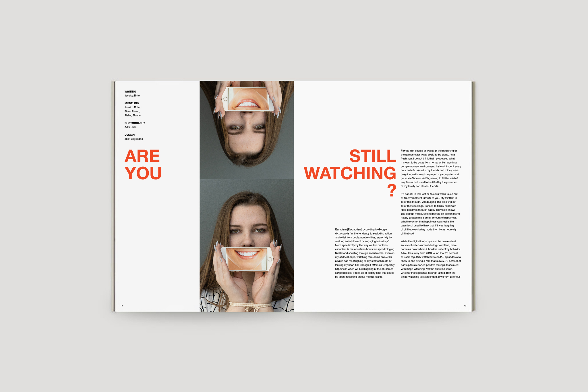
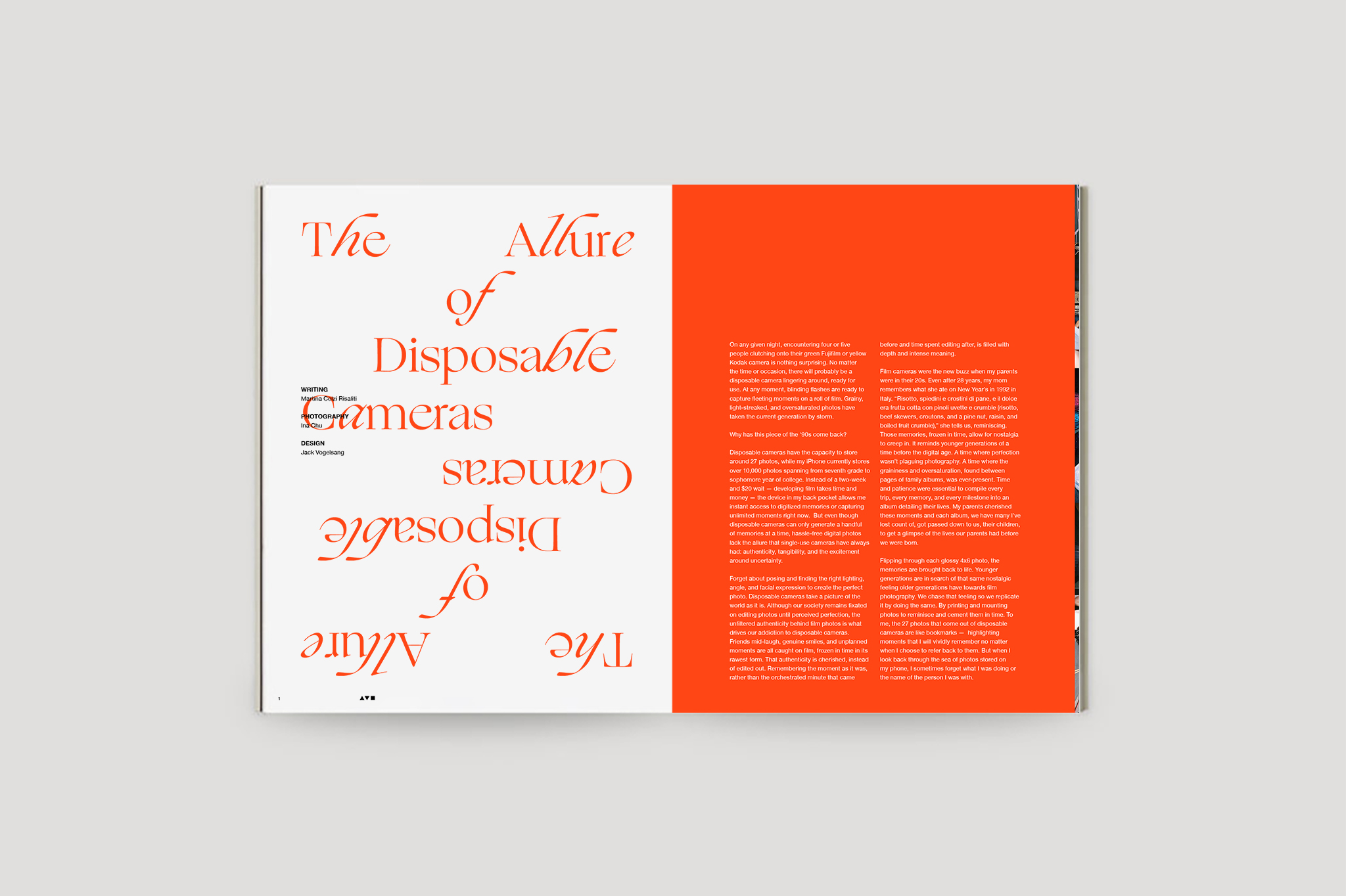
Designing spreads.
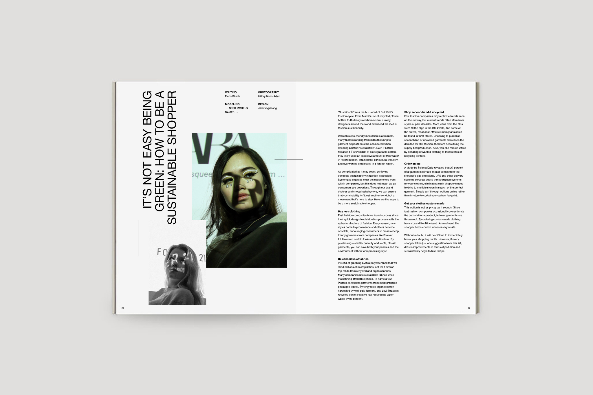
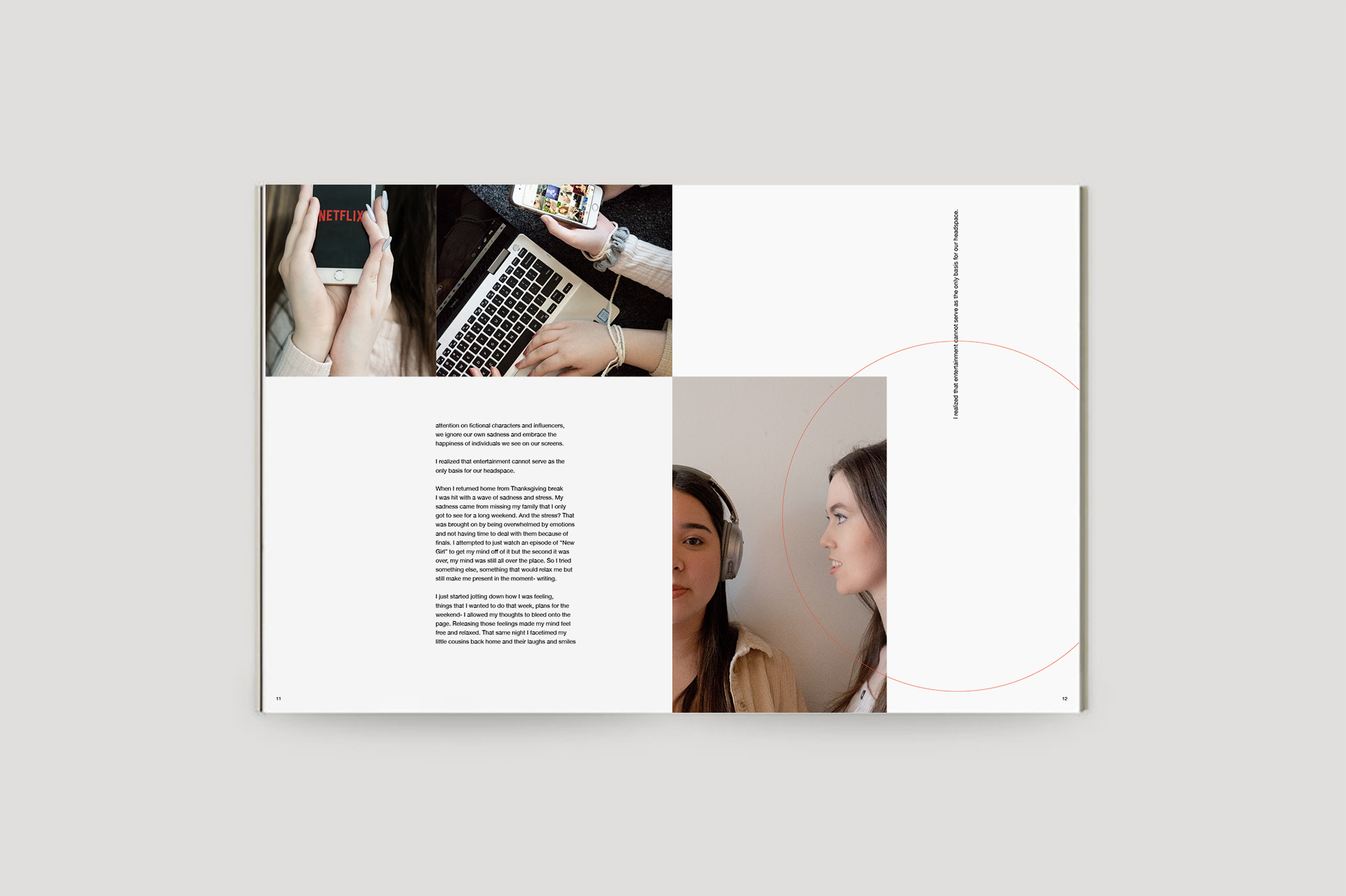
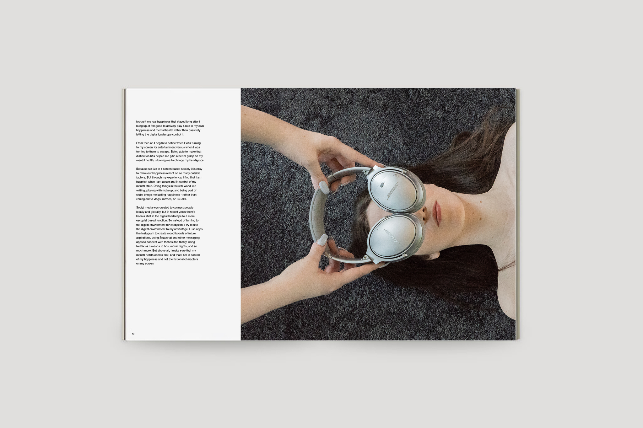
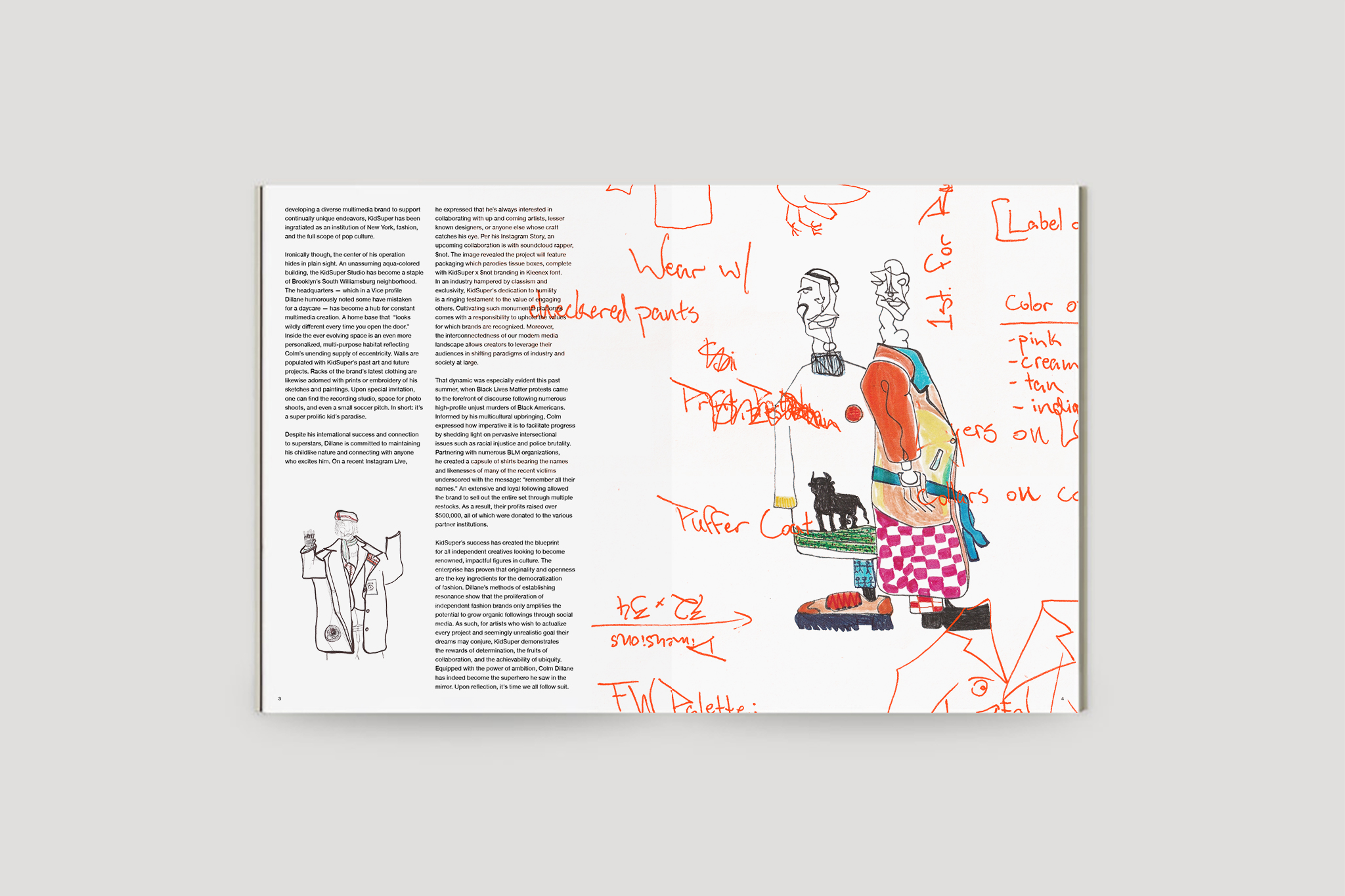
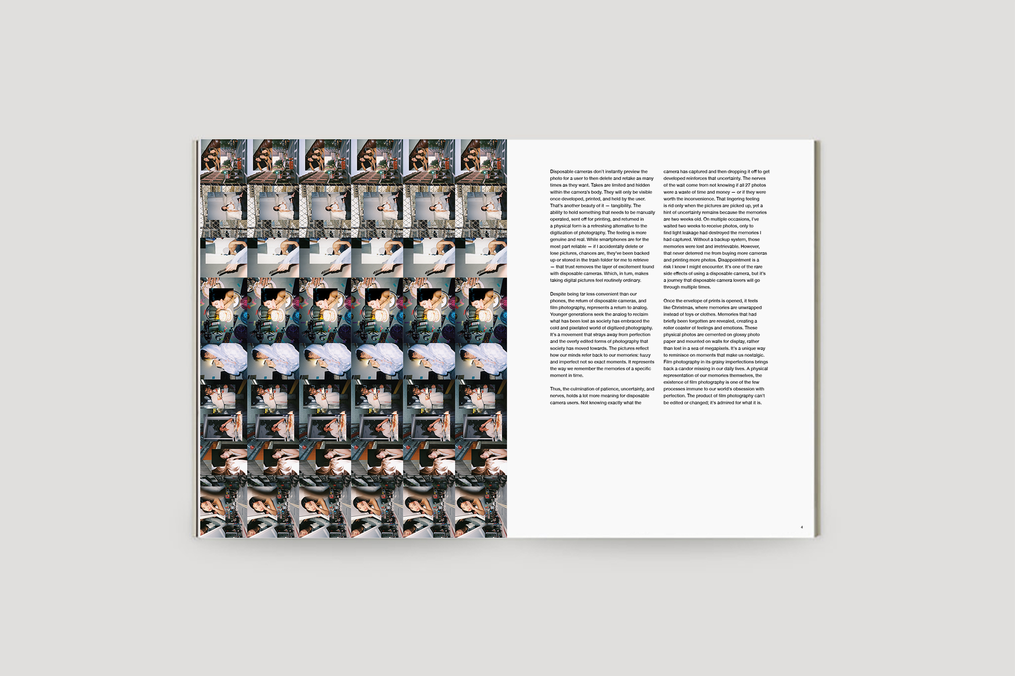
In addition to posters, I designed four spreads in two issues of the magazine. I worked directly with the magazine’s design director while adhering to the style guide of the publication. Utilizing white space and the magazine’s grid system, I was able to produce elegant spreads that effectively emphasized the articles I was designing for. Included in this experience, I was able to collaborate with illustrator Jack Weiss, to design an article based on his vision.
