Guided*
/

Better than Belts
(it's suspenders!)
Project Type
Brand Strategy
Brand Identity
Web Design
Role
Designer
Team
Sarah Porter
Vinny Carlino
Silvia Diaz
May Perez-Villatoro
Sarah Porter
Tina Wu
↳ Brand Book
↳ Live Site
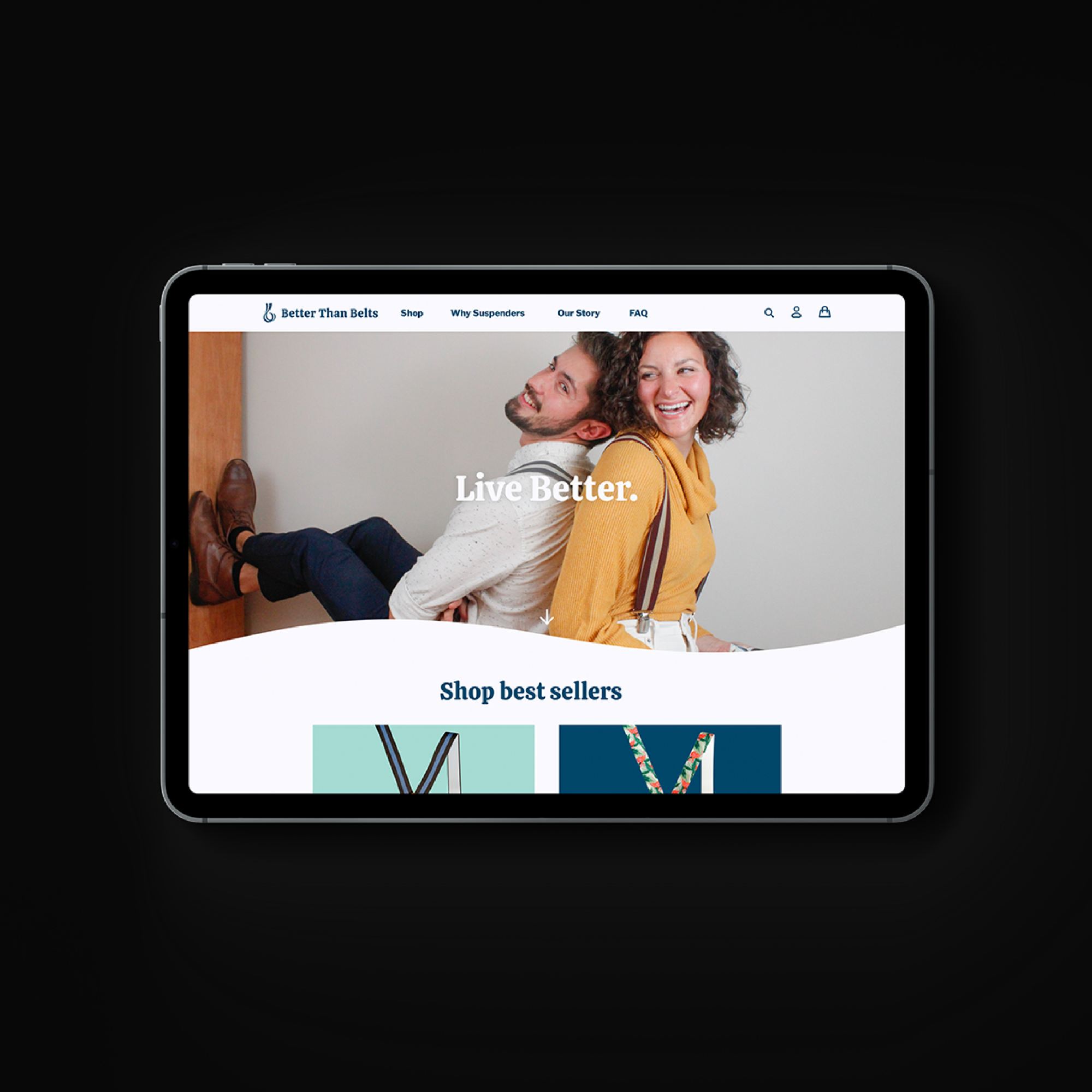
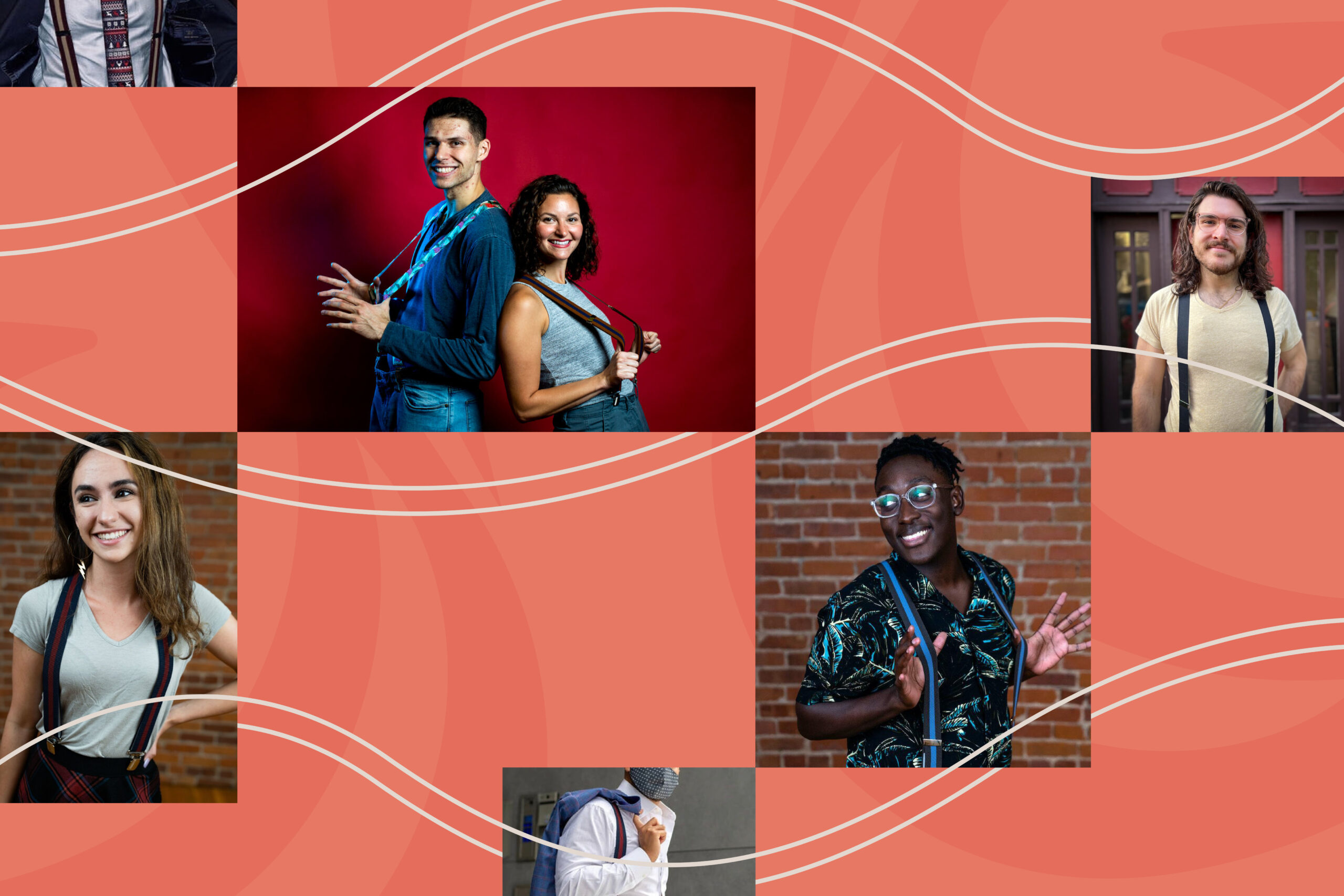
Better Than Belts is a modern lifestyle brand that delivers conscious, high-quality, fashion-forward comfortable suspenders for people who want to have more fun.
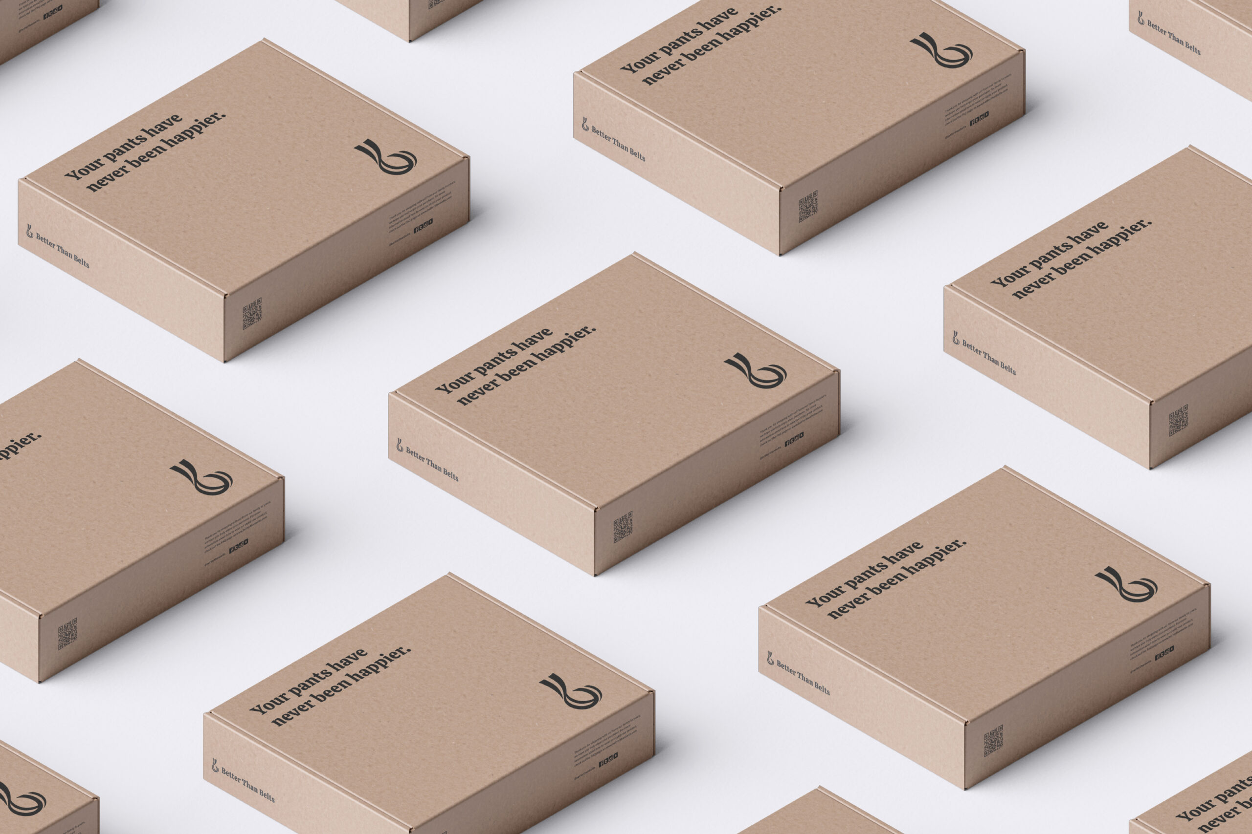
I worked with a team of two designers and two developers under the direction of our Project Lead, Sarah Porter. We created a new brand from the ground up as well as an e-commerce website and marketing collateral for Better Than Belts. Our brand is approachable, friendly, and celebratory– identified primarily by energetic colors, conversational curves, and fun circular and rectilinear design elements. All of these combined result in a declarative and eye-catching brand that celebrates living better and having fun while doing it.
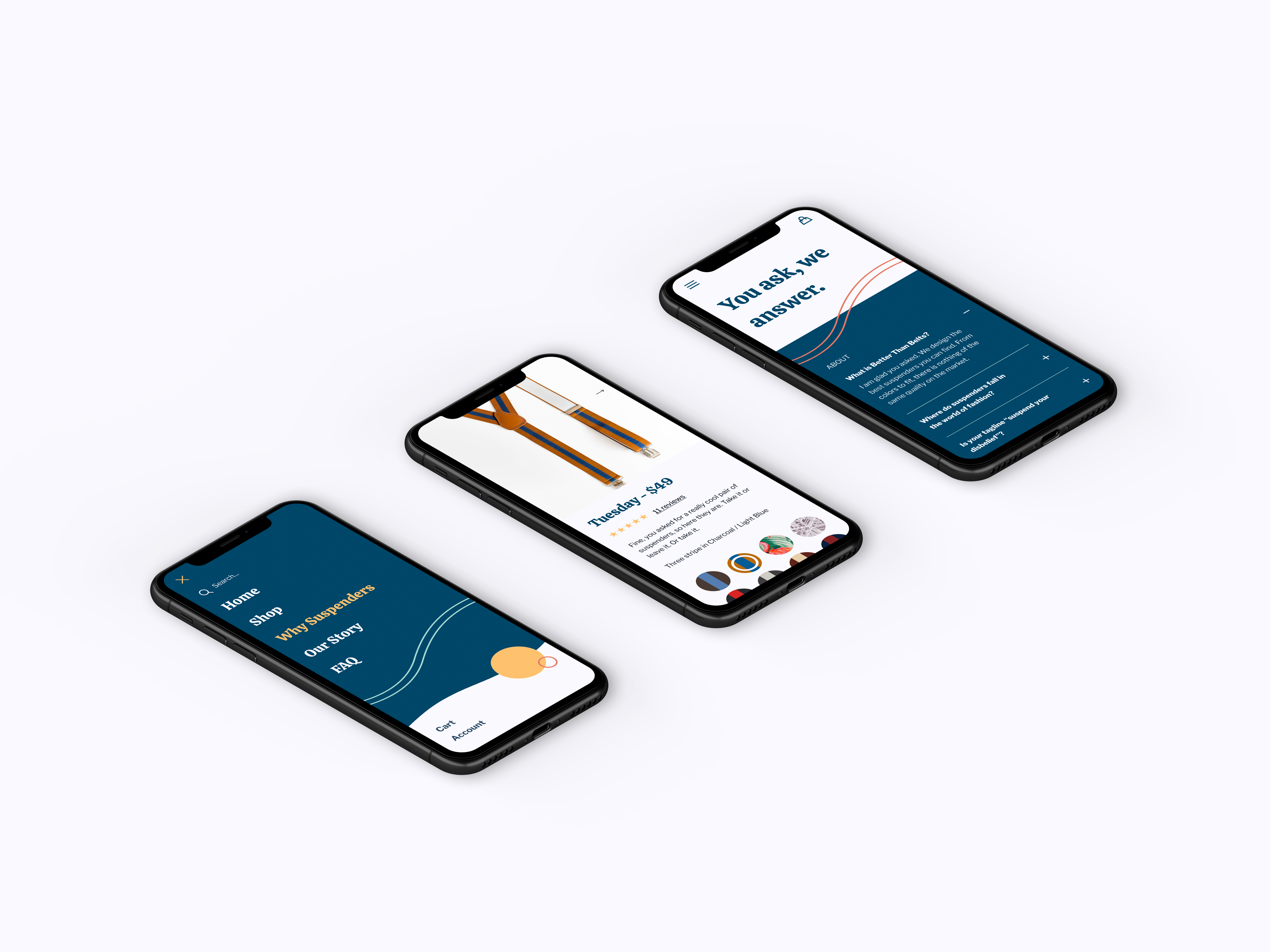
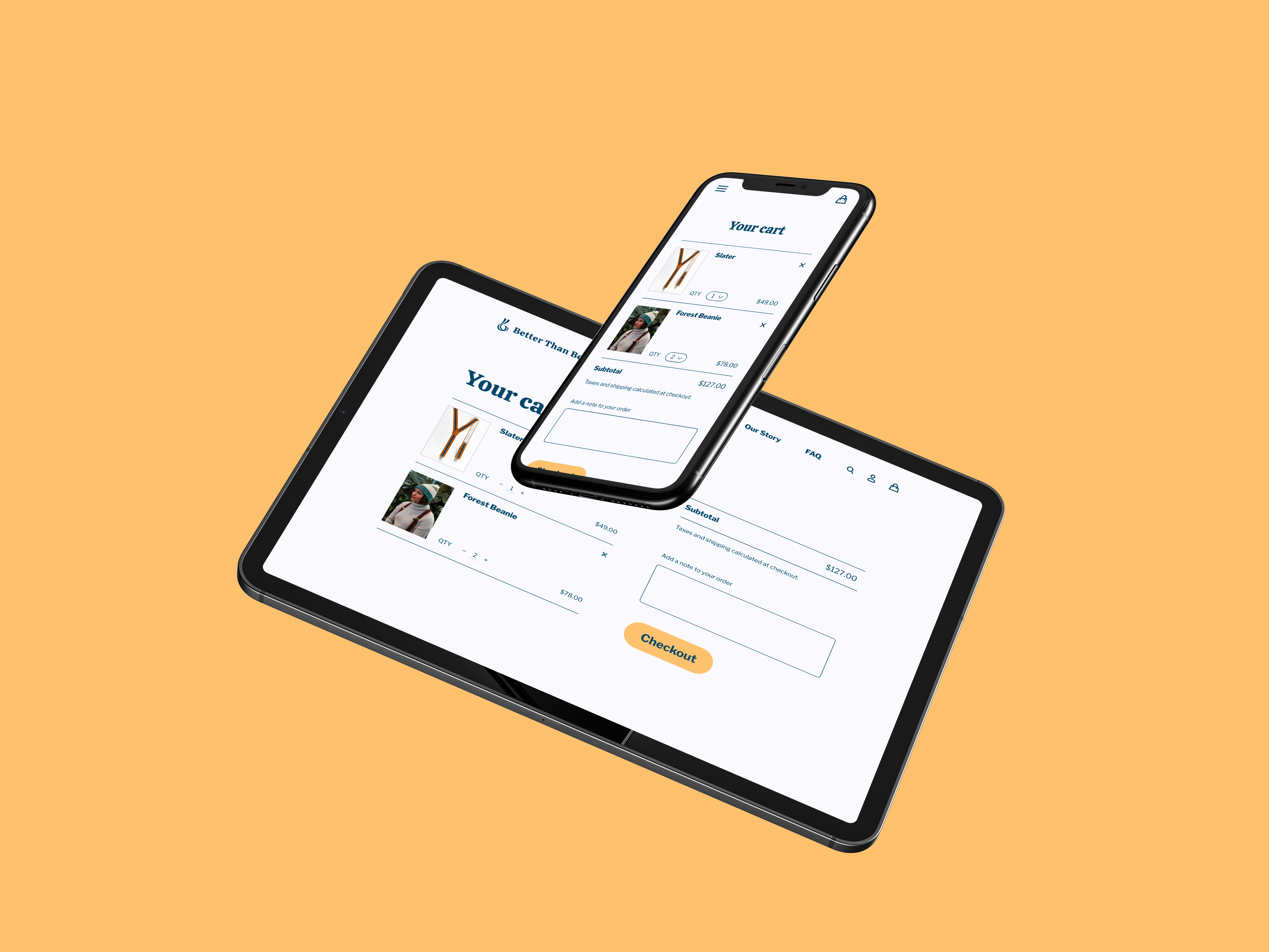
Early on, we developed a robust set of low-fidelity wireframes that made the transition to high-fidelity relatively simple with the visual language mostly fleshed out at that point. The brand was further refined throughout the process of creating hi-fi wireframes. We also designed and developed a fully functional e-commerce portion of the website.
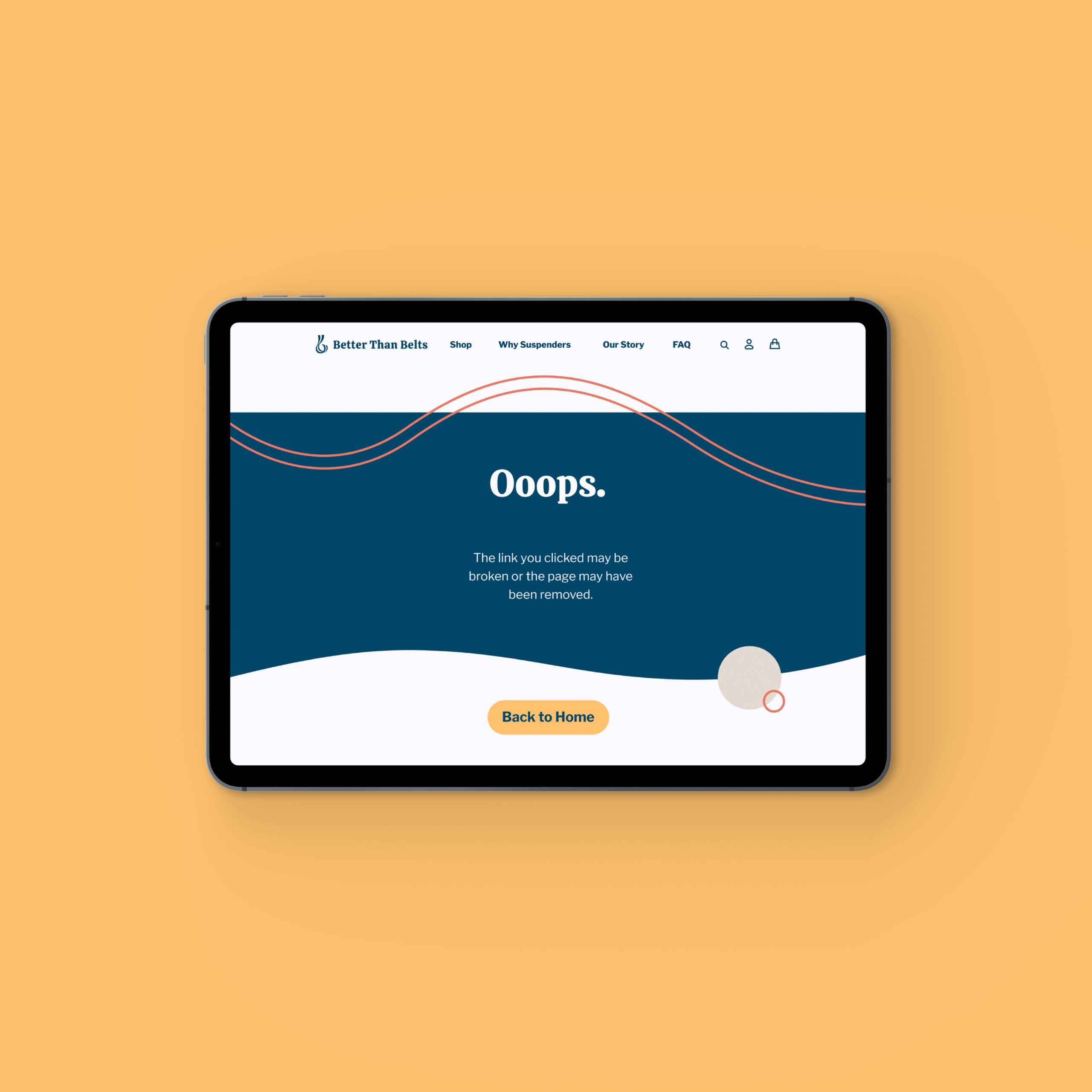
The transition to high-fidelity designs was a matter of incorporating color and visual interest while preserving the established architecture of each page. Each page was designed, using color, typography, and graphic elements, to strike a balance between energetic and refined.
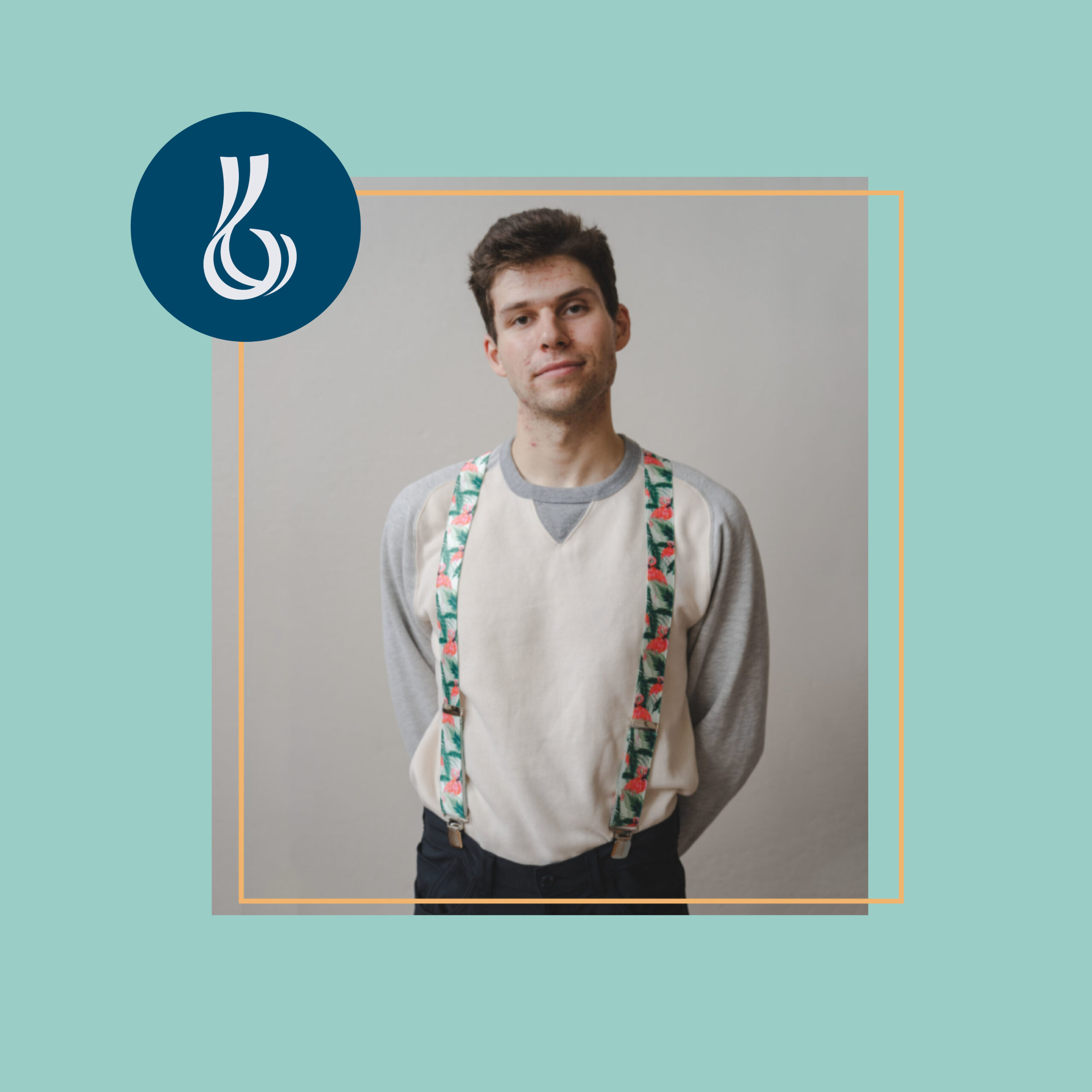
The brand elements we developed for the client add moments of color and energy to the company’s visuals. Inspired by suspender stripes, Each of these combinations is encouraged to be split up and used individually to overlap images and page dividers. These elements may be rotated or rearranged as long as they maintain an asymmetric composition and the original intra- compositional ratio of elements.
We came to Scout to work with a team of designers and developers that could bring our celebratory, friendly, and frankly scrappy apparel brand to life – and they did just that.
Tyler Farley
Founder, Better than Belts
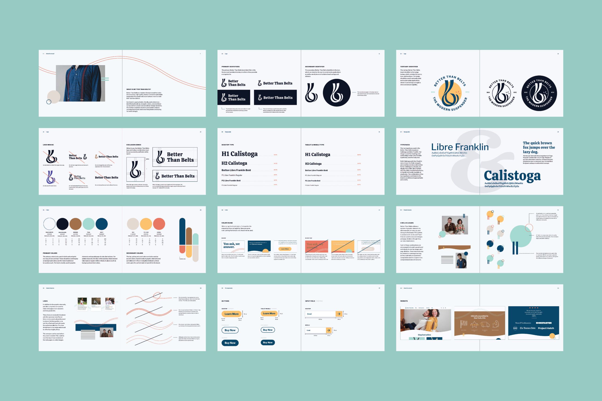
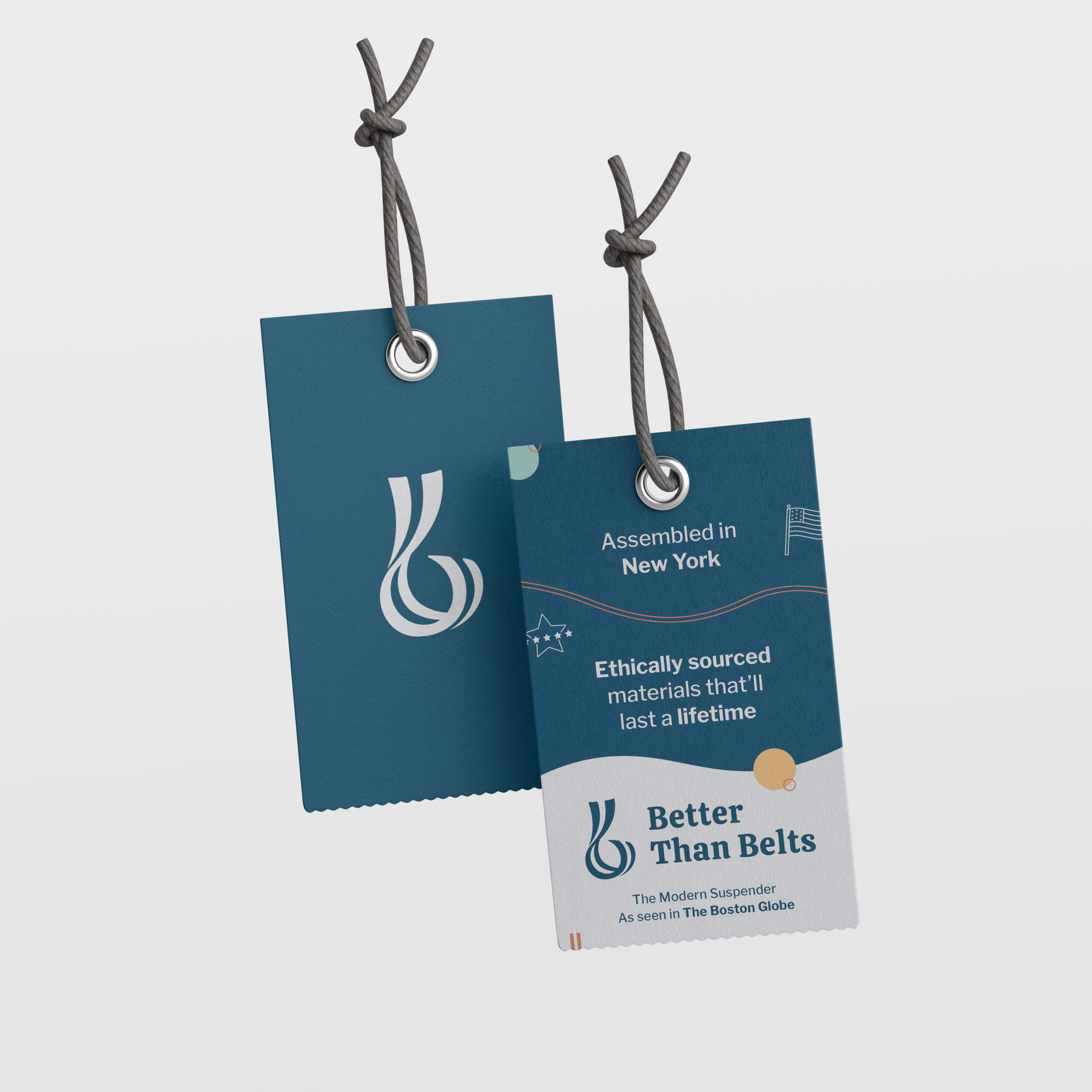
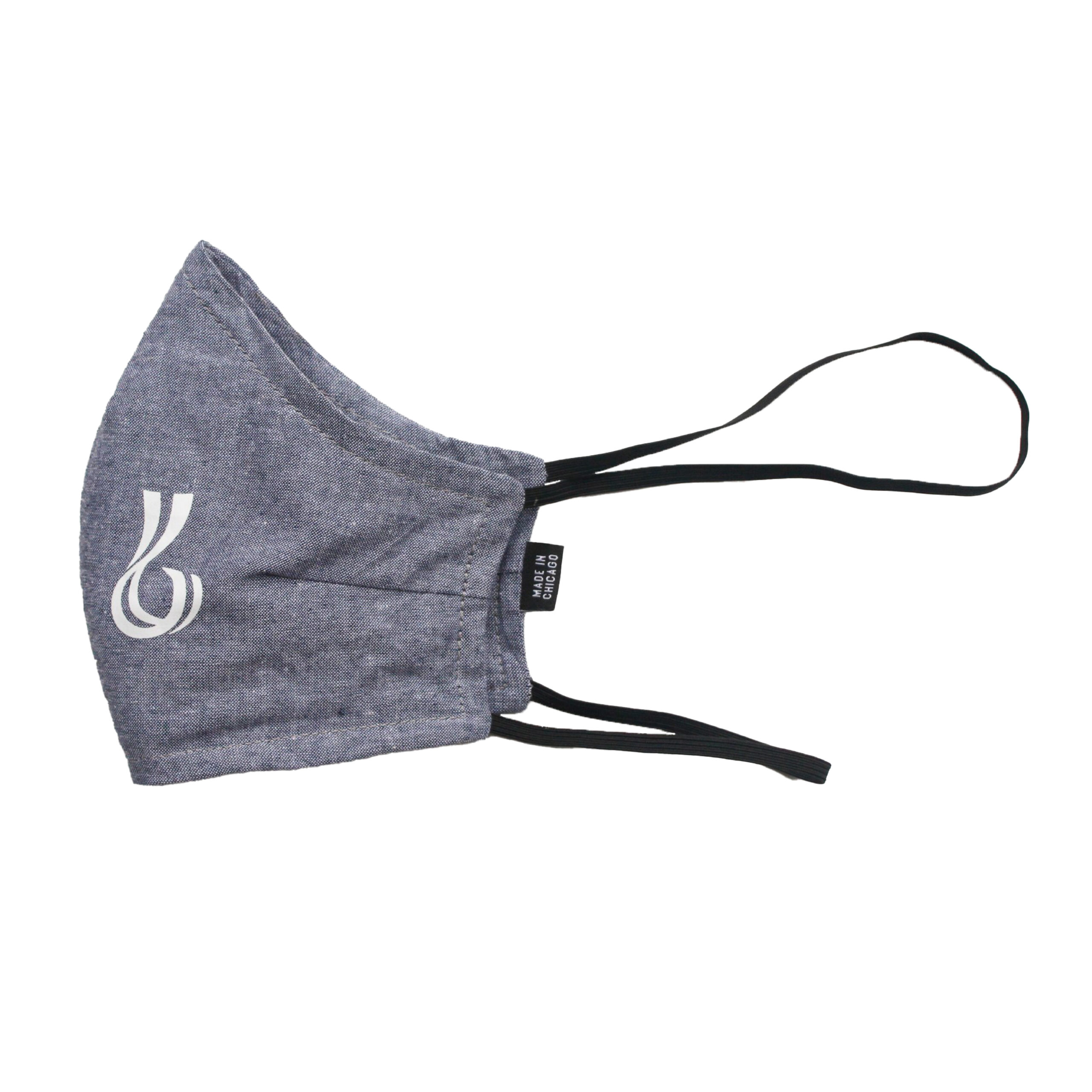
I worked with the team to establish the logo and lockup for the brand. The clients wanted a logo that could stand on its own and resemble the name of the company as well as physical suspenders. Our team developed a logo based on the striped suspenders that the company sells. Through many iterations, the final icon is dynamic, energetic, and fun.
Through our weekly design sprints, our team landed on a comprehensive visual identity for the Better Than Belts brand. Our main deliverable is their branded website, which includes pages of various information as well as an online shop that includes subtle interaction design elements, to ensure a straightforward and seamless user flow.