Bean
Helping coffee-lovers find their city's best brew.
Project Type
App Design
User Testing
Role
UX Designer
Brand Designer
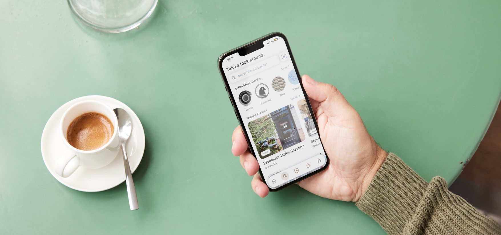
As coffee culture continues to flourish, coffee enthusiasts seek more than just coffee; they desire memorable experiences, connections with friends, and insights into the coffee-making process. Within a challenging 5-week timeframe, I aimed to provide a platform for these desires by developing Bean. The app's core objectives included streamlining cafe discovery, facilitating user-generated cafe ratings, connecting users with friends, enabling cafe orders, and providing comprehensive information on coffee varieties and the roasting process.
Pain points with competitor apps.
Through tracking the entire app functionality of two coffee tracking and rating apps, I was able to dissect the user flows, functions, and decisions that could be streamlined while developing Bean. Mapping out each decision, input, choice, and process in a flowchart proved helpful in learning what was and wasn't working well for users.
The app "Coffeely" contained multiple pain points in the app's user experience, as identified during the evaluation of its complicated flowchart. One challenge I encountered was the feature allowing users to list challenges they faced while making coffee. While this function may have been intended for user retention, I found it lacking in providing tangible value to the user experience. In addition, the "Trending Posts" feature, designed to connect users with random individuals, proved ineffective in a relatively small user community without the involvement of companies or businesses. Furthermore, I noticed that essential icons conveying coffee stats and information were buried deep within the flow while searching for coffee, leading to suboptimal user engagement with this valuable feature.
The "Source" app turned out to be a much better option compared to Coffeely and ended up being a solid inspiration for Bean. Taking a closer look at the full app flowchart, it was pretty clear that users could easily access the app's main features right from the navigation bar. This meant fewer complicated nested pages and an overall better user experience. However, it's worth noting that this simplified flowchart makes sense for "Source" since its sole purpose is to offer coffee enthusiasts in-depth coffee knowledge. Unlike Coffeely – it doesn't have any social features, so you can't connect with friends or join coffee conversations. As a result, it might feel a bit one-dimensional, mainly focused on providing coffee information. This is where Bean comes in.
Personas
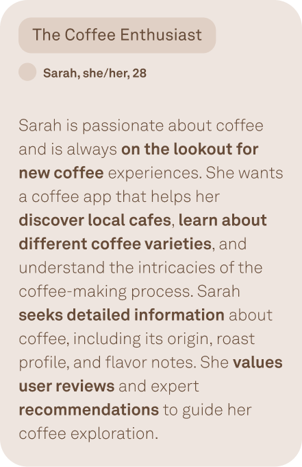
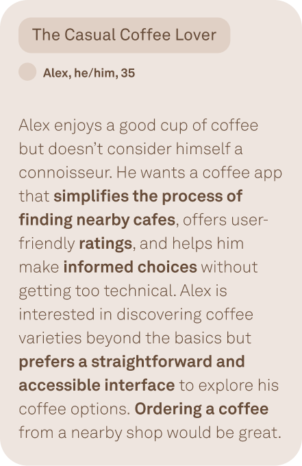
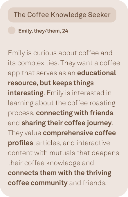
Through a series of in-depth user interviews, I engaged with a diverse group of coffee enthusiasts to understand their preferences, behaviors, and pain points in relation to coffee consumption and exploration. The insights gleaned from these interviews were instrumental in shaping my design decisions. Following the interviews, I synthesized the findings, distilling them into three distinct user personas: Sarah, the devoted Coffee Enthusiast; Alex, the Casual Coffee Lover; and Emily, the Coffee Knowledge Seeker. These personas serve as representative archetypes, encapsulating the varying needs and desires of our target audience. They play a pivotal role in informing the design process, ensuring that our coffee app caters to a broad spectrum of user preferences and creates a personalized and enriching coffee experience for a range of people.
From Flow to Function
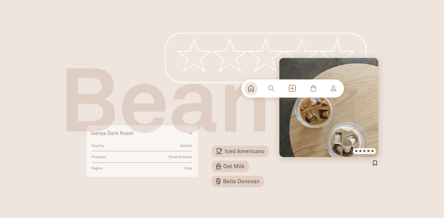
Within the 5-week sprint, we delivered the final design solution for "Bean." The app boasts an intuitive interface, a comprehensive search directory, user-generated coffee reviews and ratings, connections with friends, cafe ordering capabilities, and rich information on coffee varieties and the roasting process. Prioritizing simplicity and elegance to enhance the entire coffee exploration journey, the app transformed seamlessly from low to high fidelity.
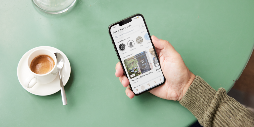
Bean functions like a social app for coffee lovers. Connecting with your friends allows you to see what kinds of coffee your friends are trying, and where they're trying them.
You can learn about nearby cafes and what coffee they're brewing. Each cafe has its online ordering system linked, so you don't have to wait to try their signature cup of joe.
One of the app's main features is the option to log your coffee, which can be public or private. Whether it be to share with your friends, or to keep a private coffee journal, Bean allows you to document everything about your brew.
Creating the bean brand
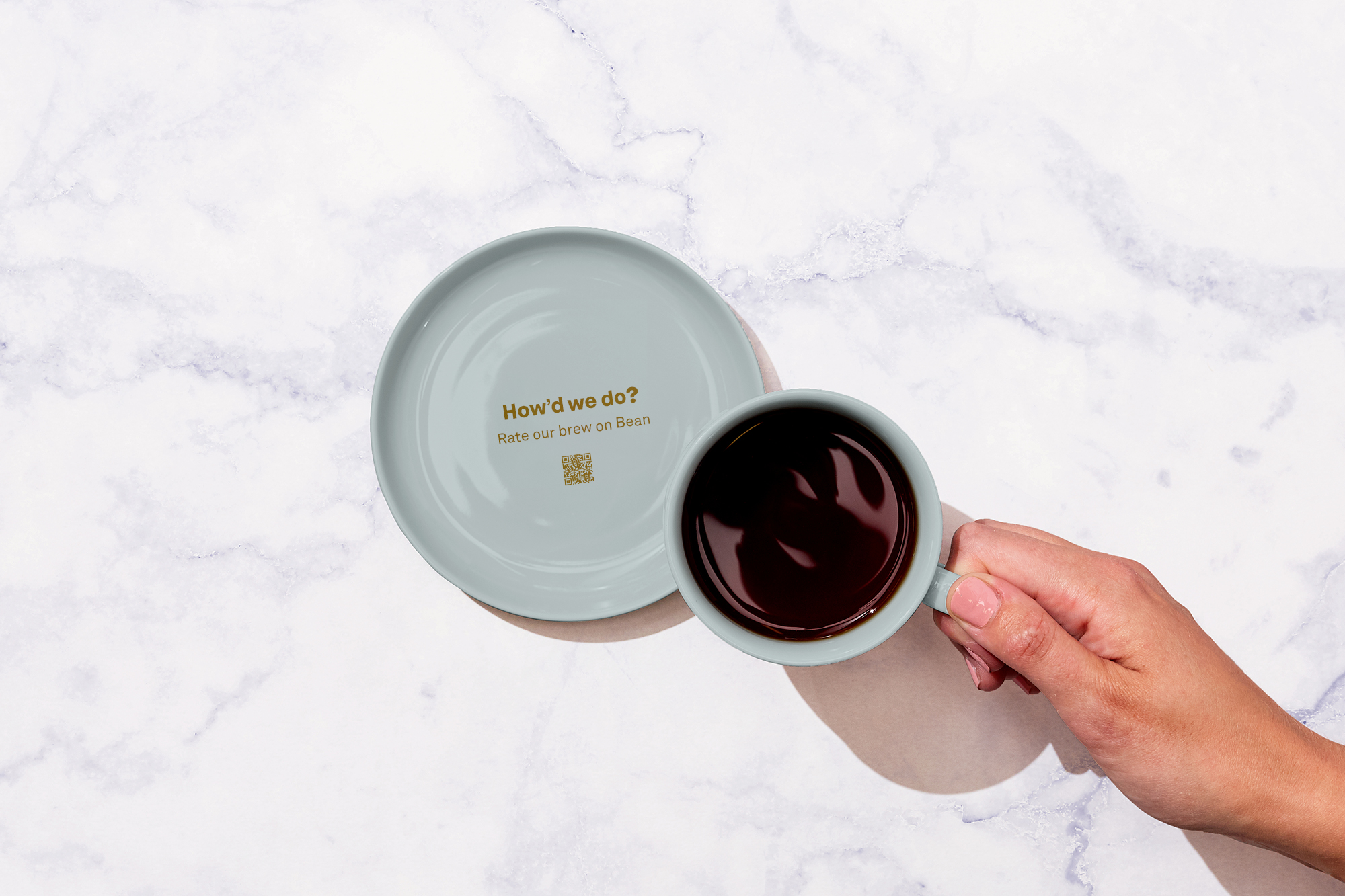
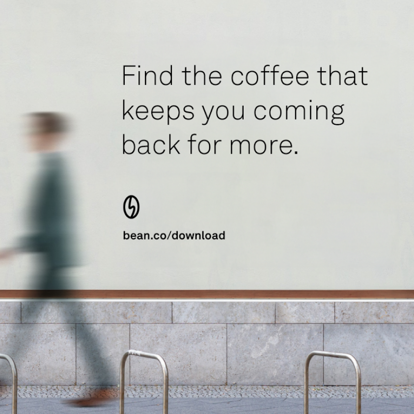
In the highly competitive world of mobile applications, a distinctive brand and visual identity serve as the first point of contact for users. By investing in a memorable and cohesive brand, we aimed to communicate not just the functionality but also the essence of the Bean app—its dedication to coffee exploration and community connection. A well-defined brand helps users feel a sense of trust and reliability, which is especially vital in an app that revolves around discovering local cafes and coffee varieties.

Conclusion
In conclusion, the Bean app, executed within an ambitious 5-week timeline, has successfully addressed the initial problem statement while integrating additional features. By streamlining cafe discovery, facilitating social connections, enabling cafe orders, and providing rich coffee-related content, Bean enhances the entire coffee experience for enthusiasts. The project exemplifies the potential of efficient and agile design processes, making Bean a valuable and multifaceted platform for coffee lovers and cafe owners alike.
