Guided*
Not just another travel app
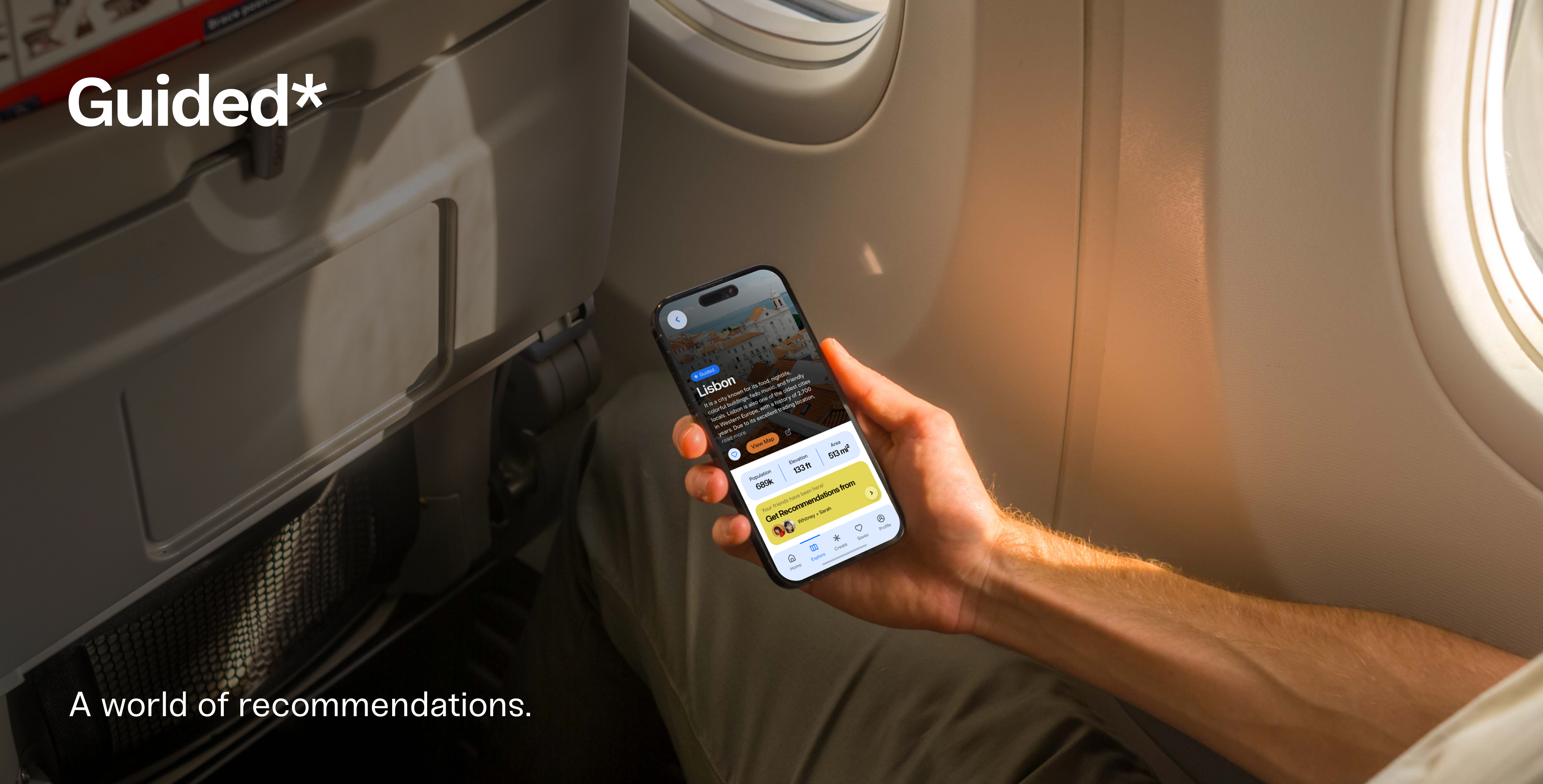
The travel industry is evolving rapidly, driving demand for smarter, more intuitive travel technology. To meet this need, I created Guided—a travel recommendation app that transforms the way people explore new destinations. By harnessing the power of social networks, Guided delivers personalized travel recommendations tailored to users’ interests, making trip planning effortless and more enjoyable. Through a seamless system of shared insights, users can tap into their friends' experiences and uncover the best a destination has to offer—without the overwhelm of endless research.
I developed the marketing strategy, interactive app prototype, and comprehensive branding and UI documentation for this concept. In the process, I deepened my expertise in Figma’s prototyping capabilities and challenged myself to create a cohesive brand identity across a highly visual, dynamic platform. The result is a brand system that remains strong and recognizable both within the app and beyond.
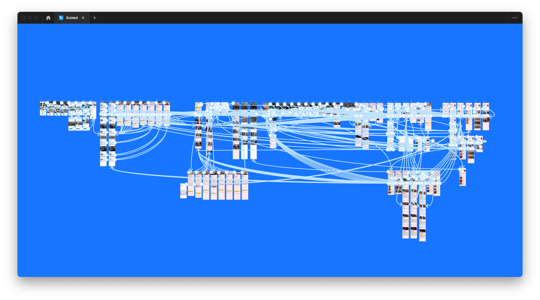
Developing functional animated user flows
Creating a few user flows that highlight the fundamental uses of this app was essential to show the app's intuitive interactions and functionality for a variety of purposes. In creating the app prototype, I created three overarching user flows that showcase the onboarding process and profile setup, which leads into the next flow, to create a collaborative group plan with your friend, followed by the interactions to save places for an upcoming trip. All of these flows showcase the animated interactions that are essential to making and following recommendations.
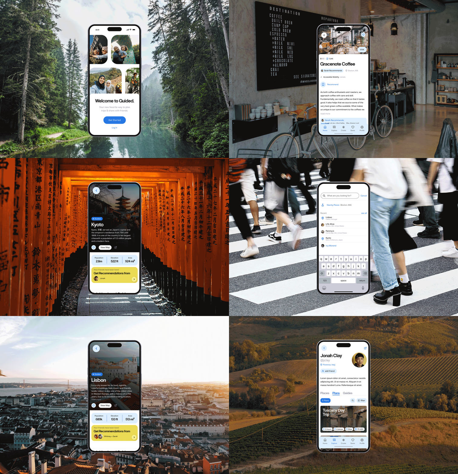
Guided's onboarding flow allows the app to learn about your travel preferences, allowing for more personal recommendations and guides.
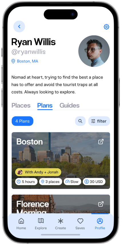
Once your account is created, you can browse your Guided feed to see your friend's recommendation activity.
Guided's explore page allows you to see recommended places, activities, and restaurants from the app. Nearby places of interest and city guides are highlighted for more recs.
Through searching in the explore page, you can find friends, locations, or cities, where you can discover your friend's recommendations or guided itineraries.
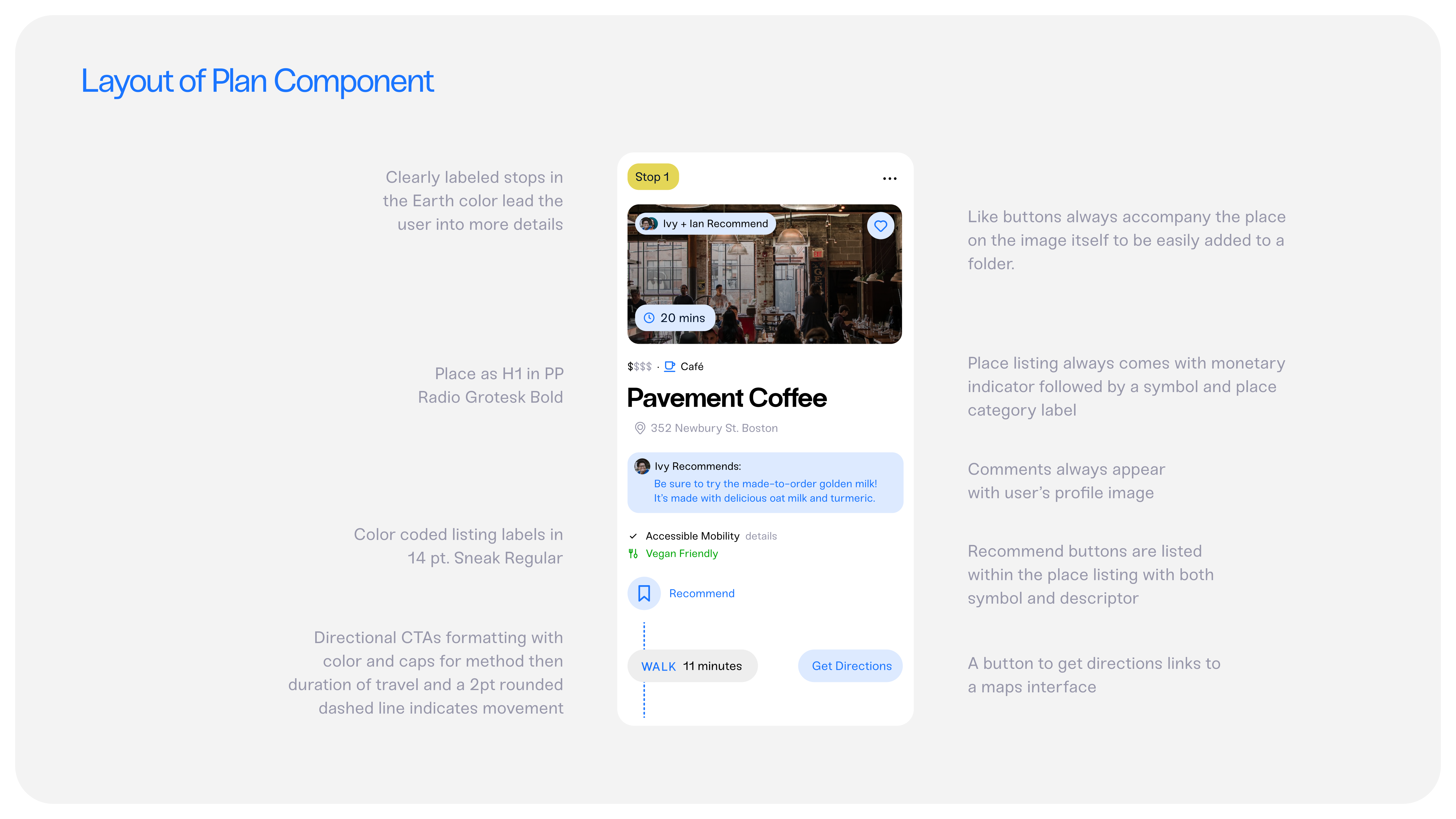
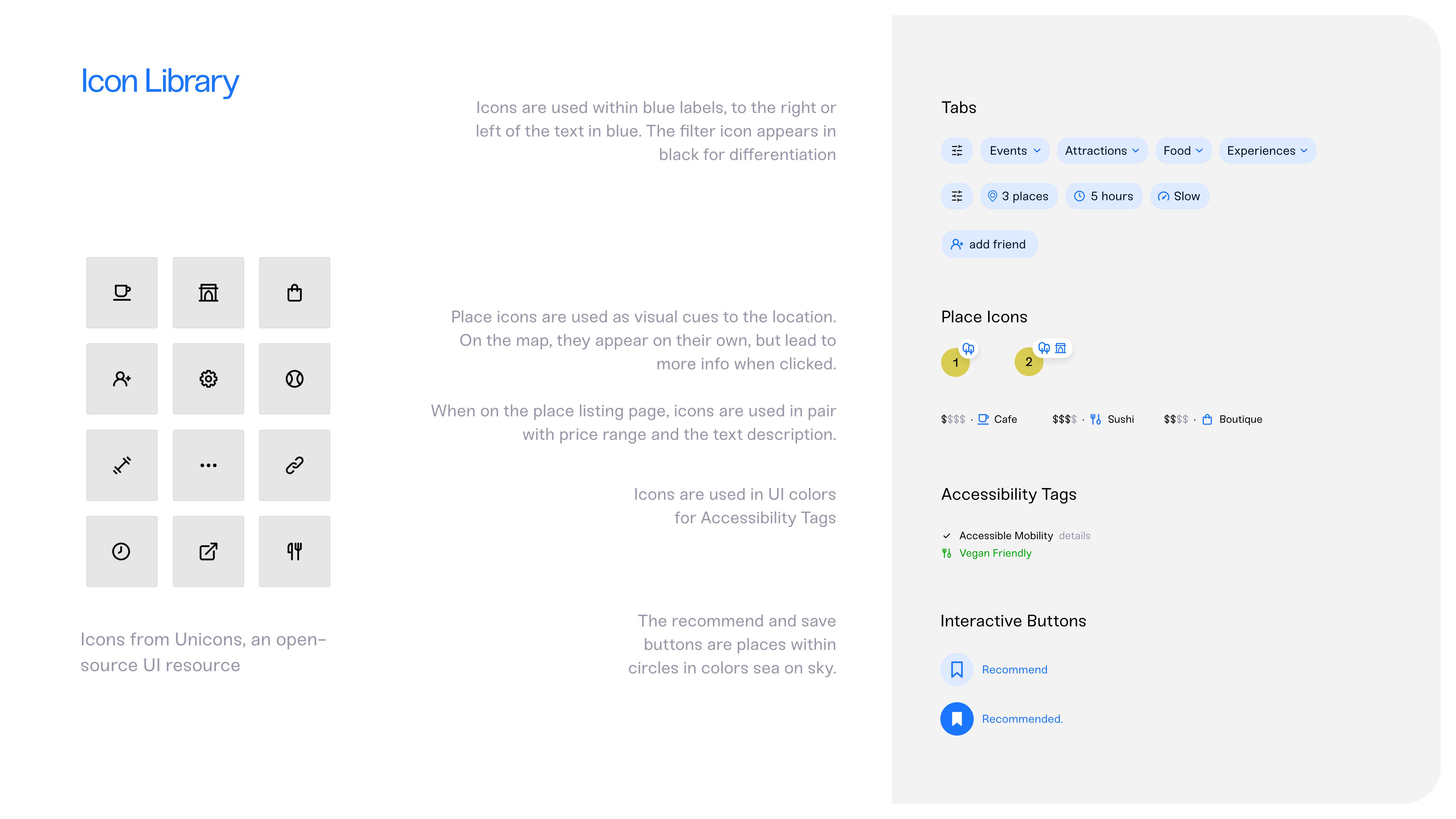
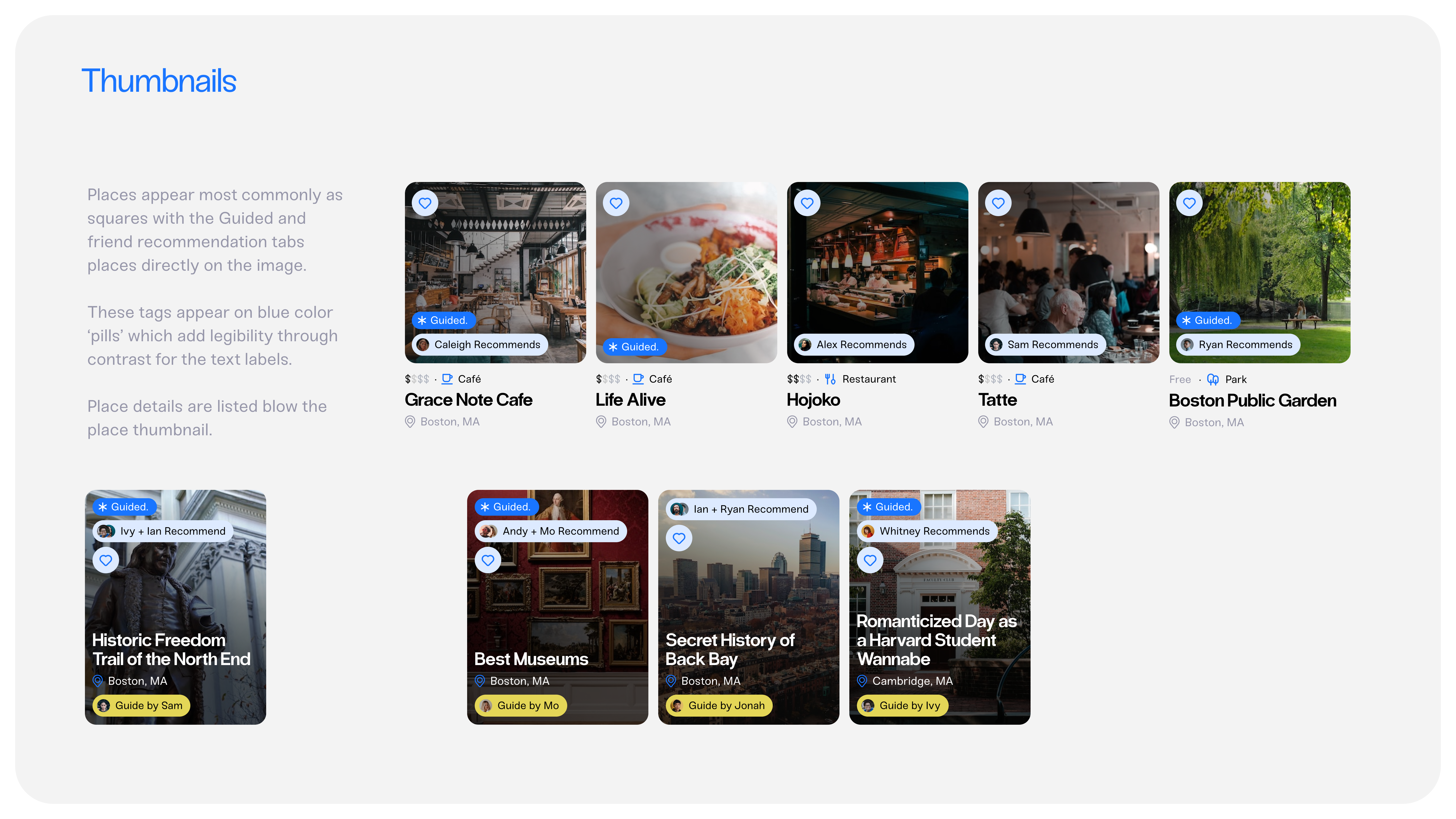
Documenting the specific interactions, use cases, sizing, and spacing of the app's components are essential to creating an organized and cohesive UI component system in every interaction on the Guided app.
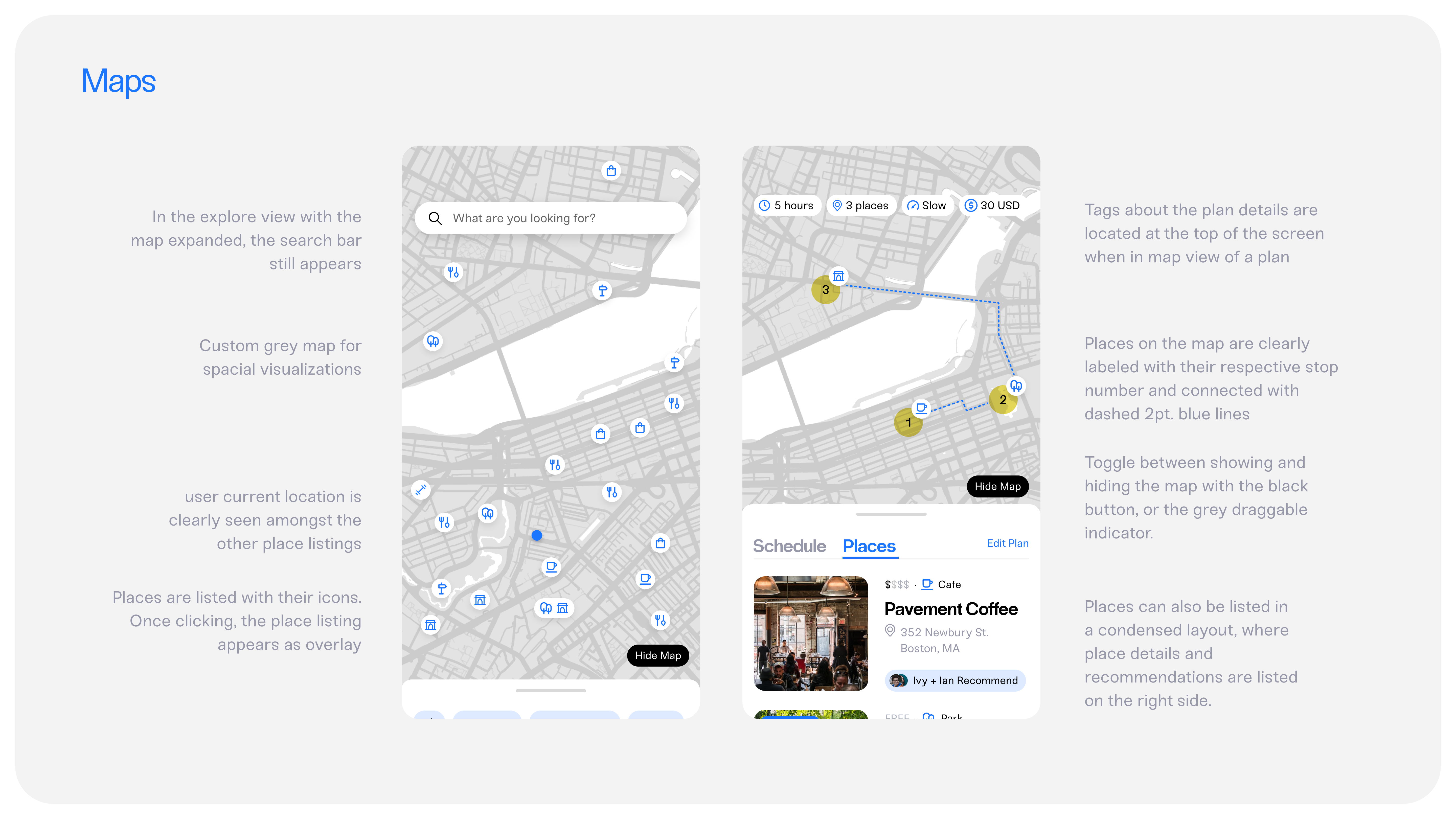
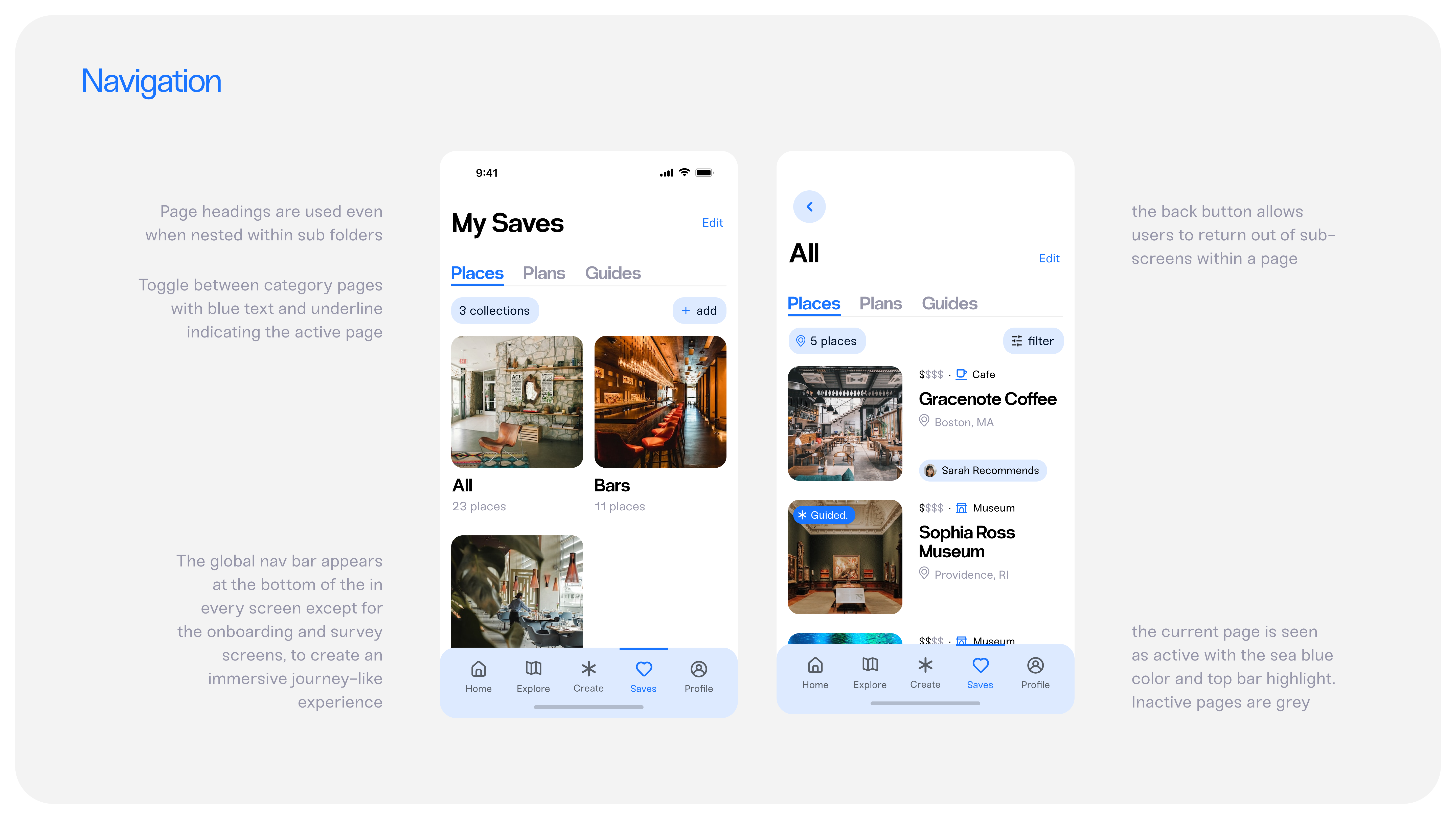
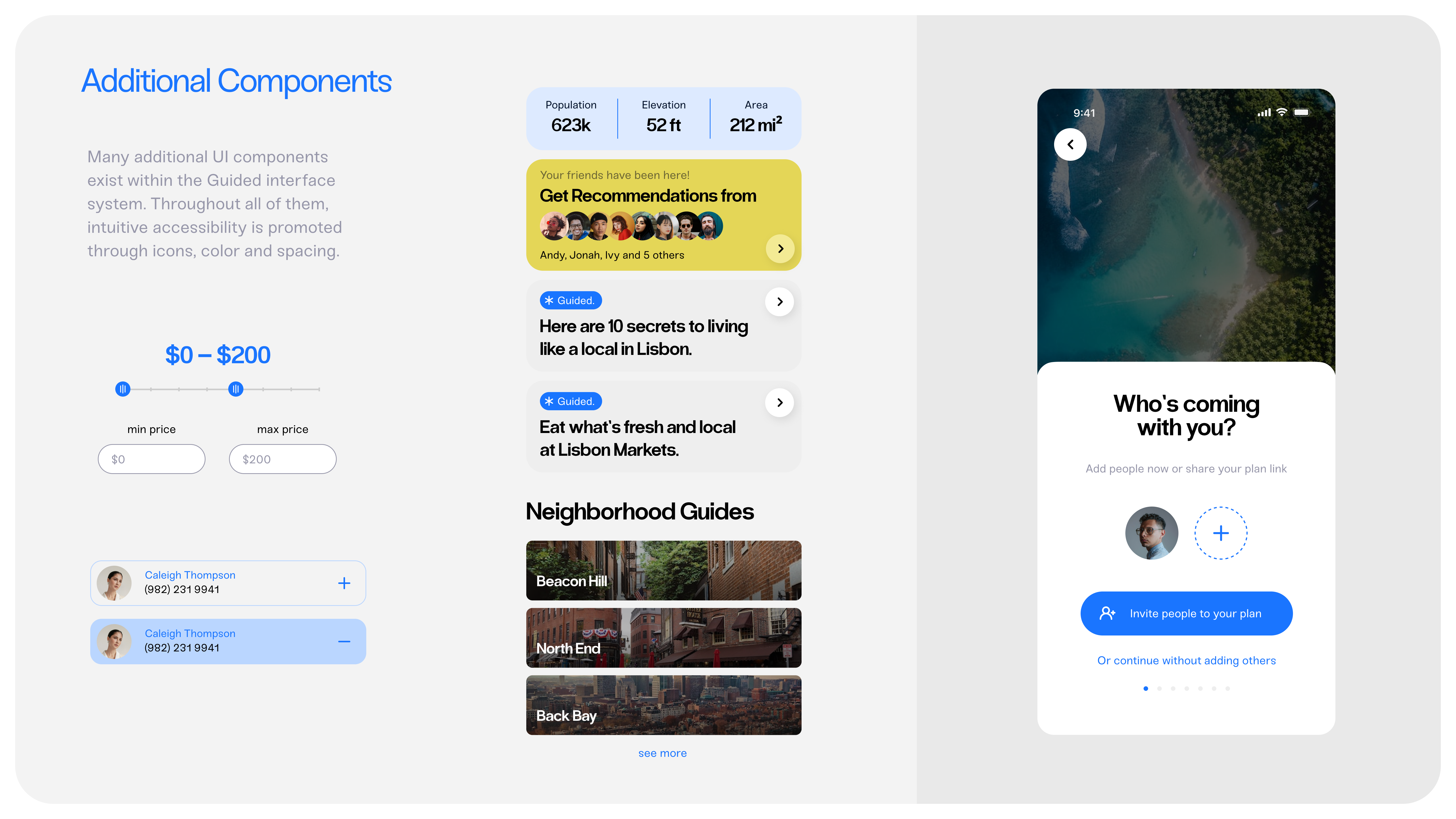
Where visual design and functionality meet.
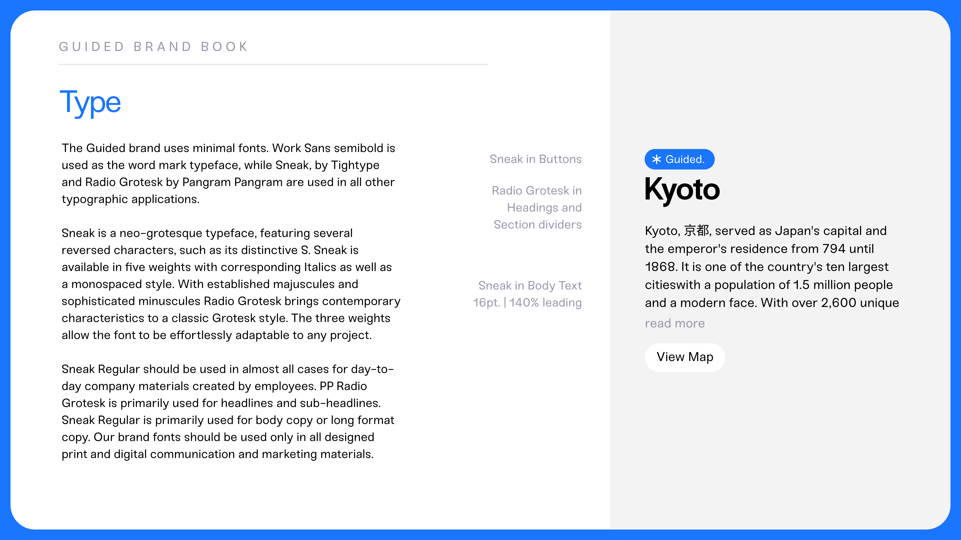
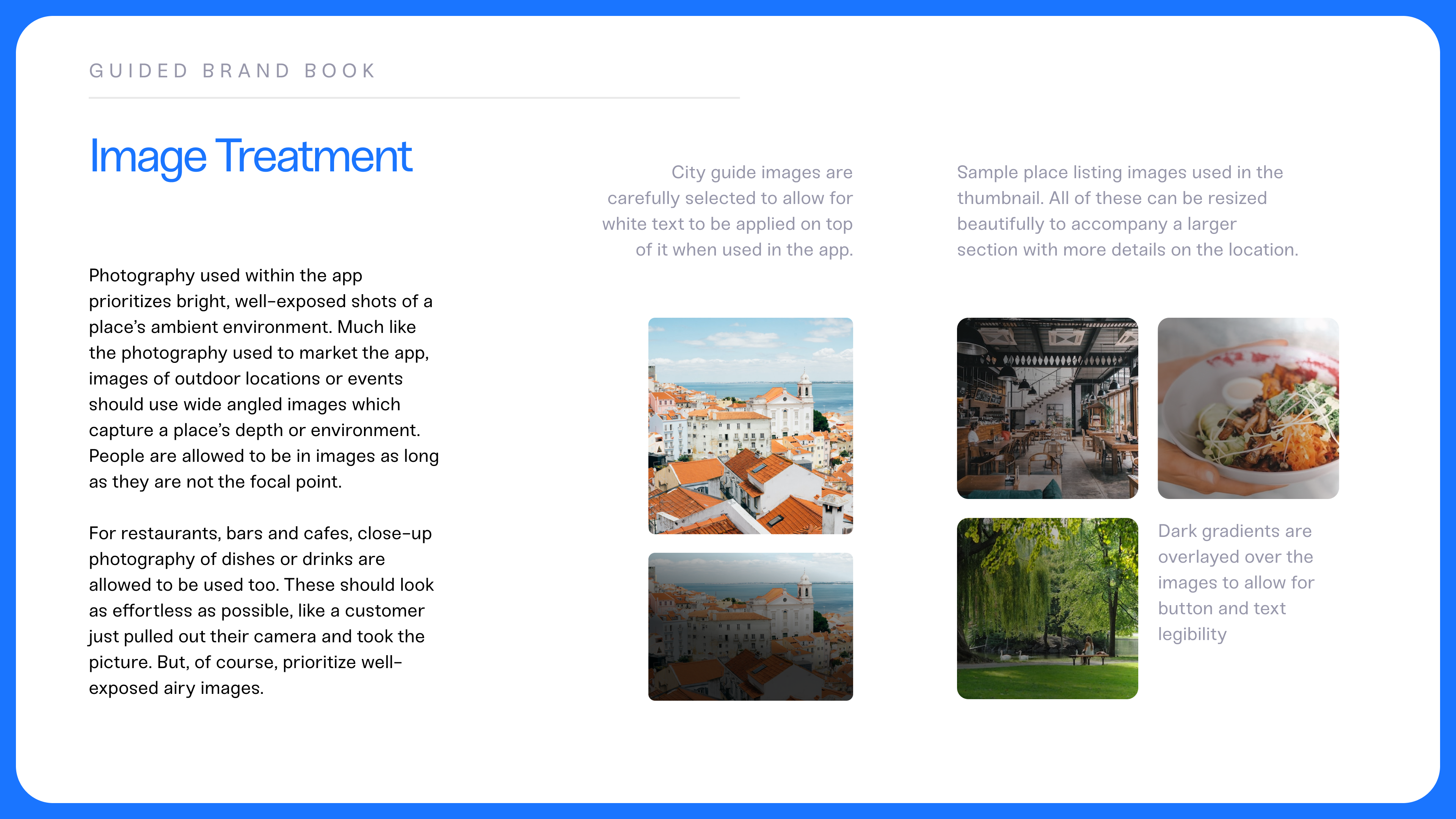
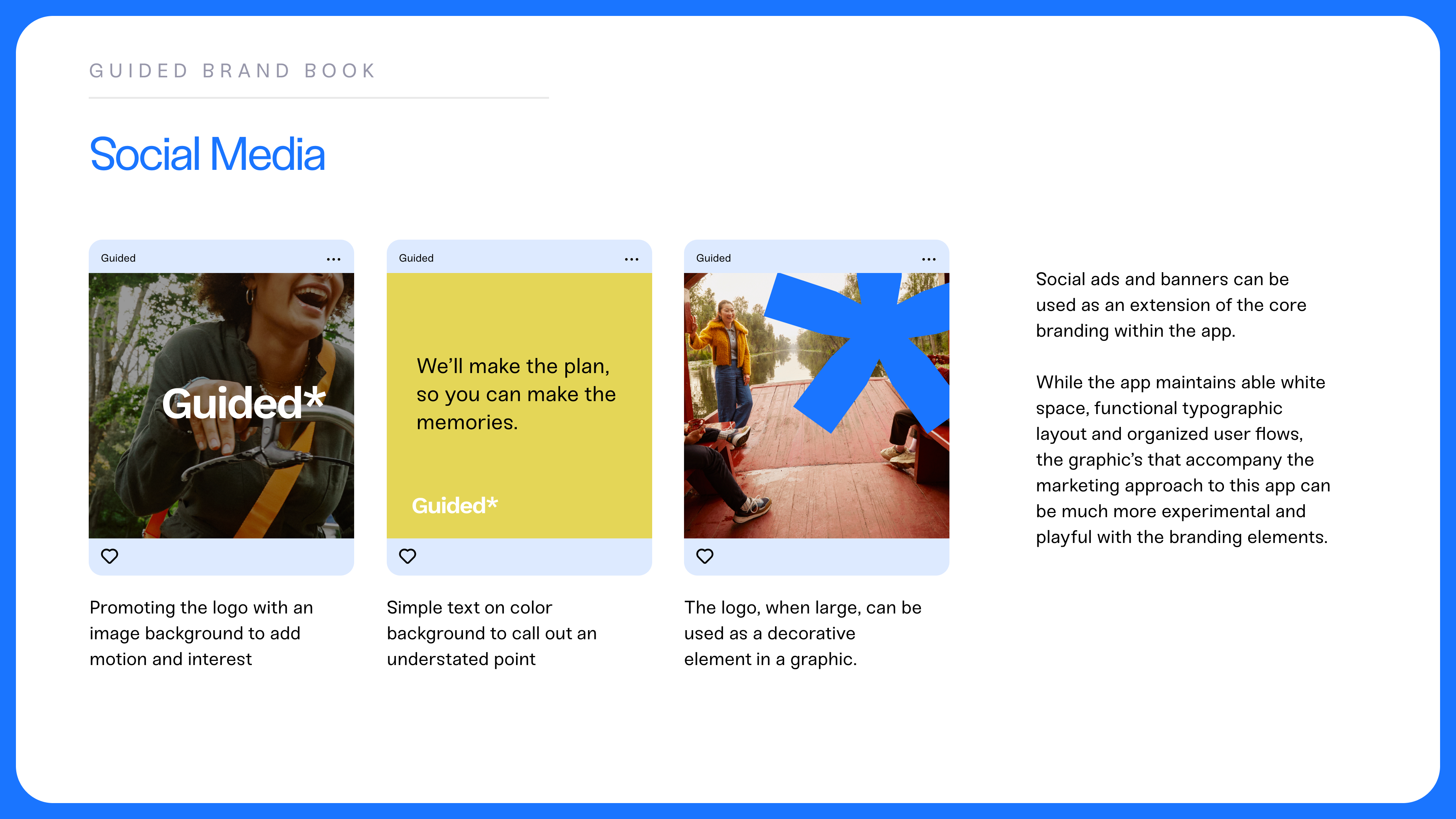
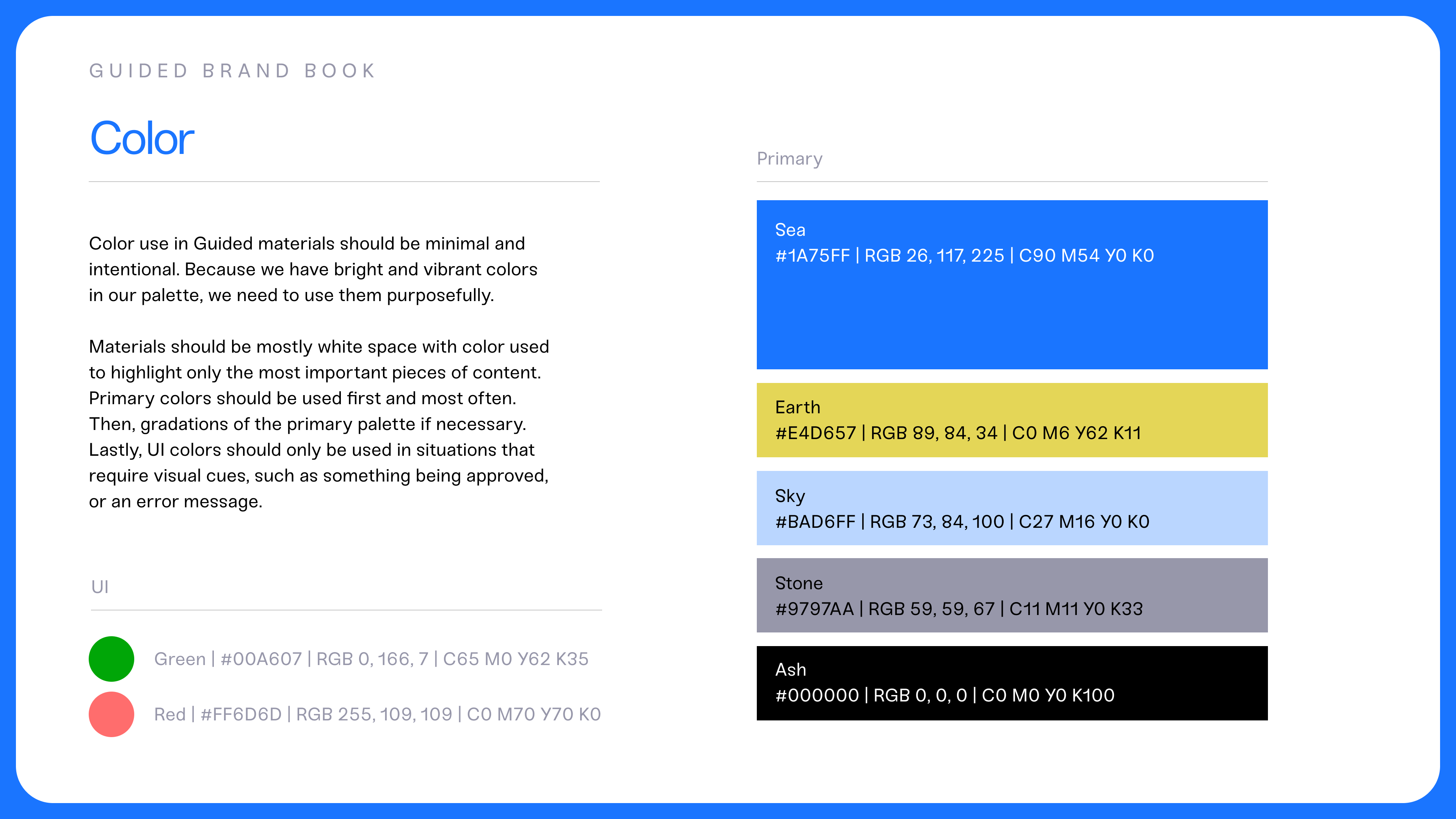
The visual branding system developed for Guided is meticulously laid out for consistency and intuitive interactions across pages. A strict color palette, regimented typographic sizes, and auto-layout allow for even spacing and padding in every aspect of the app's interface.
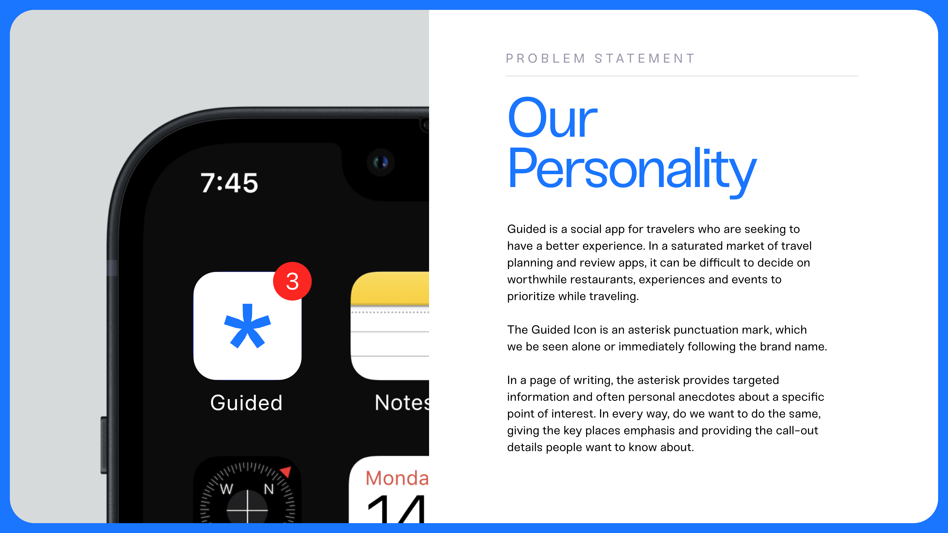
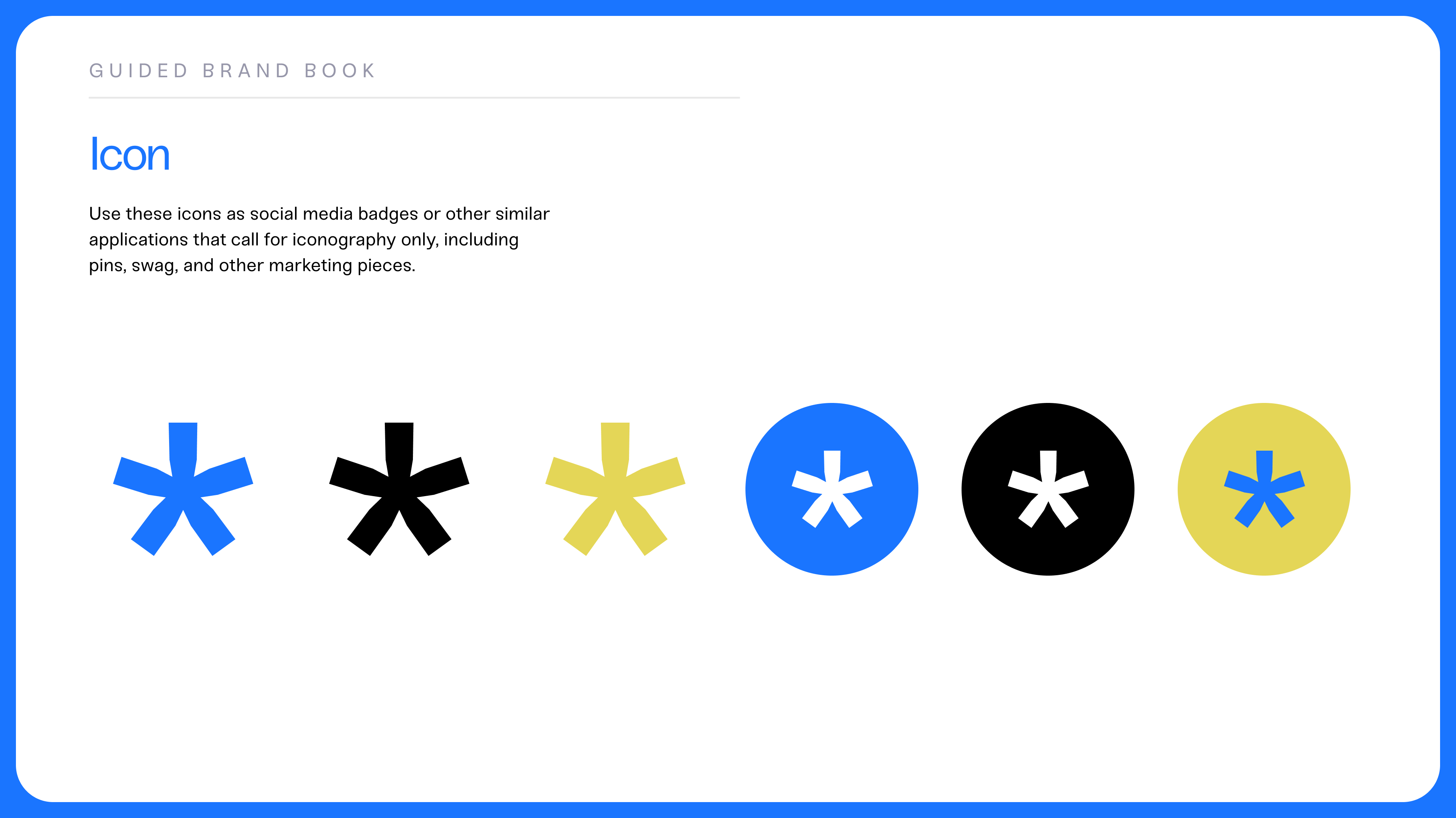
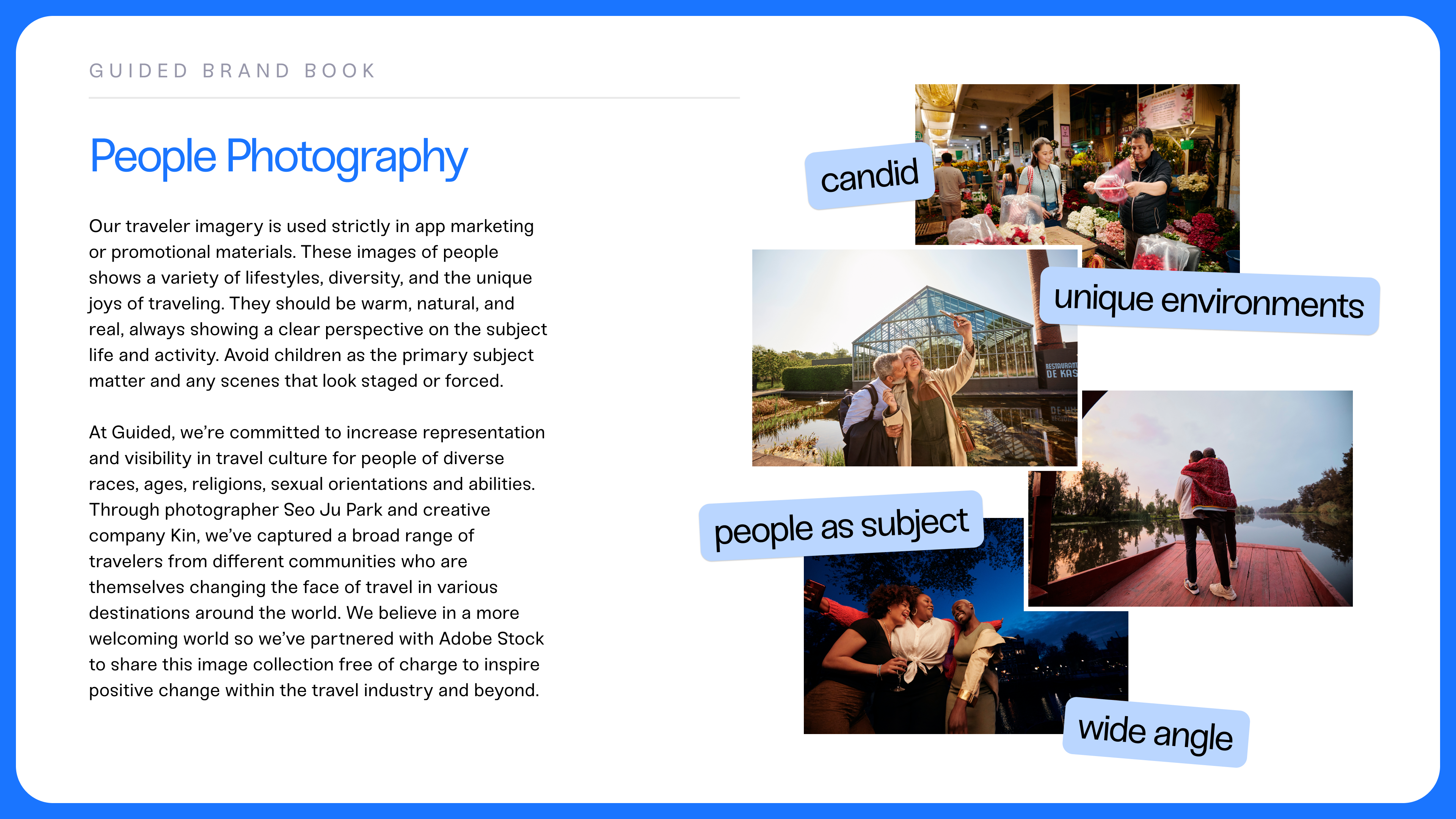
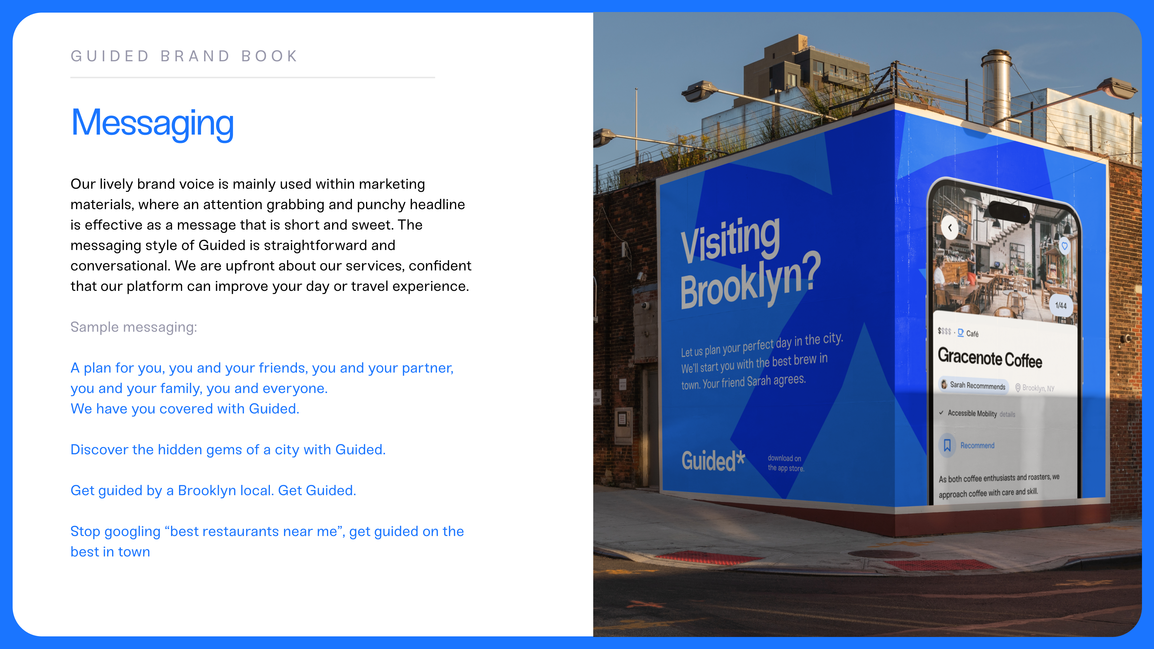
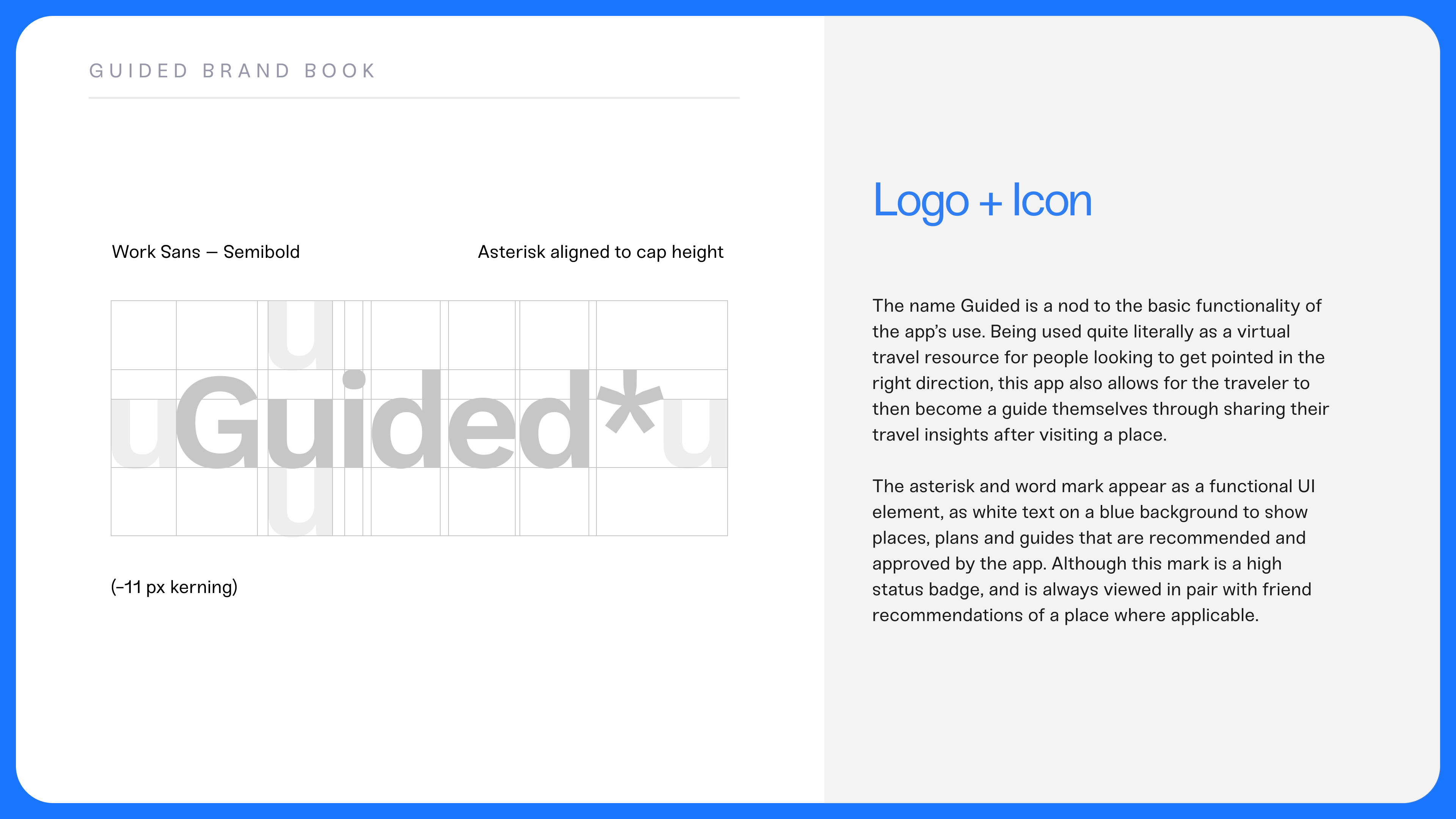
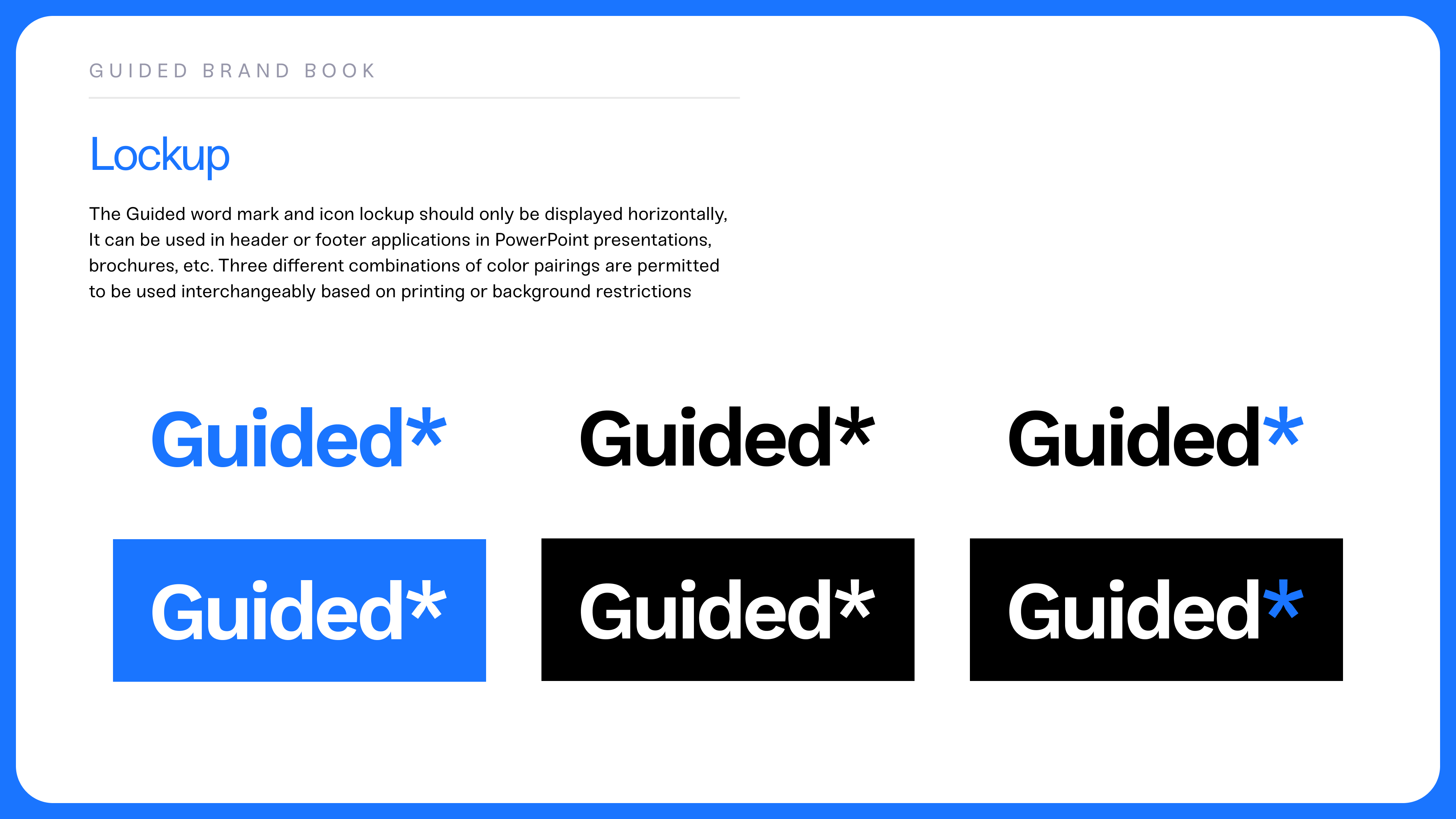
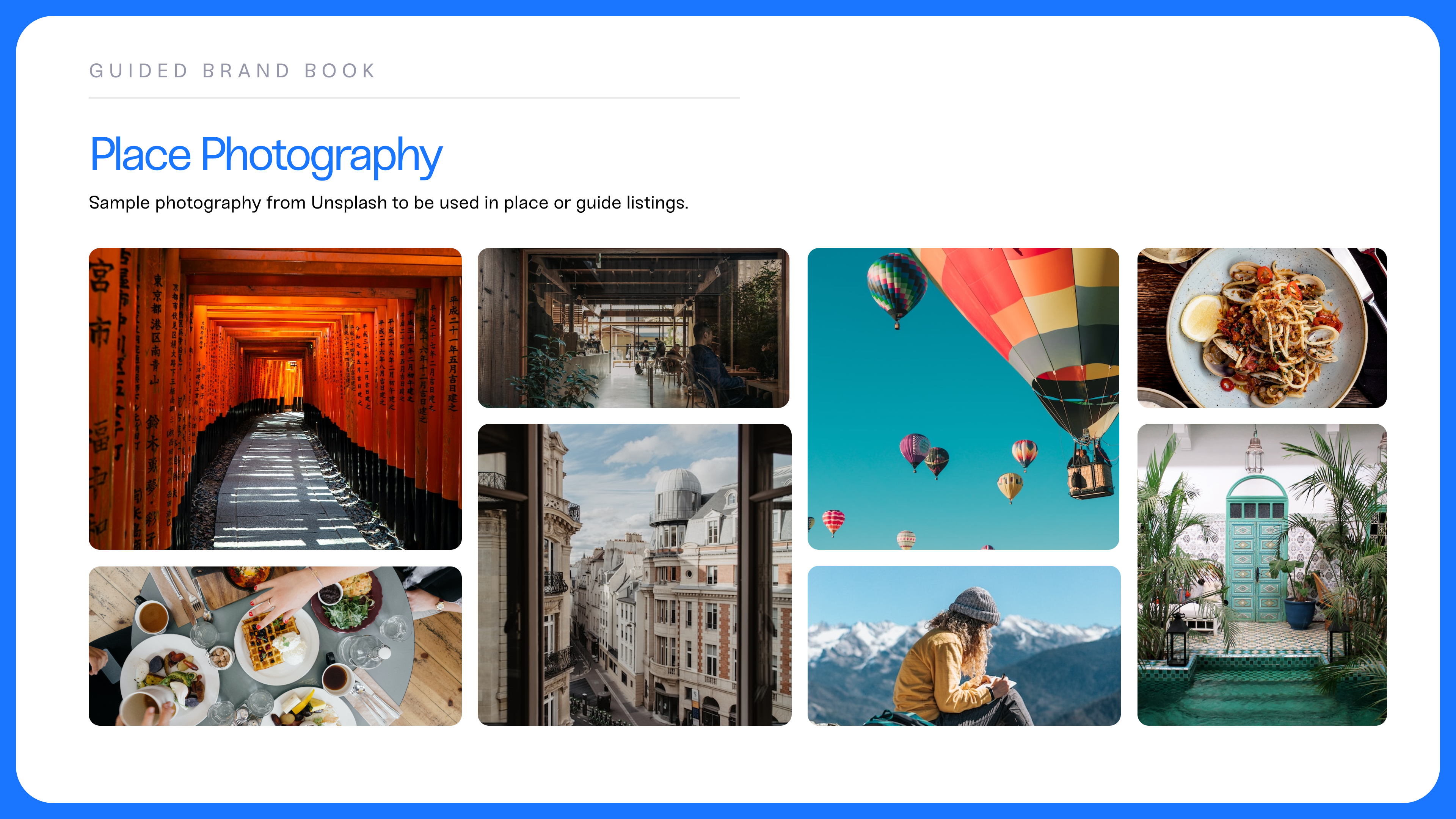
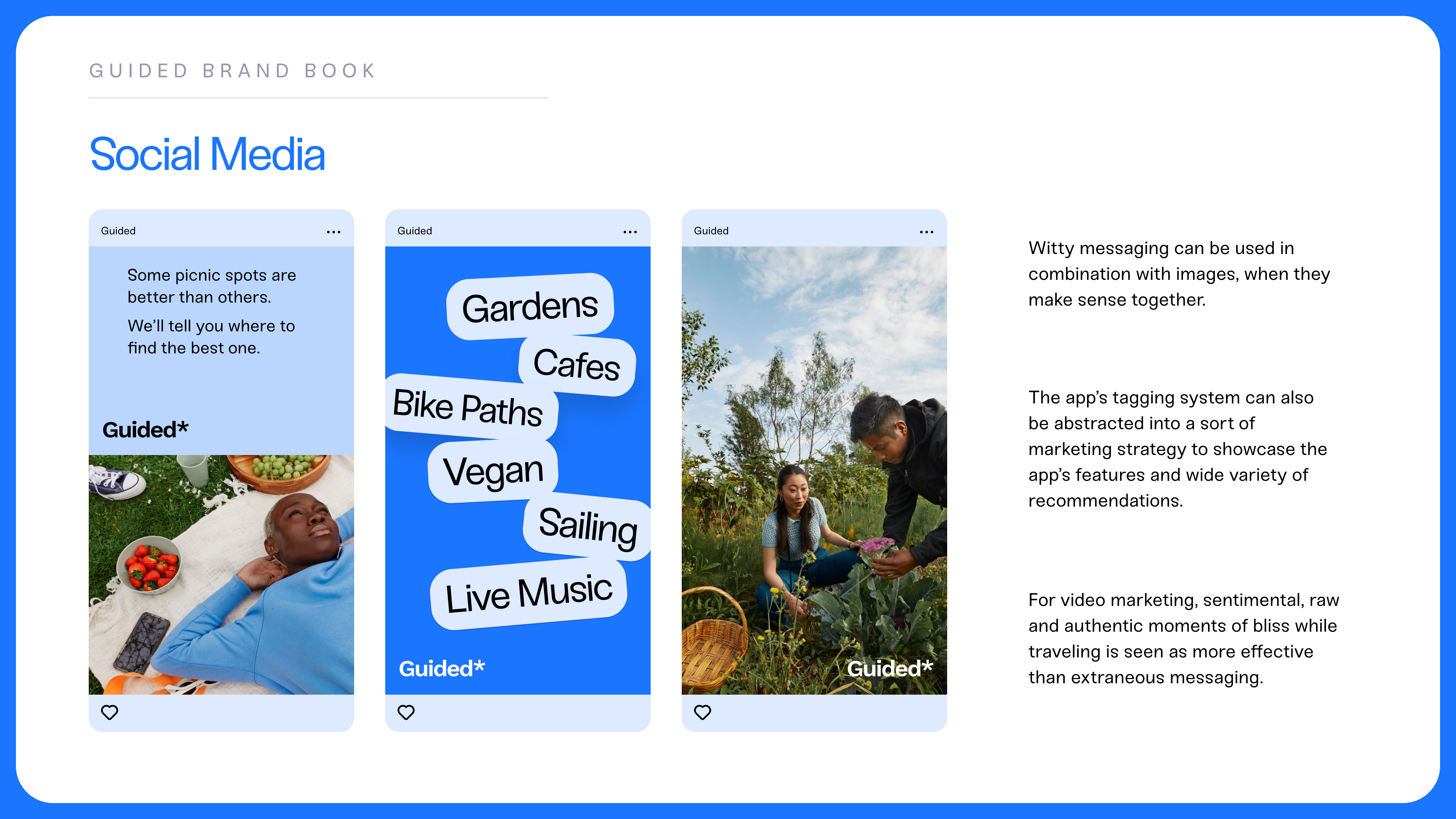
A second deliverable in the creation of the Guided app was a brand identity and documentation of its best practices. I documented the precise makeup of the logo, lockup and its various uses in combination with image, messaging and color.
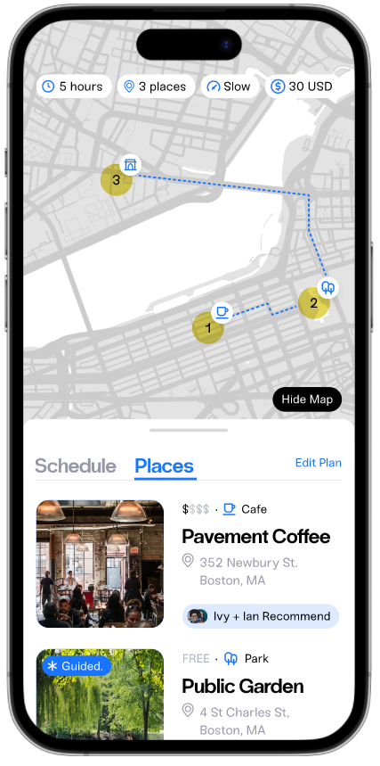
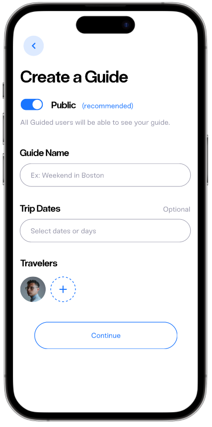
One of the most functional features of Guided is the ability to create a travel plan that is optimized for groups – based on each member's likes and preferences in real-time.
Through the process of creating a group plan, you are prompted with a survey that allows the app to create an optimal plan based on the individual member's unique preferences. This allows for the group to spend less time debating over the best plan and spend time actually carrying it out. Guided takes a lot of the stress and pressure out of planning activities for groups while suggesting new ideas or activities the group may have not considered doing before.
Conclusion
Guided is an app that aims to simplify the process of finding travel recommendations by leveraging the power of social networks. By allowing users to discover and follow recommendations from people they trust, the app provides a more personalized and reliable experience compared to other travel recommendation platforms. The design of Guided prioritizes simplicity, ease of use, and customization, with features such as personalized travel profiles and curated recommendation feeds. Through user testing and feedback, we have refined the design and functionality of Guided to ensure that it meets the needs of travelers seeking authentic and personalized experiences. Overall, Guided is an app that empowers travelers to make informed decisions, connect with their social network, and create unforgettable memories.
↳ Check out my Process Book, where I documented the process of building the Guided app and brand.
