NIA Startup Challenge
Designing the visual system for a new business challenge.

Project Type
Logo Design
Brand Strategy
Collateral Design
Role
Lead Designer
Team
Ogilvy
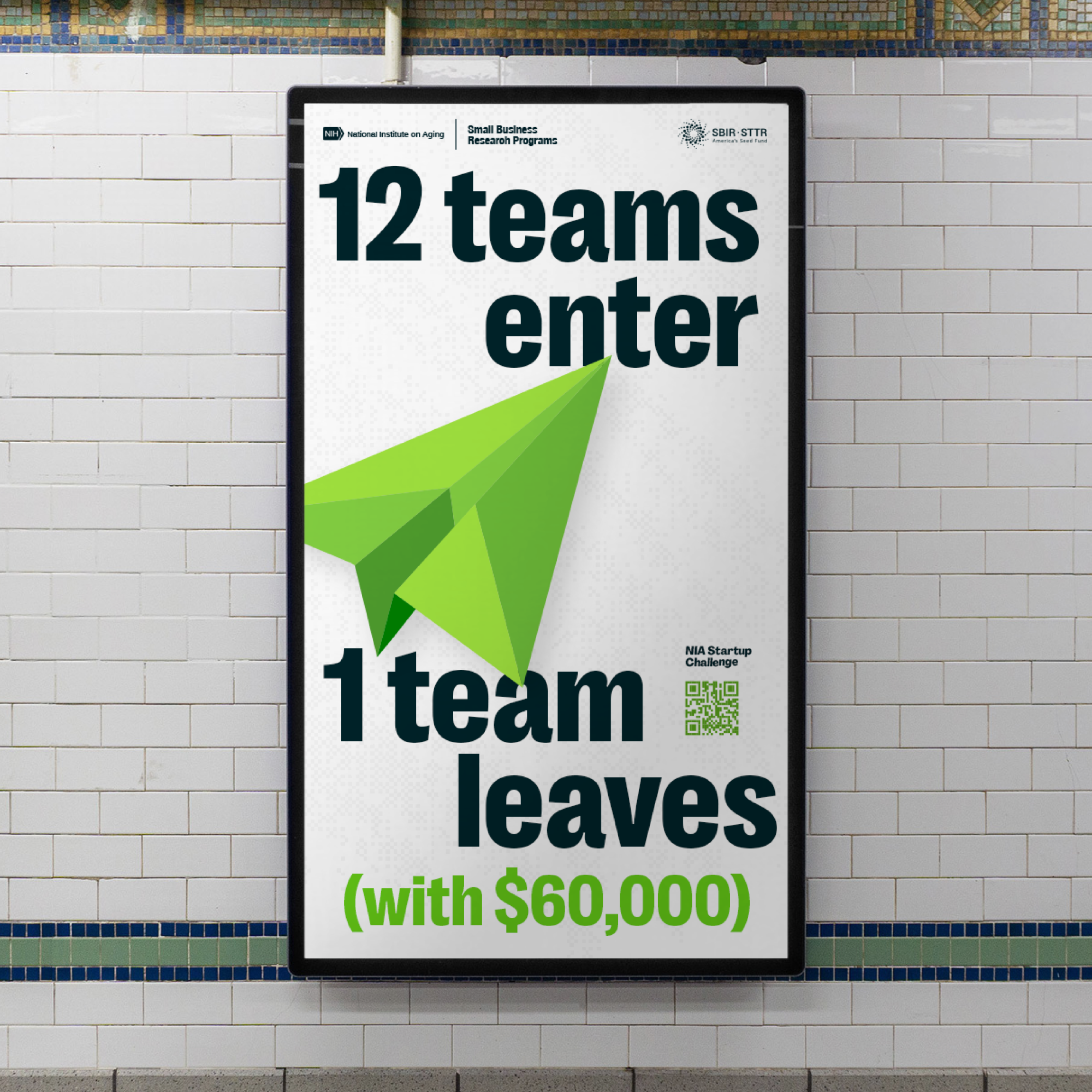
The National Institute on Aging (NIA) Startup Challenge presented an exciting opportunity to create a visually compelling and memorable brand identity for a National Institute of Health (NIH) Initiative. Tasked with developing a distinctive branding system, my objective was to convey innovation, dynamism, and the soaring spirit of entrepreneurship. This case study delves into the creative process behind the neon green branding system and the unique paper airplane logo.
This project was strategically managed through Ogilvy, with my role focused on spearheading the visual strategy for the campaign. The NIA Startup Challenge provided a unique canvas for crafting a brand identity that resonated with innovation and for fostering groundbreaking ideas in aging-related ventures.
The NIA Startup Challenge spanned six dynamic weeks, featuring 12 workshops strategically blended with both in-person and remote activities. This hybrid approach offered flexibility and accessibility to participants. The diverse format extended to conferences, where thought leaders converged physically and virtually to share insights. This comprehensive structure fostered innovation, skill development, and a vibrant community of entrepreneurs.
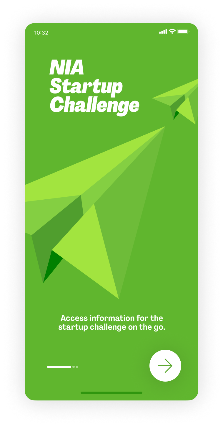


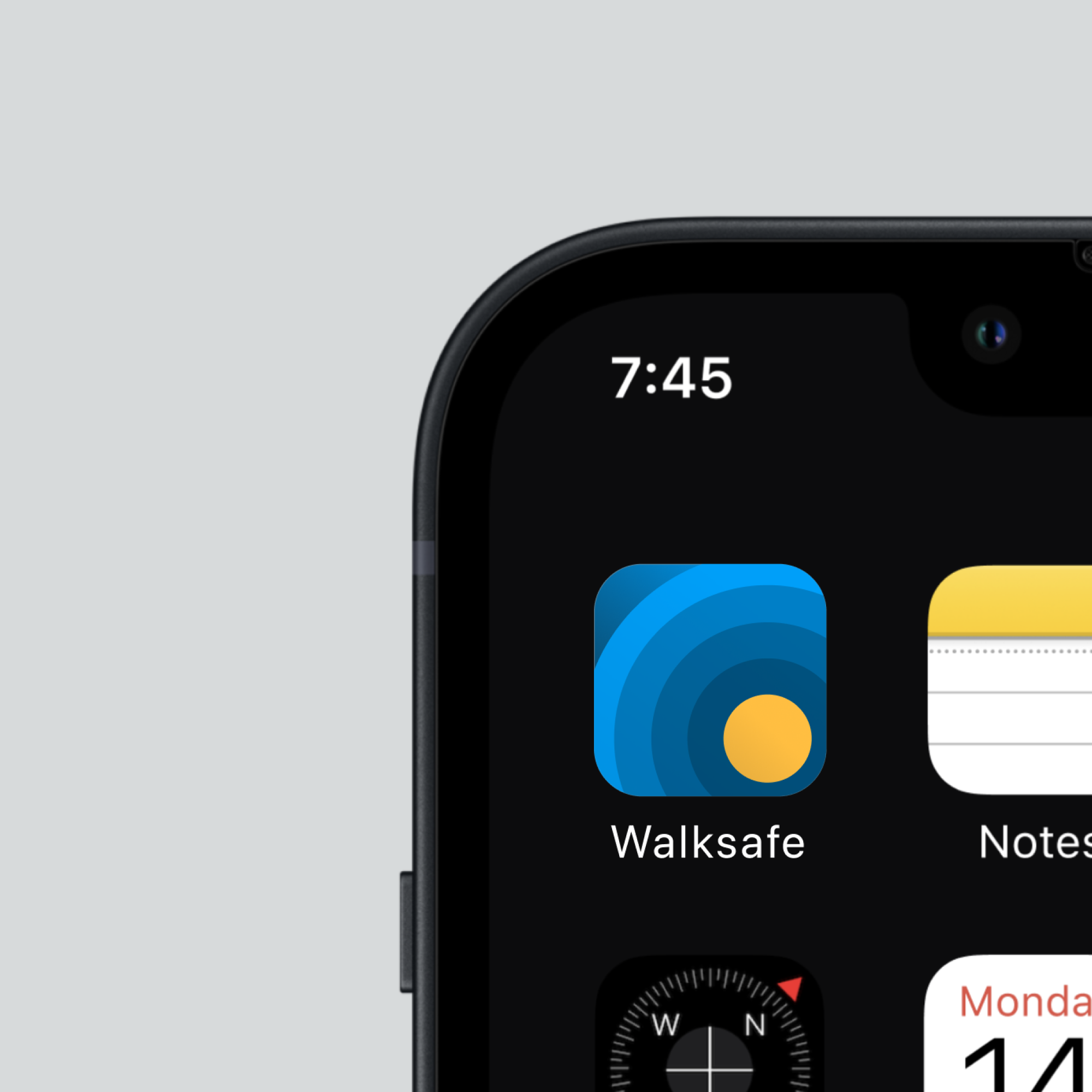
As part of our design strategy for the NIA Startup Challenge, we developed a customized conference app aimed at enhancing participant engagement and simplifying the monitoring of challenge deliverables. The app, seamlessly incorporating the neon green branding and paper airplane logo, provided attendees with a practical tool for accessing event schedules, speaker information, and real-time networking opportunities. Notably, the app's primary function was to serve as a centralized platform for tracking challenge-related milestones and submissions. Its user-friendly interface facilitated efficient communication and ensured a transparent and accountable evaluation process, contributing to the overall effectiveness and organization of the event.
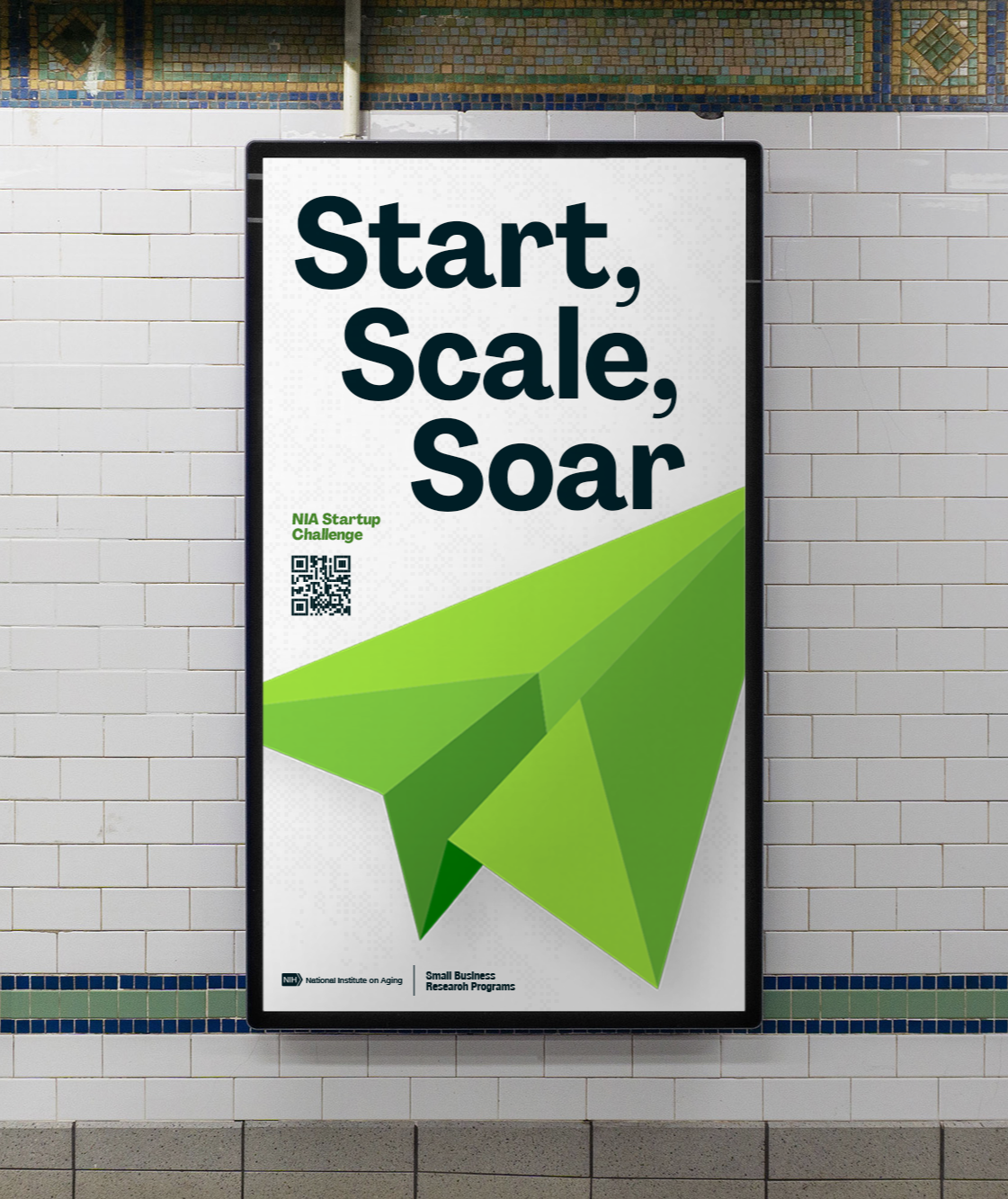
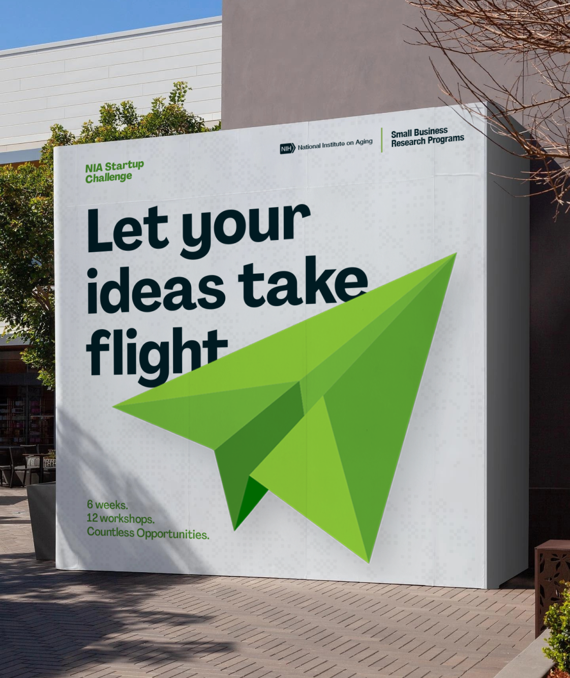
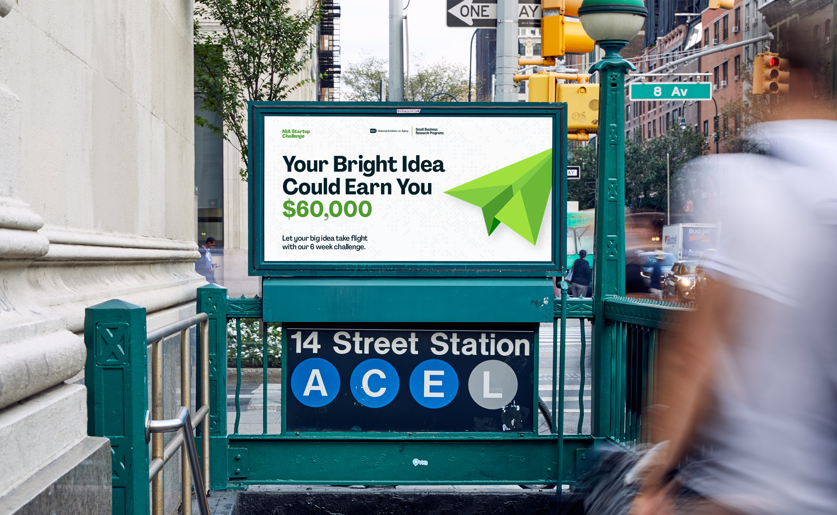

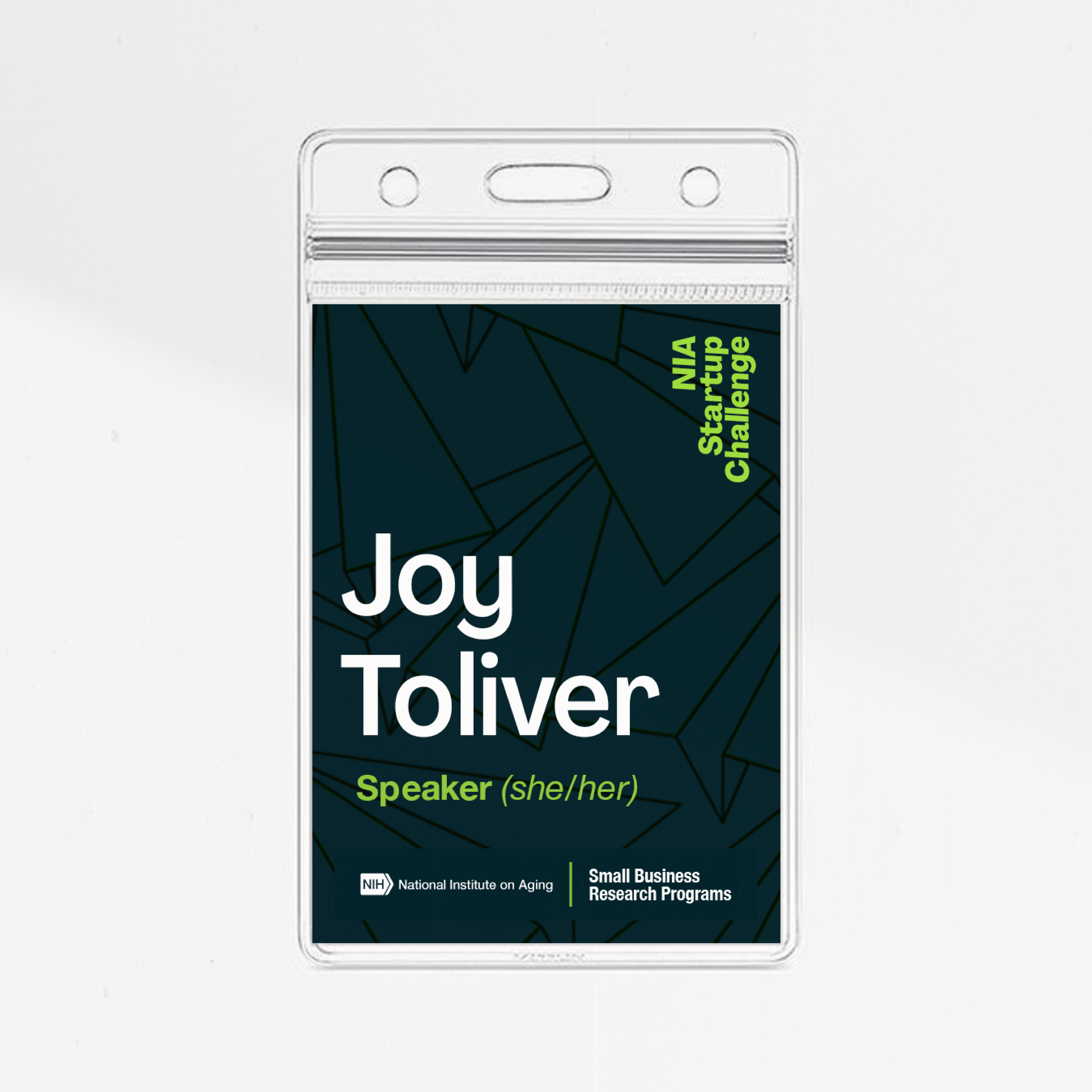

Marketing Collateral
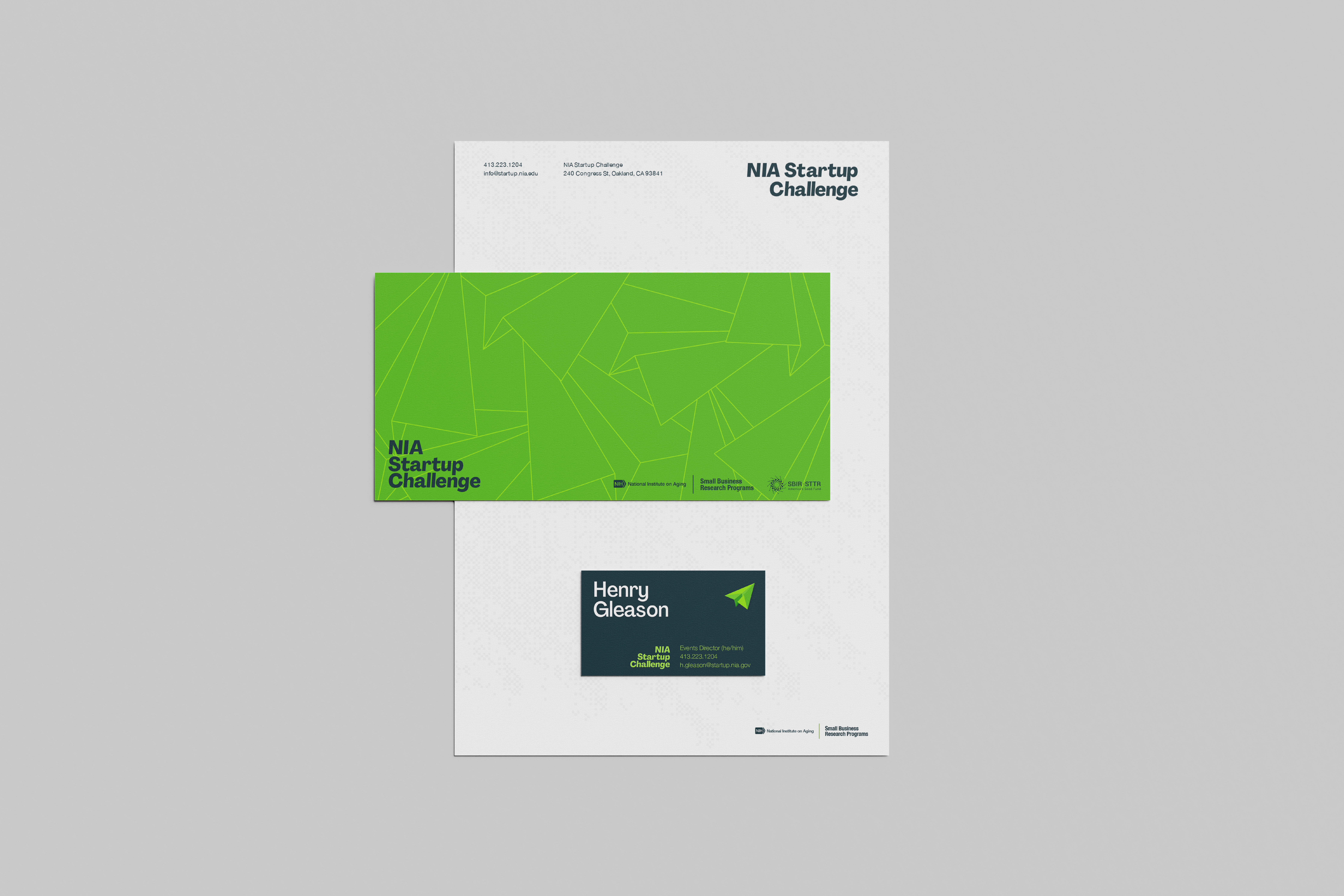
From t-shirts, to tote bags, to name tags, the branding system maintained its visual impact. The neon green and paper airplane elements served as eye-catching motifs, reinforcing the brand identity at every touchpoint. Where the paper airplane is too bold, it is added to background elements as an outlined pattern.
Visualizing the Startup Challenge's Success
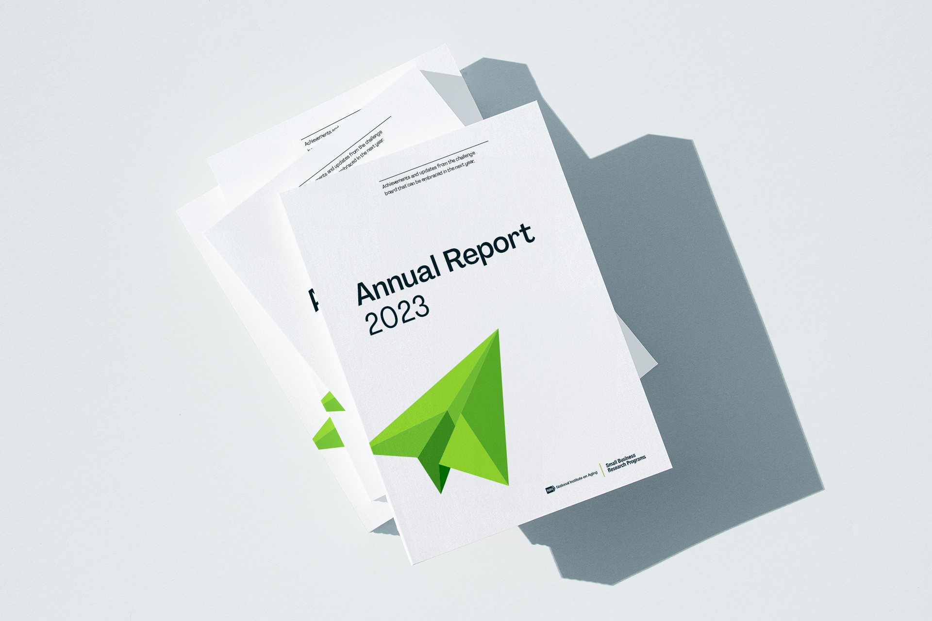
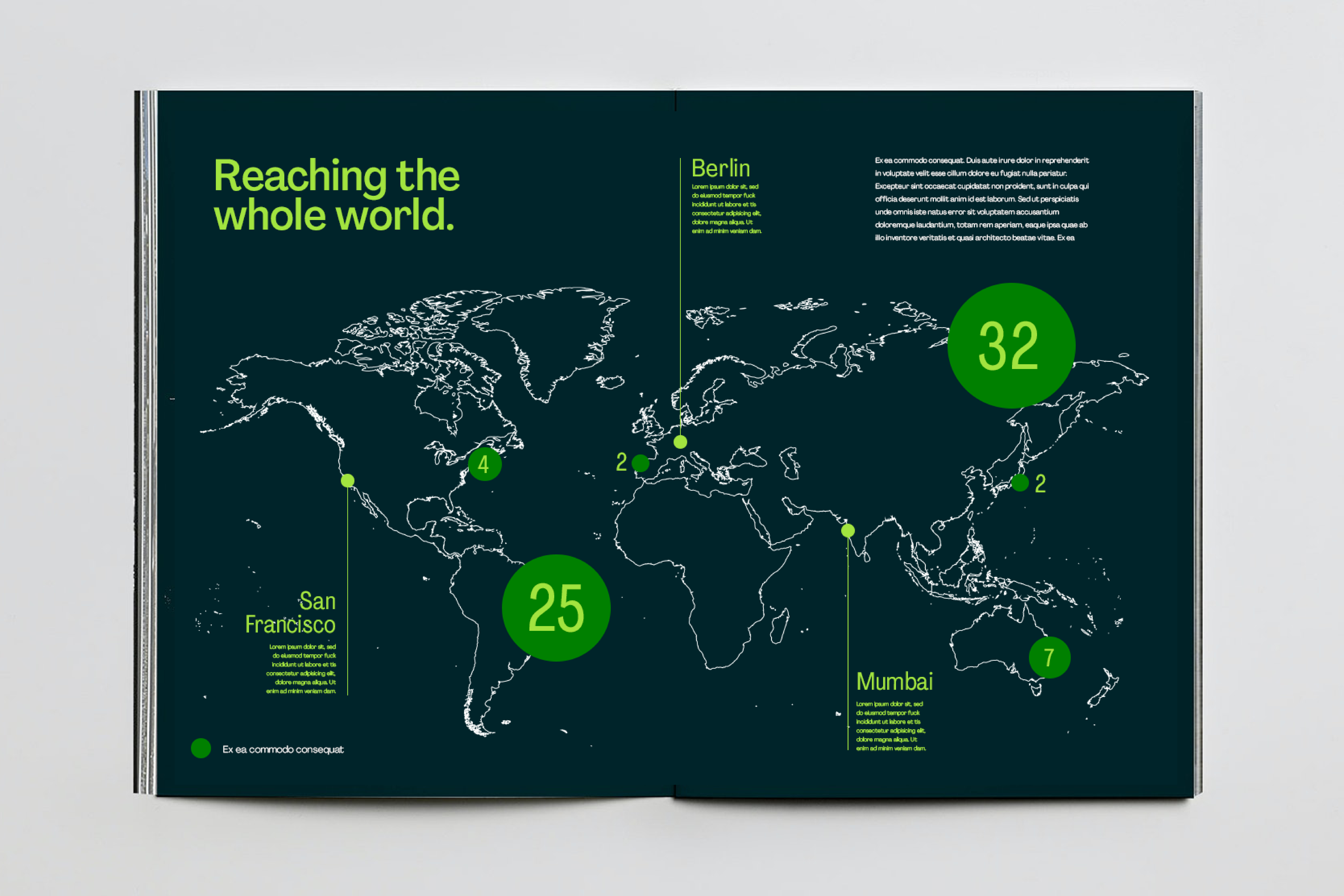
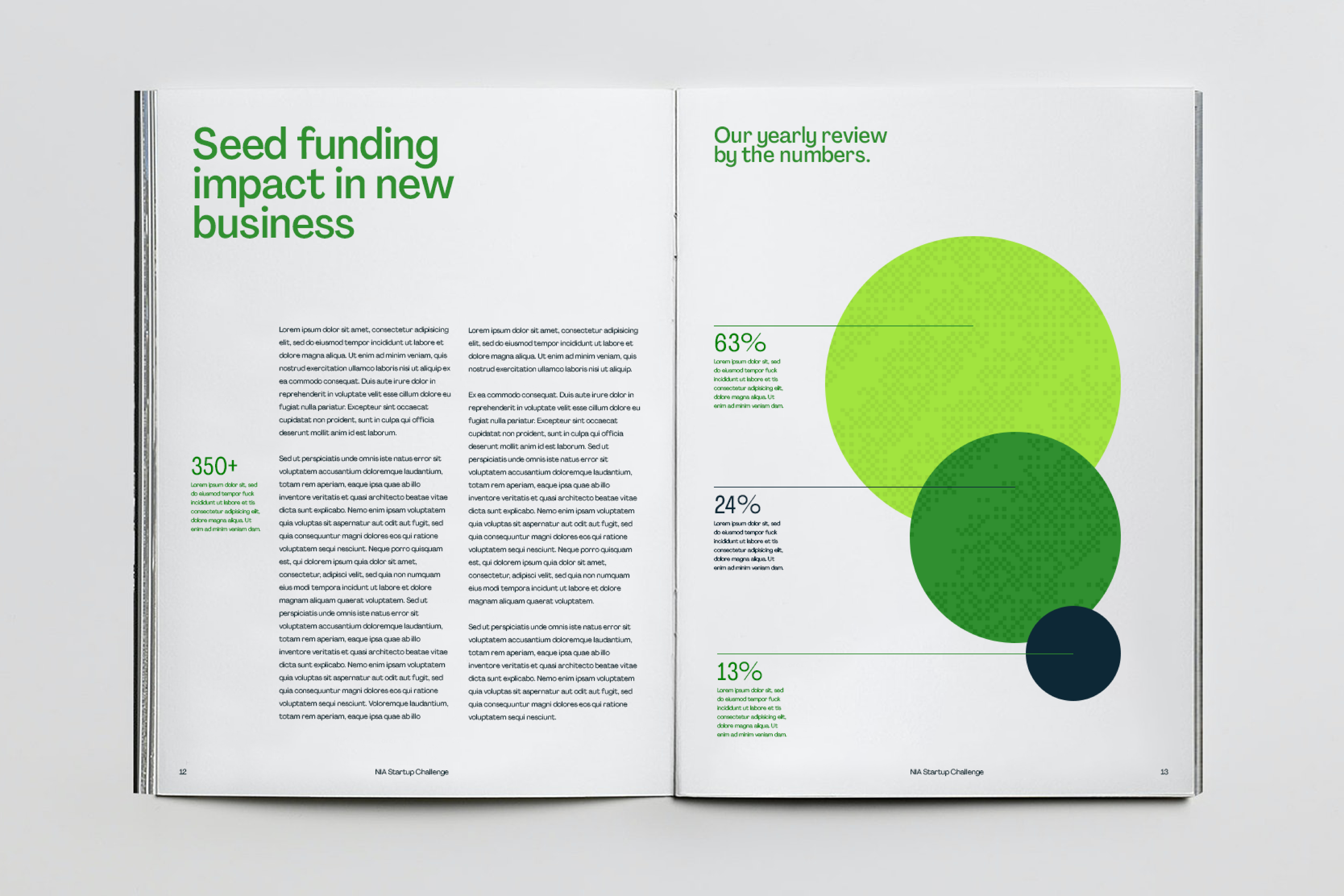
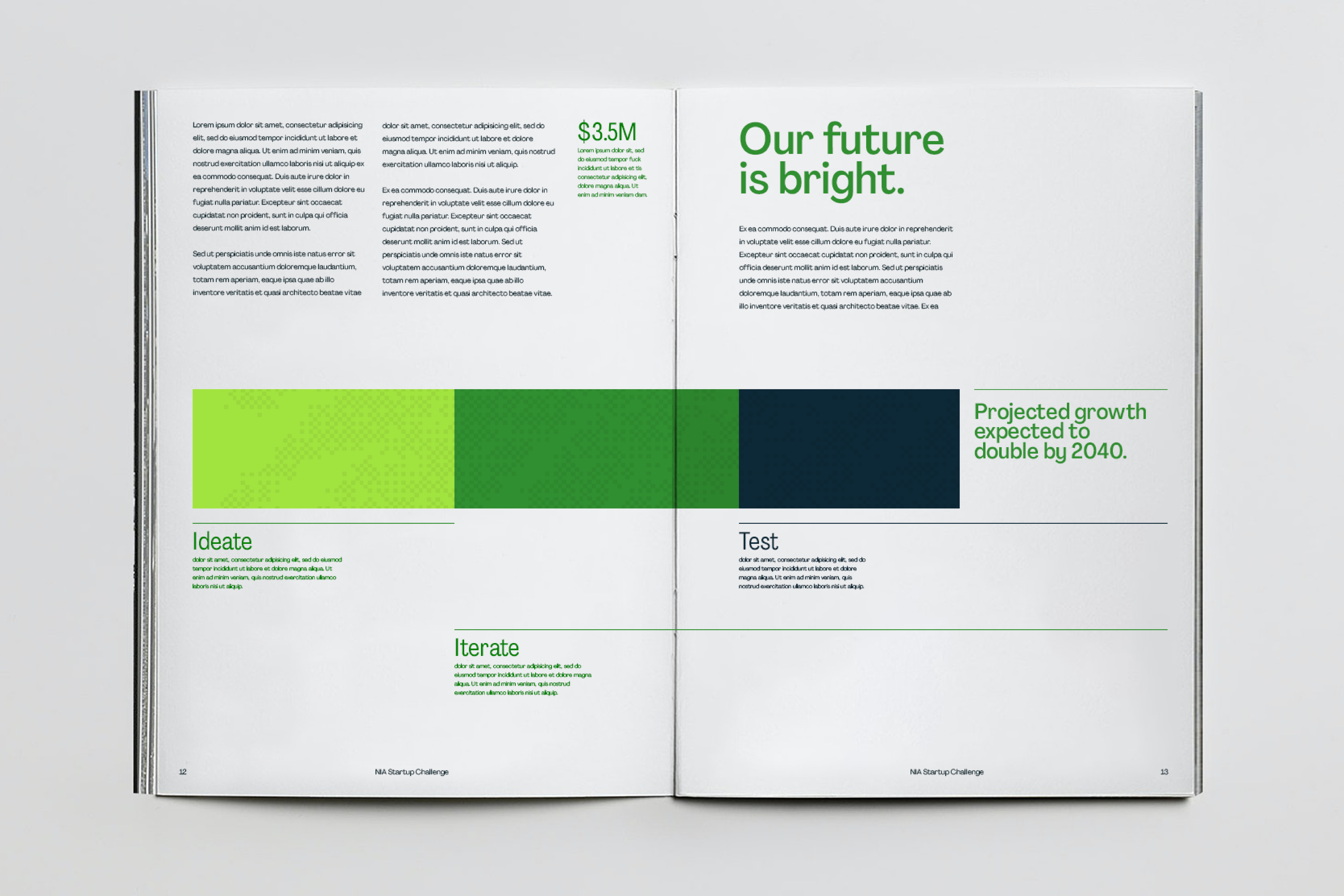
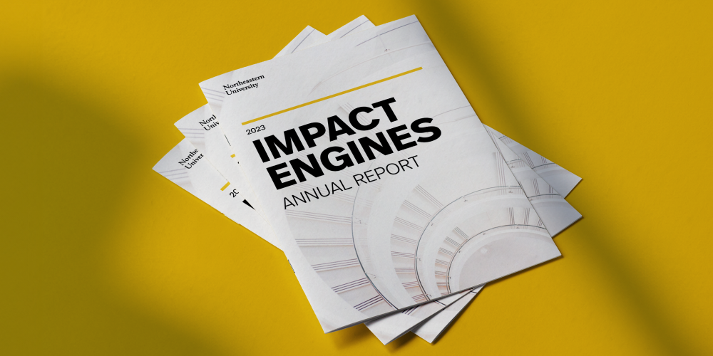
A compelling Impact Report was designed following the NIA Startup Challenge. This document serves as a comprehensive overview of the event's outcomes, presenting key metrics and achievements. Aligned with the neon green branding system and paper airplane logo, the Impact Report encapsulates the entrepreneurial spirit and collaborative energy that defined the challenge. Beyond statistical insights, the report narrates success stories, providing a thorough and polished representation of the profound impact the NIA Startup Challenge had on the participating startups and the broader entrepreneurial landscape.
